Features:
COVID-19 story recipe: A dashboard with at-risk health indicators
We teamed up to give our communities context about vulnerable populations—here’s how you can use our code and data
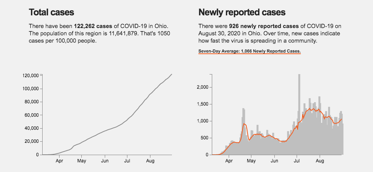
Screenshot from the COVID tracker dashboard with Ohio data
As confirmed COVID–19 cases rose across the United States in early March, each of us—in our own public-media newsrooms—began looking for county-level data on the disease and it’s spread in the hopes of better informing our local communities. We came across each other through previous collaborations, NICAR, and the Lonely Coders slack, and we all wanted to tell this story from the local angle. After we slid into each other’s DMs and began sharing datasets, we realized we could do so much more.
Statewide and nationwide numbers on COVID–19 cases and deaths often don’t tell people everything they need to know in order to make the tough decisions we are all facing during the pandemic. We thought it was important to empower our audiences with information on the outbreak in their own communities—using county-level data—as well as context about particularly vulnerable populations.
All of us had the same goal, and none of us had time to build basically the same app four different ways. We decided to build a dashboard together that would show two kinds of data: how widespread COVID–19 is in a community, alongside health indicators that show how some people are more at risk. We’ve open-sourced the project and are sharing some guidance here to help you spin up your own dashboard, or even just use the health data we’ve processed to write a story about your community’s vulnerable populations.
What we made
COVID–19 data
The datasets available for us to work with changed rapidly. First, Johns Hopkins University had some local COVID case and death data, then just country-wide data, then county data. Then Big Local News started hosting data. During our second week of work, the New York Times came out with county-level data.
As of the publication date of this article, the best source for U.S. county COVID cases and deaths is the New York Times dataset. It is updated daily, and efforts are being made to correct inaccurate case and death numbers reported on past dates.
By default, our dashboard app is set up to use the NYTimes dataset for all states except California, which uses county COVID data from the Los Angeles Times.
While these two datasets are comprehensive and well-maintained, you may have reasons why collecting your own county data is preferential. We tried this approach in California for a month but realized that it was not a realistic, long-term solution for us. If you would still like to create your own dataset, we have included some helpful tips at the bottom of this article.
Health indicator data
To add context to the COVID–19 data in our dashboard, we had to find local risk data. Experts say that some groups are more at risk if they contract the virus, including seniors or people who suffer from chronic respiratory disease, cardiovascular disease, or diabetes. Through previous reporting, Alexandra had experience working with The Institute for Health Metrics and Evaluation’s Global Health Data Exchange datasets. They include county-level estimates of certain disease mortality and prevalence rates. We also used age data from the 2018 American Community Survey.
We processed age and disease data for all U.S. counties, which allowed us to compare them and help people understand the risks in their counties compared to the rest of the country. Those data points are included in the app by default, including information on why these factors leave a person more vulnerable to a serious case of COVID–19 and a graphic to help users understand the quartiles we used. You can also view a csv with that information here.
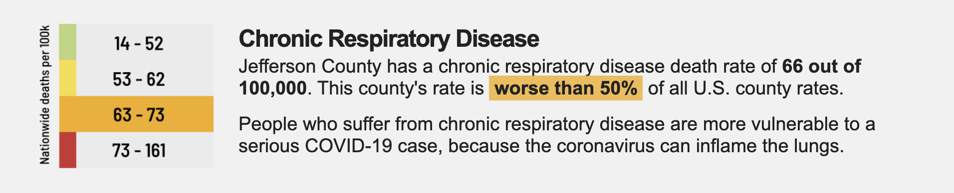
Screenshot from the Kentucky COVID tracker
Right around the time we launched version 1 of our apps, the president and local governments started talking about reopening guidelines. Those guidelines included analyzing new case trends in order to assess a locations relative risk with regards to phase 1 reopening of some businesses.
At this point, we began designing and developing version 2 of our app to include new cases and new deaths overtime. We also incorporated a 7-day average new case trendline to account for delays in reporting.
The code
When we first started discussing which tech tools we’d use to build our COVID trackers, we knew a few things:
- We needed to use a system that had a low bar of entry, i.e. it needed to be as close to “plug and play” as possible
- We needed to use languages that at least a few people on the team were familiar with
- While we needed to get things going ASAP, we also needed to build things in a way that made it easy to adapt to each state and to further development
We decided to use GitHub to keep track of our code and the issues and features we decided on in our daily conference call. We chose d3.js as our visualization library because that was what most people were familiar with.
We also decided to release versions of the app. This helped us not get hung up on small details or enhancements that we thought would make the app better. A lot of our conversations went something like: “Should we include new cases as well as cumulative cases? No time. Add it to version 2.”
Another consideration we had from the beginning was how to implement these version updates. Since we’d have a variety of newsrooms using these apps, we wanted to make sure updating to a new version wasn’t going to be unnecessarily cumbersome. Using strict file structures and naming and newsroom-specific external javascript, we were able to make an easy-to-update app.
You can view and read more about our code on the Github project page.
You Have the Tools, Now What?
Now that you’ve heard more about this project and what it’s capable of, there are a few options for you if you want to use the tools we’ve provided.
- Embed one of our dashboards on your site
- Build your own dashboard
- Use our health indicator data to write a story
(No matter how you use our app, we would love to hear about it! Please fill out this Google Form so we can contact you about updates, celebrate your success with the tracker app, and see how widely this tool is being used.)
Embed one of our dashboards on your site
We’ve already created dashboards for California, Kentucky, Ohio, and West Virginia, and we’re in talks with a couple of other public radio stations to make them for a few more states. If you cover a state that we already have a dashboard for, we got you. You can just embed the dashboard on your site.
One option you have is to create a page in your CMS, write a headline and some intro text, and just link out to the tracker. Here are the links for the ones we’ve already created:
Another option is to use Pym.js to create an iframe. The app is already responsive, so you should be able to go into your CMS—or inject HTML snippets into your page if you’re able—and add this code with the link to the tracker you want to insert:
<div id="covid-tracker"></div>
<script type="text/javascript" src="https://pym.nprapps.org/pym.v1.min.js"></script>
<script>
   var pymParent = new pym.Parent('covid-tracker', 'https://laist.com/projects/2020/coronavirus-tracker/app/california/index.html', {});
</script>
You can see an example of this on CapRadio’s site here.
If your station uses Core Publisher, which doesn’t work well with Pym.js, you could use a regular iframe. Just like with the first two options, write up some intro text and a headline and then insert this code into the page’s HTML:
<iframe src="https://laist.com/projects/2020/coronavirus-tracker/app/california/index.html" height="1500"></iframe>
You can see an example of this on KQED’s website here.
Build a state dashboard
If your state isn’t one we’ve covered, we’ve still got you covered.
We’ve built our repo in a way that makes it easier to create your own tracker. You’ll need to have a public place to publish the app to, like AWS S3 or a Github Pages repo. If you don’t have access to those resources, reach out to our team on the LCC Slack and we’ll see what we can work out.
Step 1: Copy the code
Our code is hosted here. You can clone the whole repo, but you’ll only need the app directory.
Step 2: Rename the STATE directory
Once you’ve cloned the repo, go inside of the app directory and find another directory called STATE.Rename that STATE directory to your state’s name.
Step 3: Adjust state- and newsroom-specific variables
All state- and newsroom-specific variables are located in the app.js files within a state directory.
These lines control how the app sees your data:
var lastUpdatedwill help users know when the app was last updated. If you leave this variable blank (var lastUpdated = '';), the app will pull the most recent date from your data and display that on the app. Some orgs like to have date and time displayed, so you also could manually enter the datetime here each time you update the data.var casesFilewill tell the app where the data lives. This can be a relative path or an absolute path. If you are using custom data, your data will have to follow this template. If you need help constructing historical case and death data, please get in touch with us.var dateFormatwill tell the app the format of your date field. By default, the app expects dates like2020-04-08.var stateNameis the capitalized name of the state your app will feature.var dataSourcesholds notes about the data. If you are using custom data, include any data sources and caveats here. If you are using NYTimes data, leave the text as it is.
Several lines at the top of app.js can be commented out or uncommented, depending on whether you’d like to use the New York Times county dataset. The rest of the lines control how social media sees your version of the app.
Step 4: Test your tracker
Because the app uses javascript to pull data into the page, you’ll need to spin up a local server to test your tracker on your own machine. Here’s how you start a local server if you’re on a Mac or Windows.
Step 5: Host your files
Host the app directory in a publicly accessible place. We use AWS S3 for this but you can use Github Pages or Digital Ocean. Whatever works for you!
Write this as a story
Even if you don’t think creating a dashboard for your state is feasible for your newsroom right now, that doesn’t mean that you can’t use some of the tools we’ve created. It’s super valuable right now for local newsrooms to get talking about their community’s vulnerable populations in the context of their outbreak coverage.
You can use the data we’ve collected to take a dive into how your area’s counties differ in the age of their populations and in the prevalence of diabetes, chronic respiratory disease, and cardiovascular disease. Every community faces a different level of risk from COVID–19, and this is a great way to provide your audience with an idea of what the pandemic’s impact on their life could be.
Download the data and filter by your state’s FIPS code to get all health variables for counties in that state. Here are some of the ways you can begin reporting on this data:
- Sort by
column perc_62plusto see which counties have the highest percentage of residents over the age of 62 - Sort by column
diabetes_rateto see which counties have the highest percentage of residents with diabetes - Sort by column
crd_rateto see which counties have the highest chronic respiratory disease death rate per 100,000 - Sort by column
cvd_rateto see which counties have the highest cardiovascular disease rate per 100,000.
Here is a full data dictionary to explain all of the columns.
Once you have analyzed the data for your state, we recommend you run the results by regional health experts to gain better context for what you’re seeing.
Get ahold of us
We hope the tools we’ve laid out here can be useful for you as your newsroom embarks on covering this evolving situation. If you have any questions, always feel free to reach out to any of us!
- Lisa Pickoff-White: Email / Twitter
- Alexandra Kanik: Email / Twitter
- Emily Zentner: Email / Twitter
- Dana Amihere: Email / Twitter
Collecting your own data
Local public health departments often have the most accurate and up-to-date information on COVID–19. There is a range in how quickly that data is sent out through state and national datasets.
If you do want to collect your own COVID–19 data, the first thing you’ll need to do is figure out what the health jurisdictions in your state or region are. Many times, these jurisdictions are just counties themselves, but that isn’t always the case. Look out for individual cities (often large ones) that may be their own health jurisdiction, and small counties that may share one health authority.
There are a few ways to go about finding these jurisdictions. For example, in California, we found these jurisdictions through some open data posted on the Department of Health Care Services’ website. When you find these jurisdictions, you’ll need to have a plan of attack for how to handle any ones that aren’t a single county.
HINT: The CDC maintains a list of helpful links for each state’s health department setup.
For combined counties, you can deal with them as a combined entity. In California, we started by dealing with Yuba and Sutter counties as a combined entity, and later went back and split them apart when they started reporting separate numbers. For individual cities, you will need to reach out to the county that city is in and see if the city’s case numbers and deaths are counted in the county totals. If they are, you’re good to go. If they aren’t, you’ll need to add them into the total county counts as you track the data.
Now you’ll have to find the data you’re looking for. It may be on a page specifically dedicated to COVID–19, or it may be a part of a press release on the department’s news page or a post on its social media account, so peek around for it. We found that there were variances across California’s counties in how and when these numbers are reported, so we tried to note these along the way to make collection easier. Make sure that, if you collect data, you use the number of confirmed cases rather than the number of active cases, which some counties report separately. We also noticed that some counties report cases among residents in the county and cases among nonresidents in the county, so you’ll have to make a call on whether or not you want to count them in the county total (we have been, but are likely going to stop).
In California, we created a Google Sheet for our data recording, noted when most health departments update and then scheduled one person to do entry and one person to edit that work each night. You can find an example spreadsheet here, which you’re welcome to copy and use.
Credits
-
 Dana Amihere
Dana Amihere is data editor at KPCC, an NPR member station in Southern California. She’s a designer, developer and data journalist who has previously worked for The Dallas Morning News, The Baltimore Sun, and Pew Research Center.
-
 Alexandra Kanik
Alexandra Kanik is a data reporter for CityMetric where she analyzes data and writes about housing, transportation and other city issues. Previously, she was a data reporter for Louisville Public Media in Kentucky and PublicSource in Pennsylvania.
-
 Lisa Pickoff-White
Lisa Pickoff-White is a data journalist at KQED. Lisa specializes in simplifying complex topics and bringing them to life. She previously has worked at the Center for Investigative Reporting and other national outlets. Her work has been honored with awards from the Online News Association, Investigative Reporters and Editors, the Society of Professional Journalists, and SXSW Interactive.
-
 Emily Zentner
Emily Zentner is a Data Reporter at CapRadio in Sacramento, where she combines her skills in reporting and digital production to create original, data-based interactives for the station’s website. Before coming to CapRadio, Emily worked as a video producer at the Sacramento Bee. She is passionate about local news and how to use data and visuals to help people better understand their community.


