Features:
Draw Your Own Election Adventure
Using the Leaflet Draw Plugin to Give Users Control Over Election Results Display
It’s an elections year in Argentina this year, and I honestly think that they could win a world record for most elections in a single year. Voting is a “compulsory right” in Argentina, so for example if you live in Buenos Aires, you must vote at least fives times this year—maybe six, depending of the margin of victory of the winner party at the national level.
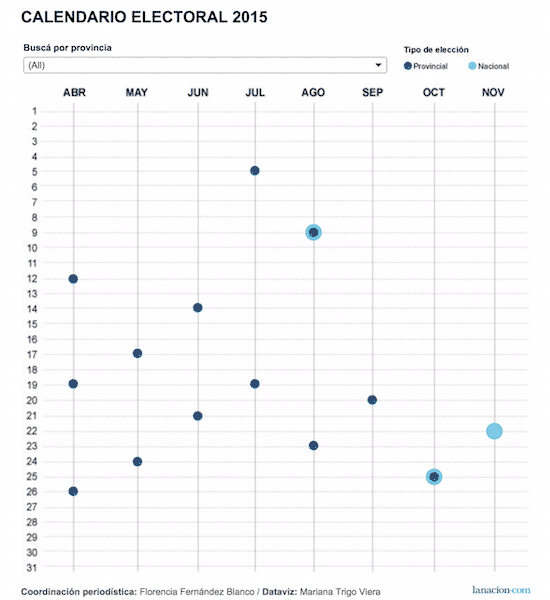
Chart of the calendar of elections
For example, Porteños were called to vote three times to choose their new mayor. First came the April primary election, to decide which candidate would represent each political party of. In the second election, in early July, they voted for their selected candidate/political party—and then, because no candidate hit the 50% barrier, a run-off election was held two weeks later to choose the final candidate.
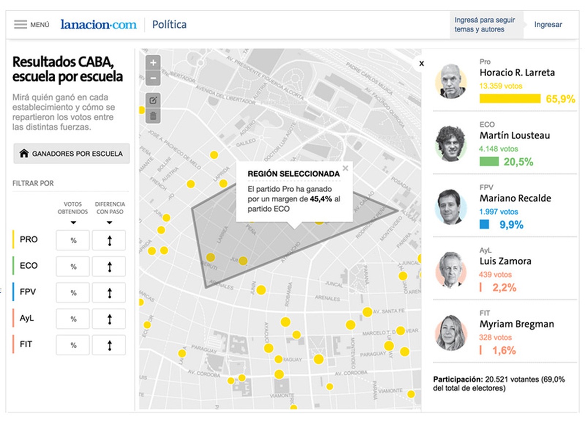
At La Nación, we have been working on real-time coverage of Buenos Aires elections, as well as a more detailed view results once we get data for each polling station. In this post, we’ll to explain our mapping-app innovation that allows readers to choose what parts of the city they are interested in by drawing shapes over a basemap, and then returns custom results for their selected area.
Meaningless Boundaries
Sometimes the official divisions of a city needed for administrative tasks are not necessarily meaningful to the city’s population. In many cases, the city has living parts that do not fit in the limits of official administrative level divisions.
In Buenos Aires, the first division is called comuna, and many people do not relate to the comuna they live in. They speak more about neighborhoods, which are the next-smallest division, and about even smaller sub-neighborhoods that don’t have an official equivalent.
After covering the detailed results for the primary elections in a previous project, we wanted to improve the readers experience by letting them decide for themselves exactly what parts of the city they wanted to check results about.
Leaflet.draw Plugin to the Rescue
As we thought about how could we improve the user experience for the upcoming election, we considered digging deeper into official administrative divisions, but that did not work since neighborhoods are officially broken up into “electoral circuits,” which almost nobody cared about.
But we knew about the existence of a drawing plugin for Leaflet—so what if we let the reader draw over the map, and then created a geospatial query to get the results from each intersecting polling station, aggregated them, and displayed the selected results?
Very cool.
Design Decisions
We decided to go ahead with the drawing solution but restrict some of the the functionality. The Leaflet plugin allows you to create multiple shapes over the map, but we thought that could be confusing for our audience, so we allowed only one selection at a time.
Giving that we had previous results for the primary elections in Buenos Aires, we also wanted to be able to compare the new election results with the primary results for every polling station of the city so we could quickly show where each political party had won or lost votes.
To show change, we have used arrows colored the party color in case they got more votes in a given polling station and black otherwise, that matched perfectly with our idea of being able to have a quick overview of the areas where a candidate had improved or lost votes. As you can see in the following images.
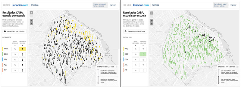
PRO (left) and ECO (right)
Using a basemap when you are displaying fine-grained results is a good option, since viewing the streets allow the readers to quickly locate their area of interest. But having street labels and neighborhoods visible at a high level of zoom distracts the attention of the reader from the election results themselves. So we have used MapBox Studio to customize the basemap appearance by zoom level. (For anyone who does not know about MapBox Studio, it allows you to customize every aspect of a map that you can think of, improving the user experience by showing details only when those details are needed.)
Technology Choices
We have used Leaflet.js for the map, MapBox Studio for the customization of the base layer, D3.js to create an overlay layer that shows the location of each polling station and finally CartoDB to host the results data and their SQL API for our geospatial queries.
We are using RequireJS to allow us to keep our JavaScript projects modular and Underscore.js for our templates.
We did encounter one interesting problem combining these components. Since both the Leaflet.draw Plugin and the D3 layer use OverlayPane to draw themselves, we had some issues with the focus of mouse events after the removal of a selection: an orphan SVG stayed over the map, disabling the D3 layer interaction. We hacked around the issue using CSS pointer-events magic, but will be investigating more thoroughly and reporting back to the affected project.
We’ve made the source code available on GitHub, so please send us any suggestion or questions through an issue.
The final result, in 30 seconds:
Did It Work?

In the paper edition
The Leaflet.draw plugin, used in conjunction with finely detailed information overlaid on a map and geospatial queries, improved our users’ experiences and interactions, freeing them from the restrictive official boundaries and divisions. The project has also been used for the paper edition. These multi-platform projects are a step forward towards greater efficiency more consistent look and feel across platforms.
As a bonus, we’re also putting the tool to work internally in the newsroom: our journalists are using it to find new stories in the election results data and publishing articles without needing a complicated analysis or help from the newsroom technical team.
The project has received a lot of attention from our community, with very positive feedback, and we hope that it can inspire new approaches to election results.
People
Organizations
Code
Credits
-
Juan Elosua
Spanish telecommunications engineer. 2015 Knight-Mozilla fellow at @LNdata. Data Analysis & Visualization Developer. Open Data enthusiast.


