Learning:
Forms Matter
How the design of forms can decide an election, affect racial profiling & shape identity

This story was co-published with ProPublica.
Forms. They’re the often-tedious tasks that stand in the way of an online purchase, seeing the doctor, or filing your taxes. They may be boring, but they have tremendous power.
Whether you’re filling out a form or building it yourself, you should be aware that decisions about how to design a form have all kinds of hidden consequences. How you ask a question, the order of questions, the wording and format of the questions, even whether a question is included at all—all affect the final result. Let’s take a look at how.
How You Ask the Question: The Census
The Census determines everything from how our congressional districts are drawn to how $400 billion in federal aid is distributed to enforcement of civil rights laws. Perhaps most profoundly, the Census gives people the chance to define their identities, communicating how they think about themselves.
But even small changes in the ways Census forms ask questions can have surprising effects, and not just because of the inherent limitations of asking people to put their identity in a box.
The Census has repeatedly changed the way it asks about race and Hispanic origin, for example. These are two distinct sections on the Census. Between 1990 and 2000, the sequence of these sections was reversed. The 1990 form asked about race first, but the 2000 form asked about Hispanic origin first. Even more notably, the 2000 Census was the first ever to allow Americans to define themselves as members of more than one race.

The Census Race and Hispanic Origin Question in 1990 and 2000. (Census)
These design changes likely altered people’s responses, according to a 2000 Census report that looked specifically at the new form’s effects. In test questionnaires sent out as part of a national experiment, the number of respondents choosing two or more races doubled once people had an explicit instruction to mark “one or more,” rising from .83 percent in the 1990-style form to 2.03 percent in the 2000-style form. (In the actual 1990 Census, someone who filled in more than one race would have had their response edited to choose a single race; the test allowed researchers to see how many people would mark two races despite instructions to mark one.)
Contrary to what some feared, the change was not enough to substantially reduce the number of people reporting a single race in the five main race categories (White, Black, Asian, American Indian and Alaska Native, Native Hawaiian and Other Pacific Islander). But it did have a large effect on one group: Hispanics.
Hispanics reporting as “White” went up 10 percentage points between 1990-style and 2000-style form, while reporting as “Some other race” went down by the same amount (overall Hispanic percentage of the population stayed the same). The report notes that this jump “probably reflects the effect of the new ‘one or more’ option and the reversed item sequence…” and warns that “these questionnaire effects may mask true population changes, or may masquerade as change when none has occurred.”
The Order of the Questions: The Ballot
For further proof that form effects have real consequences, just look at the ballot. The order, format and wording of questions on the ballot can (and have many times in the past) influenced how votes are cast.
I’ve written about ballot design in the past, and you can read much more about the impacts of unclear instructions…

Palm Beach county’s infamous butterfly ballot. (Wikimedia Commons)
….outdated rules that mandate ALL-CAPS text, which makes ballots harder to read…

Illinois Election Code used to require candidate names to be printed in capital letters. (Statutes of the State of Illinois)
…distracting large cartoonish icons required to appear next to candidates’ names that only clutter the form…

New York ballots must include “the image of a closed fist with index finger extended pointing to the party or independent row.” (Otsego County and North Castle, Westchester County)
…and how missing column headers or ballots that span two pages can lead to errors and people’s votes being tossed.
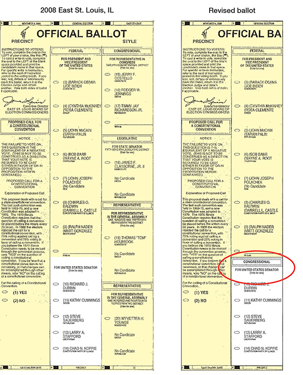
On the left, no header for the Senate race, on the right, a revised version with headers for all contests. (Brennan Center, Better Design Better Elections)
But I want to highlight a design decision that seems trivial but in fact has a substantial impact on our selections on the ballot: the order of the candidate’s names. Numerous studies have confirmed that the candidate listed first has an advantage. A recent study of Texas primary and runoff elections attempts to quantify exactly how much. Ballot order is randomized within each of Texas’ 254 counties, so it’s possible to compare the results of federal, state, or judicial races across them all. Darren Grant, the author of the study and an economics professor at Sam Houston State University, found that “the ballot order effect is huge.” Having your name listed first versus last can swing the race as much as 10 percentage points, especially in less high-profile races further down the ballot. Many elections have been determined by a smaller margin of victory than that.
If the order of questions on a form can affect who you vote for, just think of how it might influence other decisions.
How Easy it Is to Answer the Question: Encouraging Enrollment
It’s well known that many kids who graduate high school and plan on going to college don’t show up in the fall (about 10 percent to 40 percent according to research from Harvard). This phenomenon, known as “summer melt,” was the subject of a recent episode of NPR’s Hidden Brain podcast. The episode described how the drop-off rates are much higher for students who come from lower income families and those who are the first in their family to go to college.
Surprisingly, researchers have found that one of the biggest reasons for this drop off is not a lack of money, or a sudden change in circumstances, or a change of heart. It’s forms—specifically, how these students struggle to fill out the vast number of forms required to satisfy schools: the FAFSA, transcript requests, health forms, etc.
The admissions office at Georgia State University noticed more and more of its accepted students falling off at some point in the enrollment process. At its height, this number reached 18 percent of students. School officials suspected the massive amount of required paperwork might have something to do with it.
Their relatively simple intervention? An artificially intelligent chatbot nicknamed “Pounce,” after the school’s mascot. The chatbot interacted with students via text message in real time to answer common questions. When is my transcript due? How do I send in my FAFSA? The first summer using the chatbot, 300 more students enrolled than the previous year, and summer melt dropped from 18 percent to 14 percent.
In this case, making the form-filling process less cumbersome and intimidating had an undeniably positive effect. Businesses, too, use the design of forms to grease the wheels, to get people through the boring/painful parts as fast as possible. Online social networks such as Twitter and Facebook depend on their users posting, tweeting, liking, and messaging as much and as quickly as possible, so they have every incentive to design forms that get users from beginning to end in record time.
But sometimes designers actually want to slow users down. So they add a little friction to the process, making it harder to answer the questions on a form.
How Easy it Is to Answer the Question: Stopping Racial Profiling
Nextdoor is a social network that acts as an online message board for people living in the same neighborhood. But like real neighborhoods, Nextdoor has repeatedly encountered problems with racial profiling. Members have used the crime and safety section of the platform to report “suspicious activity” by black neighbors, often with no evidence of any wrongdoing. In Oakland, for example, members of the platform labeled black people as suspicious for merely “walking down the street, driving a car, or knocking on a door,” reported the East Bay Express in 2015. This sometimes even prompted calls to the police.
Nextdoor could have banned all members or shut down the site. Instead, the company chose to focus on the design of the form. Among a number of other changes, they added required fields in the Crime and Safety section specifically meant to slow down a user reporting suspicious activity. First, they ask the user to describe the incident. If that description includes any reference to race, Nextdoor expands the form and requires the user to include at least two other descriptors, like hair color or what the person was wearing. If you don’t fill out these fields, you can’t post at all.
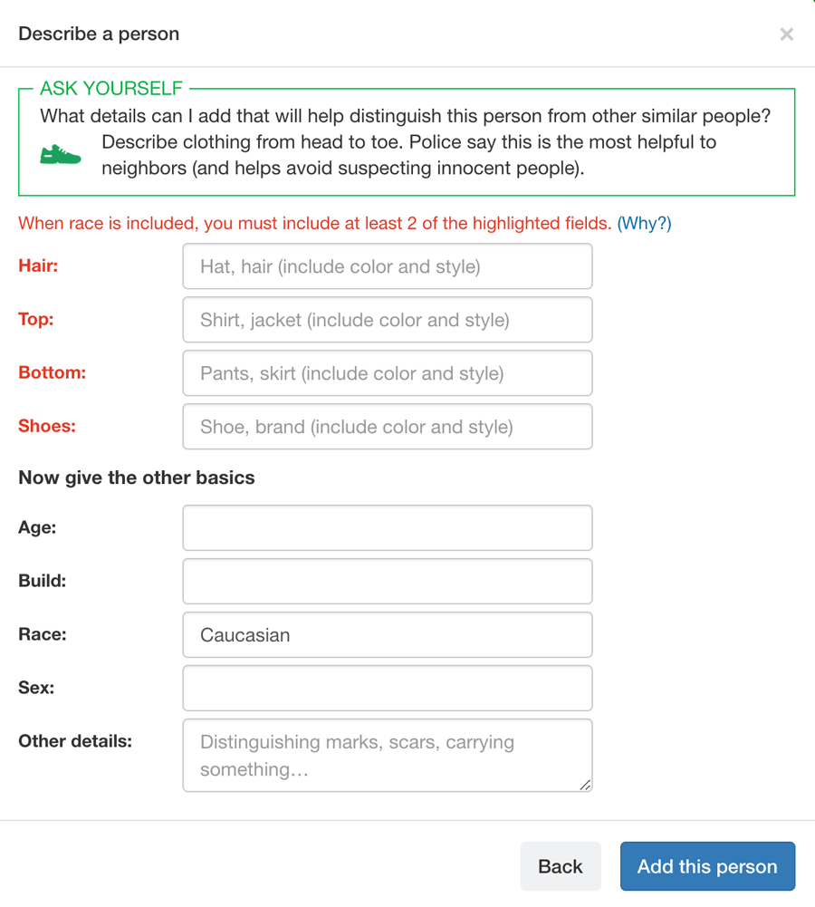
Nextdoor requires its members to fill out extra fields if they include race in their description of a crime or suspicious activity. (Nextdoor)
Interrupting someone—forcing them to stop and think—can change behavior. This concept has been applied to everything from encouraging personal fitness to making people more honest.
In Nextdoor’s case, by making it just a little harder to post unsubstantiated “suspicious activity” messages (and making a few other changes to the form design), the company says it has cut racial profiling in the crime and safety section by 75 percent.
Of course, that means there’s still racial profiling on the platform. Critics say the company has not gone far enough–for example, Nextdoor has not tackled comment threads. According to a spokesperson at Nextdoor, work on these sections is ongoing.
The Format of the Question: Male vs Female
The format of a question on a form–multiple choice, dropdown, fill in the blank–can seem pretty trivial. But consider how many forms–from birth certificates to drivers licenses to passports to job applications–ask about respondents’ sex/gender. Almost all forms give just two options: “Male” and “Female.” That’s no problem if you identify as one or the other. But for people who don’t, the form’s makeup is anything but trivial.

Sometimes, designers can just eliminate the question. But an increasingly common tweak is to make the format a fill-in-the-blank. Facebook, for example, has changed how it asks about gender by including a “Custom” option, where users can select a descriptor from a long list or write in their own. However, that’s only once you already have a Facebook account. To sign up in the first place, male or female are still your only two options.
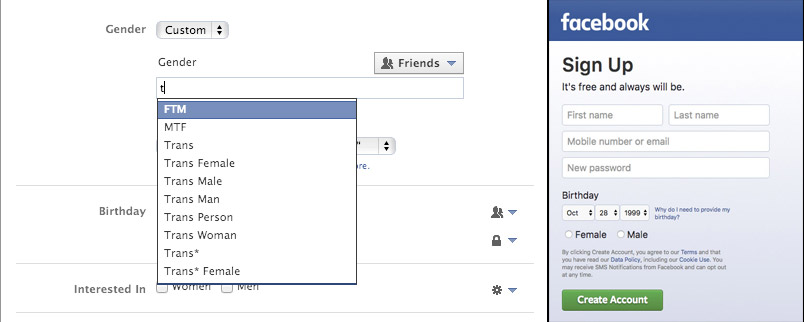
In 2014 Facebook added custom options to its gender form field, but to sign up in the first place users still must select either male or female. (Facebook)
A similar issue comes up with country of origin questions, which are often formatted as a dropdown. As Zara Rahman writes in a powerful essay called “Where Are You Really From,” forcing someone to pick one “origin” sometimes doesn’t reflect their more complicated reality.
“Your systems are set up to judge me based on where I’m from, but like millions around the world, I’m not from one place,” she writes. “Yet you have chosen not to develop ways of computing multiple locations. Instead of adjusting your system to reflect reality, I’m forced to conform.”
Similar to Facebook’s approach to the gender question, a form that allows users multiple selections rather than just one offers them more autonomy—and allows them to give more accurate answers.
The Format of the Question: “Not Approved” Names
While Facebook has evolved to give users more flexibility on gender, its forms have standards that repeatedly flag and reject Native American names—Shane Creepingbear, Dana Lone Hill and Lance Brown Eyes have all had their real names not approved as authentic by Facebook. Even after Lone Hill sent in multiple forms of identification, she describes how Facebook sent her an automatic message to be patient while they investigated to see if she was a real person. Another user had to threaten Facebook with a class action lawsuit before they would permit him to use his real name.
“They had no issue with me changing my name to a white man’s name,” Lance Brown Eyes told the Washington Post, “but [they] harassed me and others, forcing us to prove our identity while other people kept whatever they had.” The policy has also affected drag queens, who protested in 2015 when Facebook threatened to suspend their accounts if they did not use their legal names (the company later apologized).
Try again @Creepingbear apparently my family name does not meet @facebook standards. Way to go #ColumbusDay #facebook pic.twitter.com/HYiu55DYgh
— Shane Creepingbear (@Creepingbear) October 14, 2014
Some have suggested that Facebook abandon the name verification process entirely and just build a form that accepts any name it’s given. But Facebook has repeatedly emphasized that verifying names is important. In a 2015 statement the company said that “having people use their authentic names makes them more accountable, and also helps us root out accounts created for malicious purposes, like harassment, fraud, impersonation and hate speech.” When we reached out to Facebook, a spokesperson referred us to a 2015 post on the subject, which stated that Facebook has made changes to its name reporting and verification and is “continuing to make improvements in this area.”
The Future of Forms
While forms are ubiquitous, their design has long been a matter for the select few. But that might be changing. Just this summer a District of Columbia government team hosted Form-a-Palooza, a day-long hackathon aimed at redesigning common city forms. Through brainstorming and prototyping, over 100 D.C. residents and government employees worked to improve the D.C. driver’s license application, the Lead Disclosure Form, the Basic Business License, and others. The Center for Civic Design has been leading participatory design projects and publishing field guides and toolkits for better ballots and voter forms.
As we all become more aware of the ways bias can seep into online forms and the data that comes out of them, perhaps some of us will develop if not a fondness, at least a newfound respect for forms.
If you’re designing a form, think hard about the wording, order, and format of the questions (as well as those you are not asking). If you’re using the results of a form, think carefully about how its questions and process might have influenced the data you’re looking at. And if you’re filling out a form, best of luck.
Credits
-
 Lena Groeger
Lena Groeger is an investigative journalist and developer at ProPublica, where she makes interactive graphics and other data-driven projects. She also teaches design and data visualization at The New School and CUNY. Before joining ProPublica in 2011, Groeger covered health and science at Scientific American and Wired magazine. She is particularly excited about the intersection of cognitive science and design, as well as creating graphics and news apps in the public interest.


.jpg)