Features:
How (and Why) We Made Twitter Reverb
Twitter and Periscopic talk about their process and goals
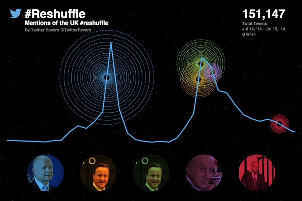
(A recent Reverb visualization)
Anybody who tells you that working with big data is straightforward is probably lying. Often, what you’re trying to do is to filter it down, make it simpler and easier to deal with.
Twitter data is no exception—there are more than 500 million tweets sent every day and if you’re “non-eng” (not an engineer), that is an intimidatingly large figure when it comes to visualizing or showing that data. This is where Twitter Reverb comes in. We wanted a tool that would allow users both inside Twitter, like me, or outside Twitter in newsrooms and TV studios, to produce a simple and quick visualization of the Twitter conversation around an event or moment. Kind of like this, where the Today Show showed the reaction to the crash of flight MH17 in Ukraine.
We had an incentive too—the World Cup would mean unprecedented interest in the immediate reaction to the events on Twitter.
We produce a number of interactive projects inside Twitter and have a cross-functional team of developers, data scientists, designers, and a data journalist (me) helping to visualize the big events in news, sports, TV, music, and politics. Essentially, we build visualizations around Twitter data for to share insights into what the world is talking about.
But we wanted to go further and provide a tool to help people who want to or need to avoid writing code and negotiating their way around APIs.
Our intention was to build a niche project for use by journalists online and on TV as an experiment for the World Cup, to see who would be interested. Users whitelisted by us would be able to search for a set of keywords and see top Tweet results (marked by numbers of retweets). We also wanted the visualization to be a way to explore those tweets—and the video or photo media they included.
We decided to work with Periscopic out of Portland, a company specializing in “doing good with data” and producing interesting visuals around complex subjects.
Together, we assembled a pretty strict set of criteria. In particular, we wanted it to be annotated—we felt that what would give the visuals a real value was combining the data with the editorial sense of whoever was making it. Knowing when something happens and seeing how quickly the world responds on Twitter is a powerful combination. In addition, it needed to:
- work on mobile—78% of active Twitter users access the service that way
- be embeddable
- work for TV display and web
- show how a conversation spreads
- be a cinematic and engaging experience
The Data
We wanted the best of both worlds—the raw information about each tweet, and also to know which were the most-retweeted tweets around keywords. To do this meant combining two APIs: Twitter’s public rest API and the Search API provided by data reseller GNIP (the company actually became part of Twitter during the process of creating Twitter Reverb), which has a smart infrastructure around the way users can interrogate tweets, and covers a rolling 30 days of data.
Using both APIs served as a check on the data, says Earl Swigert, Periscopic’s technical director. This is how he explains it: “We use the Twitter service GNIP to generate a bulk dataset of historical information, and also determine the most popular tweets during the specific search criteria. We then pass this entire dataset through the Twitter API to ’rehydrate’ the Tweets and update their specific datapoints. The double filtering of the Tweets makes sure the information is as accurate as possible for each search."
The Design
We wanted something that would work on mobile and on television, both of which bring their own challenges. And the data in itself is not straightforward —the temptation being to show the world how big it all is by producing something over-complicated. Periscopic co-founder and design director Dino Citraro describes it like this: “Twitter data is deceptively complex. There are many data points that exist for a single tweet, and multiple layers of complexity when you look to extend relationships between followers, favorites, and retweets. The largest design challenge our team faced was determining how much information was too much.”
It wasn’t about creating a dataviz but about telling a story, says James Buckhouse at Twitter: ““Reverb is designed to scale from mobile to broadcast and to tell the story of an event. Our focus was squarely on the story that a journalist might want to tell, not just trying to figure out a new way to present data.”
So, the design changed a lot over a few weeks before we got to something we were happy with. These are some of the stages:
This was an early look at mobile integration screens, the focus being on distributed retweet network and impact:

An early mobile sketch

A mobile mock-up
That design evolved to provide context for individual retweets (shown as smaller circles). We explored various layout placements and text, too.

The evolution of our layout

Another layout sketch
But in the end we wanted something that was easy to understand but also told the story via tweets, which is where this design came in:

The one we ran with
Clicking on the circles at the bottom would take you through to the tweets themselves:

Tweet view
The spinning circle in the middle represents the numbers of retweets and the major influencers. This is what happens when that overlay is swept back:

Minus the overlay
We’re planning to develop Twitter Reverb more in future. At the moment, we’re limiting distribution to a handful of partners, based on the most interesting news stories of the time.
It’s not the be-all and end-all of visualizations, but that’s not the point: we wanted to create something to help highlight the way a story explodes on Twitter. Something non-coders could use to interrogate an API and create a visual—Users like me.
People
- Emma Alterman
- Scott Benish
- James Buckhouse
- Dino Citraro
- Brett Johnson
- Kim Rees
- Simon Rogers
- Earl Swigert
Organizations
Credits
-
Simon Rogers
Datajournalist, and Data Editor @Google. Formerly @Twitter and editor of Guardian Datablog. Author, Facts are Sacred http://t.co/v8gdsFxdWW. All views my own


