Learning:
How to Use the Census Bureau’s American Community Survey like a Pro
Paul Overberg explains base tables and how to get the best data from them (hint: ask good questions!)

(Photo: James Cridland / Flickr)
Published in partnership with
When people want to start using data from the American Community Survey, they often walk right into the Census Bureau’s online storefront, called American FactFinder. That’s usually not a good idea.
Why? ACS data is deceptive. Compared with most social statistics, it’s quite clean, up to date, spin-free, easy to access, comprehensive, and widely useful. And did I mention that it’s free?
But it’s a complex product built on industrial scales through a rich community of practice—the craft of the people who make ACS their career. I guarantee you’ll be frustrated if you don’t learn a little about their words and ways before diving in.
So instead of downloading data, first read up a bit on ACS. Let me walk you through some basic ways to think about and approach ACS data.
Consider:
- Each year, the Census Bureau collects hundreds of millions of data points from 2.5 million ACS households—over 5 million people. This year, half will respond on paper, half online. The bureau chooses these households through a complex sampling frame. How well does it collect a truly random sample that mirrors the nation? You can look it up, state by state, on several measures.
- With all of those responses in hand, the Census Bureau begins editing: filling in missing data (statistically); adjusting for inflation; and calculating means, medians, percentages, and proportions. It also adds data that it learns from taking the survey, such as why a housing unit is vacant. It’s worth knowing something about this process. For instance: how rules check and change a same-sex occupant listed as “spouse” to something else based on changing laws. Or how to find what percentage of people left a question blank.
- Each of 11 billion annual ACS data points carries its own margin of error. ACS isn’t nearly robust enough for what local data users want: every-year data on every place. The best way to figure out the necessary tradeoffs is to understand those margins of error and a related measure, the coefficient of variation.
- ACS covers more than 80 kinds of geographical areas—650,000 in all. That includes cities and ZIP codes, but that’s not what they are called in ACS. Even the simple word “place” has a specific ACS meaning. Two of them, actually. Each can have a different meaning, depending on the state.
Foundation Data: Base Tables
So let’s go back to the idea that the Census Bureau is showcasing its wares in a storefront. Let’s walk past all the counters with the consumer-friendly stuff and go down into the basement.
Down here, metaphorically speaking, the bureau stores the primary ACS product—racks and racks of base tables. There are almost 1,500 base tables in the full annual set. Most have prosaic names that begin with “B” and continue with five digits. Example: “B01002 – Median age by sex.” If you know a table’s name, you can search for it directly in AFF or the new journalist-focused tool called Census Reporter, the fruit of a Knight News Challenge grant. If you don’t know the table name, you can download a list of the numbers, full names, and the categories they contain. You can also retrieve tables via FTP or the bureau’s API.
Most ACS products—including seven other table products—are derivations of base tables.
For small geographical areas—with fewer than 20,000 people—it takes five years to collect enough survey forms to produce reliable totals for most of those 1,500 tables, hence the broadest ACS offering, the “5-year data.”
For an area with up to 65,000 people, it takes just three years to produce reliable totals. For them, the Census Bureau each year produces 1,500 tables as “3-year data” and 1,500 tables as 5-year data.
Finally, for places with more than 65,000 people, there’s enough data to publish reliably each year. For those places, all 1,500 tables are produced as “1-year data” and as the 3- and 5-year data.
So each year, ACS offers three versions of 1,500 tables for states, congressional districts, metro areas, and large cities. Also: a quarter of the 3,140 counties and their equivalents, not to mention a few hundred school districts. A user focusing on one of these areas can choose timeliness by using 1-year data, or data strength by using 5-year data. However, any comparison of large to small places—like all the counties in New York state—must use data from the same set or make big mistakes of comparison.
At the other end of the scale, there’s just one version each year of the 1,500 tables for the smallest places. That’s the 5-year data. Those small places range from small towns and ZIP codes to census block groups, the atoms of the ACS universe.
For such small areas, error margins are large and they are useful only as tiles to build your own custom area.
Zeroing In: How To Interview a Single Table
Let’s take a single base table and work through some of issues it presents.
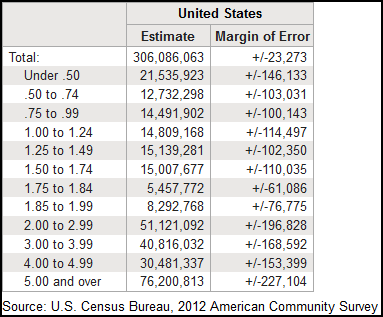
ACS base table B17002
This is table B17002, titled “Ratio of income to poverty level in the past 12 months,” for the entire United States from the 2012 ACS 1-year data set. Its coverage—what the Census Bureau calls its “universe”—is “population for whom poverty has been determined,” so the units are people. The U.S. population was 313.9 million people that year, according to ACS. So this table covers 97% of us.
Poverty is a raging national problem in the aftermath of the Great Recession. This table seems like a good yardstick to compare areas, or to measure recovery in one place.
But this table—really just 12 numbers—is tricky. There’s a lot going on around the edges and just below the surface. Before we use it to throw a national county-level map up on the Web, let’s dig a little deeper.
You’d always ask a human source some questions about what he knows and how before focusing on the information you really want from him. Do the same thing with an ACS base table. Let’s ask four questions of this table:
- What does “poverty level” mean?
- Why does it say “in the past 12 months”?
- Why is 3% of the population missing?
- What’s “margin of error,” and how meaningful is it?
The federal poverty standard is one of the most-used and most-broken of social statistics. It underpins tens of billions of dollars in safety net spending each year: food stamps, health care, heating aid, disability, and housing vouchers. It drives school aid formulas and tax credits for people buying health insurance. It shapes eligibility for subsidized housing. But the basic idea hasn’t changed since the early 1960s, when it was roughed out as three times what the average family spends on a bare-bones food budget.
Since then, a revolution has swept American households. Regional cost-of-living differences have mushroomed. Food’s share of the household budget has shrunk and housing’s share has soared. Most developed nations have moved well beyond this simplistic measure. Unfortunately, any path to overhaul in the United States would run through Washington politics. Don’t hold your breath.
The poverty standard is calculated by the White House Office of Management and Budget based on the income and number of people in a household, with tweaks if someone lives alone, with relatives or non-relatives. Why the tweaks? Economists figure that family members share income equally because it’s produced through tradeoffs of time and effort on unpaid work, such as child care and elder care, school attendance, volunteer work, and household maintenance. Roommates or even unmarried partners wouldn’t necessarily do this, and someone living alone can’t.
So how does household income get counted? It’s a series of ACS questions.
Predictably, some people leave them blank, even after follow-up calls. For poverty status, 14% of families had all of their income imputed in 2012 (table B99172). For unrelated people, 21% did (table B99171).
Does all this mean we shouldn’t use this data? No. Does a few minutes of research mean that we have a better feel for the squishiness in ACS poverty and income data? Yes. That’s crucial before we start analysis or present tables or maps.
We can also avoid simple interpretive mistakes. One example answers Question 2 above. This isn’t calendar-year income, so you shouldn’t call it “2012 income,” even for 1-year data. Why? The ACS form is mailed through the year. Each household is asked to report income “in the previous 12 months.” For someone filling out the form in January 2012, that’s January-December 2011. For someone filling out the form in December 2012, that’s December 2011-November 2012.
So income reported in the 2012 1-year ACS data actually spans 23 months. If you’re looking for trends like the onset of recession or recovery, that’s critical.
Question 3—the missing 3%—opens a window into that other kind of place where Americans live besides “households.” They are called “group quarters.” The biggest examples are prisons and dorms. Also: military barracks, nursing homes, halfway houses, monasteries, and the like. Notions like “household income” and “poverty” would be meaningless there.
ACS is full of carefully calibrated denominators like “households.” That’s why it’s important to understand what is called the “universe” of each table. Some examples:
- People who have moved in the last year: “population 1 year and older”
- People enrolled in school: “population 3 years and older”
- Language spoken at home: “population 5 and older”
- Fertility rate: “women 15 to 50”
- Type of job: “workers 16 and older”
- Highest level of education: “population 25 and older”
Finally, there’s that “margin of error” question above. It’s computed for the Census Bureau’s standard 90% confidence interval. That means that if the survey were taken many times and the results were averaged, they would land within the margin of error 9 times out of 10 (90%), piling up in a bell curve at the number that’s reported. That also means that 10% of the time, the survey could produce a result even farther out on the bell curve than the margin of error.
For anyone who didn’t get through introductory statistics, this can be disconcerting. What seemed like a bright, hard number suddenly becomes a range built from a probability function. It doesn’t help that the Census Bureau insists on called ACS data points “estimates,” because that’s what statisticians call the results of a survey.
Journalists who use ACS a lot have a helpful slogan: “Don’t make a big deal out of small differences.” Journalists have all kinds of old-fashioned tools to deal with this kind of challenge, starting with adverbs: “about,” “nearly,” “almost,” etc. It’s also a good idea to round ACS numbers as a signal to users and to improve readability.
In tables and visualizations, the job is tougher. These introduce ranking and cutpoints, which create potential pitfalls. For tables, it’s often better to avoid rankings and instead create groups—high, middle, low. In visualizations, one workaround is to adapt high-low-close stock charts to show a number and its error margins. Interactive data can provide important details on hover or click.
One of many nice touches in Census Reporter is how its pops up an error margin once a user hovers, but not until then. It will also flag a value where the error margin is at least 10% of the number it’s based on. That’s the idea behind coefficient of variation, which is often a better gauge of the usefulness of an ACS number. Instead of measuring error in terms of probability, a CV offers practical terms—how much of the number of interest itself could be due to chance alone. (Divide an ACS error margin by 1.65 and then divide the result by the ACS number of interest to get the CV.)
In the example above, the CV for each category is just a few percent except for one that’s over 12%. We might want to combine categories to shrink that.
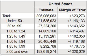
C17002, the “collapsed” version of B17002
For smaller areas, the CV for such a finely graded poverty scale could easily blossom to levels we can’t use. Then we might want table C17002, the “collapsed” version (pictured). Instead of 12 categories, it offers just six. Collapsed tables also serve a different purpose. To avoid the chance that someone might be identified by their data in smaller geographical areas, a collapsed table is sometimes the only version that’s offered.
It’s good to remember that error margin is due simply to the laws of probability working on a good random sampling framework. What statisticians call nonsampling error—all the fudging, confusion, and mistakes that lie between a blank ACS form and the published data—guarantees that the real squishiness is even larger.
Now that we’ve covered those four questions to understand one base table, think about using a similar approach each time you tackle an unfamiliar ACS subject or table.
But here’s the good news: all the statistical concepts, geographical levels, and multi-year frames that we covered for base tables apply to other ACS products as well, and even to Census Reporter profiles. These derivative products are often more useful than base tables for quick work:
- Subject tables focus on a broad topic like “commuting” and assemble bits and pieces from several base tables.
- Comparison profiles (“CP”) include a broad cross-section of items about one area, or several years running. They list the number, the percentage, and even flag if the change between two years was statistically significant. (It’s up to you to decide if it’s significant for your purposes.)
- Ranking (“R”) tables do just that to the 50 states and the District of Columbia on a measure like “percent of people in poverty” or “percentage of foreign-born people born in Mexico.”
Finally, information about ACS products and much more lies just one click off the ACS home page:
- General subjects of questions
- How many households get and return the ACS form, broken down by state (Multiple follow-ups keep the rate high. In 2012, it was 97.3 %.)
- Sample questionnaires for each year.
- Subject definitions. That’s where you learn what’s included in “kitchen facilities.”
- Comparison guides. These can tell you if you can safely compare ACS data on a certain question with earlier versions, or with Census 2010.
- Geographical areas, codes, hierarchical relationships, and changes.
- Guides designed for various kinds of users, like journalists or teachers
Learning this kind of metadata may seem like a delay but actually saves time in the long run. It also opens the door to the use of more complex ACS data, such as microdata.
It lets you craft custom queries that can’t be answered through standard tables.
Finally, learning a bit about ACS gives you entre to the wider world of social surveys and statistics. In a sense, all of ACS is a base table.
This article was published in partnership with Census Reporter, a Knight-funded project that makes Census data more accessible to journalists.
Organizations
Credits
-
Paul Overberg
Paul Overberg is a database editor at USA TODAY and member of its data team. He helps to shape its demographic coverage, but also analyzes data on everything from weather to health care. He also helps to produce data maps, graphics, and interactive applications. He has taught data journalism at American University and at seminars sponsored by IRE/NICAR, APME, the Reynolds Center for Business Journalism at Arizona State, and the Knight Foundation.


