Features:
All About the New ProPublica Site
David Sleight, ProPublica’s director of design, breaks it down

After nine years in the same CMS, ProPublica launched a new site today, running on Craft and fully responsive. The new site updates the design on all of the organization’s trademark in-depth investigative articles, launches a new Impact section to track the effects of ProPublica reporting, and is remarkably easy to read. We checked in with ProPublica’s director of design, David Sleight, to discuss the project.
We lightly edited this interview for clarity and concision. Full disclosure: Ethan Marcotte, who worked on the new ProPublica site, led the front-end work on Source’s current, responsive site that launched earlier this year.
Our Q&A
Source: When did this redesign kick off?
I came in three years ago and started the role of design director; there were three distinct phases [of our work] we knew we would have to address. The first was production and editorial art, and we nailed that down and have a fairly robust production team now, and much better editorial art and illustration. And then the second one was going to be bigger and more complicated narrative stories, which we referred to as “template busters.” And then the third one was the most strategic, which was the site itself. So it’s something that has been on the radar ever since I started.
It kicked off in earnest a few months before the election—and there were two or three phases that were more intense and then more fallow periods where we had to tend to the news stuff. We had been noodling with stuff for a long time, but in October we brought in our partners for the back-end/CMS.
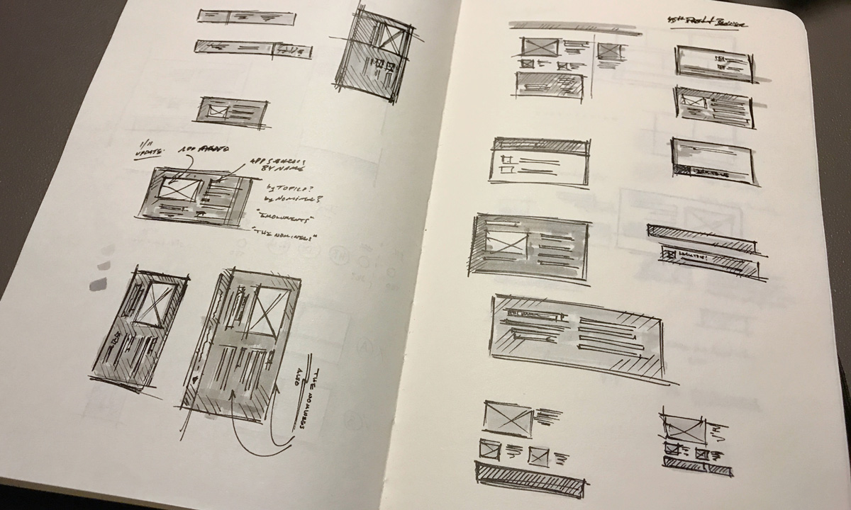
Early sketches. (David Sleight)
Source: So you were working on this through the election?
Yes—all through that time, we were doing what you’d consider the content strategy work. We had the go/no-go on whether we just freeze the current site and start publishing stuff in the new system, or do we take everything and convert it to the new design. And we decided to convert everything, and that was when there was a very complex bit of content strategy work going on with our developer partners. So countless Google Spreadsheets mapping literally thousands of fields in the old CMS to what they would be in the new one. We deleted or removed hundreds of fields from the old CMS…in the old one we couldn’t remove anything because we needed to support those pages, so they’d built up over the course of nine years. That part took months. As you know, it probably gets the least amount of glamour but was the most important part of the gig—to get that stuff over and to map it and be faithful to the structure. There was a joke in our Slack channel with the development partner that this was David’s Machete Phase, where I was killing fields left and right. It was very liberating!
Source: And at least, since you hadn’t been there at the very beginning of those nine years, it wasn’t all your stuff that you had to murder.
People here were really good about that. The other thing that helped is that production and design here are all under one roof, so I run the producers as well as the front-end design, and I take an on-call shift as a producer one out of every five weeks, so I know the fields in the CMS intimately, and I keep doing that because I want to know how the system works and what’s required and what’s painful.
There was a very short interview period in terms of the producers because I’m one of them and they report to me! So I knew things like “yeaaaah that field doesn’t connect to anything…”
Source: You-all elected to address a lot of challenges at once—switch CMSes, migrate all the things, make some dramatic visual changes including the visual identity, make the site responsive and more accessible—how…did that work? How did you coordinate all the stakeholders and potentially competing needs? Because that’s a beast.
The advantages of being a small shop—or at least, we were much smaller when started this process, though we’ve grown quite a bit since the election, and I think we might do it differently now than we did it then. But there’s only a handful of primary stakeholders who own the big channels of the site, and we all know each other and we all sit within arm’s reach of each other, which helps a lot. And some things you just know after three years. The advantages of being in-house for awhile as opposed to coming in as an outside consultant: there was basically a passive three-year interview process going on from the moment I walked in, because we always had our eye on this. And it sounds like a glib answer, but just…go to coffee with people, and as things ramp up, start meeting regularly and checking in with folks.
Source:From my perspective as a reader, ProPublica’s—not work, but presentation—has changed fairly sharply since the election. Is that something you’d agree with, and if so, how did that play into your work in progress on the site?
Do you mean visually or in terms of tone?
Source: Not just visually. In terms of tone and the way the organization describes itself and interacts with people online—certainly the social media presence has changed.
I would agree with that. I know that our engagement team, since the election, has evaluated their approach to social media and voice, and are definitely taking a very different approach than ProPublica has in the past, and trying to do it with more personality and, frankly, more of a sharper edge.
We’re trying to figure out the overall voice of the brand, to use the b-word—so the web presentation is aimed at being very clean, very professional, and much more modern, it’s not imbued with the same personality that you would use on social, or what you might use in video. And for the moment, we’re okay with that, letting each one find its own voice for its medium. There are things you would do with audio that you wouldn’t do on the site. Now, how we coordinate that, going forward, is one of the challenges facing us in the new phase of our existence as a much larger organization.
Source: Is that something you’ll be—who is doing that?
That’s all of us! I’m part of the senior editorial team, and that’s our editor-in-chief, managing editor, and the senior editors, and a bit of our biz dev—we don’t have a huge biz dev side, but we have a very productive relationship with our vice-president of of business developement, and our president. We are definitely constantly revisiting [these questions]. For our reporters, the last thing they’re going to do is stay quiet! So we have a lot of these senior editor meetings, where we open up the existential questions—who we are, what are we doing, what are we covering. And that was always a latent thing, but the election brought it into sharp focus, so it’s a conversation we have explicitly now: what are we doing, how are we talking about this.
We’re further down the road than we were before November, and we’re going to continue marching down it. And frankly, as a bigger organization, I think we need to think about it more explicitly. Before it was a more organic thing, we’re straight ahead, here’s what we do, we concentrate on the work and let the work define the brand. And that’s still the core tenet, but when you get bigger, you need to do more explicit things to communicate that. I believe we’re past triple digits [of employees] now, and there were just about 40 people here when I got here and that was only three years ago. For a nonprofit that is not a Valley startup, that’s really huge growth.
Source: I should also ask what’s going on under the hood—you’ve mentioned a development partner, is that someone we can talk about?
Yes! We worked with a group called Solspace to help us implement the new CMS. This is a complete replacement of the old CMS, we moved off of Expression Engine onto Craft. [Solspace] is an existing partner, which made it an easier transition—they already know us, they know our back end, so we were able to keep to a very tight discovery period, we didn’t have to do an extended one the way you would if you were coming in cold. But under the hood, it’s an entirely new CMS, and we have an entirely new dev environment.
For news apps and big presentation stories, we have developer rigs, but we never had a proper developer rig for the site. We had a staging server that you would make changes to, but we now have a wholly modern development stack for the site itself, so for Mike Tigas and myself, we can all just sit on our laptops with a localhost version of the site to develop on and deploy. We can constantly deploy improvements to the site now, whereas before it was a very taxing manual process. In the process of launching, as we found bugs—I could go back and count, but we have probably deployed at least three dozen times in the course of two and a half days, which would have taken somebody doing it all by hand before, which is a big deal. And we’re now hosted on much more modern infrastructure. We’ve offloaded a ton of assets—almost all the things that aren’t HTML are in Cloudfront, everything is behind a really good CDN, so it’s all very, very fast compared to where we were before. We optimized the pages themselves, but we have quite a bit of work to go with the JavaScript.
The big thing we wanted to do was to move to a fully responsive site—it had been adaptive for a long time, and now we’re fully responsive, and everything from March forward has been produced in the current template and everything behind that was sort of adapted a little bit. It’s a fully fluid, responsive design, and we actually had Ethan Marcotte come in a little bit, which we greatly appreciated. That was important for us because we’ve been keeping our eye on traffic, and sometime around the election, as our traffic started to get bigger and bigger, we are definitively mobile-majority now, by a good stretch. We had been sort of flirting with it for a year or two after I got here, getting close to 50% mobile, but we jumped way over that and have been over that mark for months. So it’s really important now that we start our work from there.
We’ve been educating developers and putting devices on their desks and giving them tools so that they’re able to do the work simultaneously across different devices, I’m constantly pushing Ghostlab at them, and stuff like that. We’re proud of that, that’s been a long time coming, and we think it looks really good—and a lot of work from Rob Weychert, on putting the front end together as well.

Rob Weychert and Ethan Marcotte vs. the internet (David Sleight)
Source: This is much harder to quantify than, like, speed boosts, but the new site seems super readable and comfortable to me and to my eyes. Can you talk about that work?
Yeah. All credit for that goes to Rob [Weychert]. We’re going to tinker with it over time, there are some adjustments to make, but he built both a grid helper tool in SASS and a typographic scale for us to use, so for the first time ever we have the beginning of a visual style guide for the site, and we’re sharing that across teams so the news apps team is getting that, too, and we’re all sort of overhauling our rigs. The scale actually really helps, because you don’t have to make lots of ad-hoc decisions to build new features, you can just base it off of this vetted thing where there’s some harmony between the pieces. Starting with that makes things a lot more legible.
It’s funny, it seems really obvious, but it’s hard to understate—we do great news apps and graphics, great graphical stories, but the bread and butter is that we publish fewer items than other people, but we publish much longer articles. That’s the crown jewel. There’s a going joke internally that ProPublica is a unit of measure that means “5,000 words or more.” So we measure pieces like, “oh this is a half ProPublica” or a “this is a two-ProPublica article.” And our producers are now able to move things around in the CMS and to add meaningful bits of editorial art and give people signposts and make the article a better read, with places where things can breathe, where you pause and resume, with better wayfinding. It’s a neat little system inside of Craft where you can move blocks around inside the article, which we hope to show off in more and more article features down the line. They inherited a lot from our “Fancy Story rig,” which is a tool I built a couple of years back where we learned a lot about what we feel works well for articles—and now we’ll be able to do everyday articles with a lot of that DNA.
Source: And today is launch day!
The official announcement post will be up on the Nerd Blog—which is a longstanding feature on the site with the news apps developers. And we’re going to put more nerds on it now. We’re opening it up to the designers, the social team, and the business development folks. We have a lot of really interesting stuff going on from the business development side, between what we did for Electionland, and the Data Store, which is really worthy of talking about, and on the engagement side. And nuts and bolts, you’ll see more of what you expect, but coming from designers, like that grid tool I mentioned—we’re going to open source it and write about how it works and give it to the world. That will probably be Rob writing on the Nerd Blog as a designer. It’ll be fun.
Source: So today, as you’re about to launch this big thing—what are you most proud of?
You almost don’t let yourself think about that, because I have preemptive Catholic guilt. But I think how far we’ve come in a short span of years in our visual evolution and narrative editorial storytelling. If you look back over the span of the last three years, it’s been steady progress in our photography, illustration, narrative storytelling—and now the home for all of them. It’s been rapid progress, but also substantive progress. We didn’t slap a new layer on top. We designed all of it, it all the way down to the CMS level—and it sounds hokey, but all of that has an incredible influence on the designs that ultimately come out of the system. I sometimes produce articles, so I know how I want it to work, in there at 11 at night. I’m proud that it’s picking up this DNA, and you’re starting to see that across all aspects of the site, and they all speak to each other. I didn’t want to just put a stamp on it for the sake of a redesign, we wanted to do it right.
People
Organizations
Credits
-
 Erin Kissane
Editor, Source, 2012-2018.
-
 David Sleight
David became ProPublica’s first design director in May of 2014. Previously, he worked with numerous startups as a consultant specializing in user experience and responsive web design. Before that, he led the interactive design team at BusinessWeek.com, and helped build some of the first web-based textbooks at Pearson Education. In 2016, Sleight was named a finalist for a Pulitzer Prize and was the recipient of a Communication Award from the National Academies for his work on ProPublica’s “Killing the Colorado” series.


