Features:
Superstorm Sandy: Code and Interactives
Web apps, maps & data from the storm
WNYC’s evacuation map
As superstorm Sandy approached the East Coast of the US, newsdev teams ranging from large to tiny created maps, charts, trackers, and tables about the storm’s path, expected effects, and civic responses. Four days later, the relief and recovery features are still coming. We’ve rounded up a batch of apps and tools from newsrooms in the US and UK, including links to data sources and component parts where available.
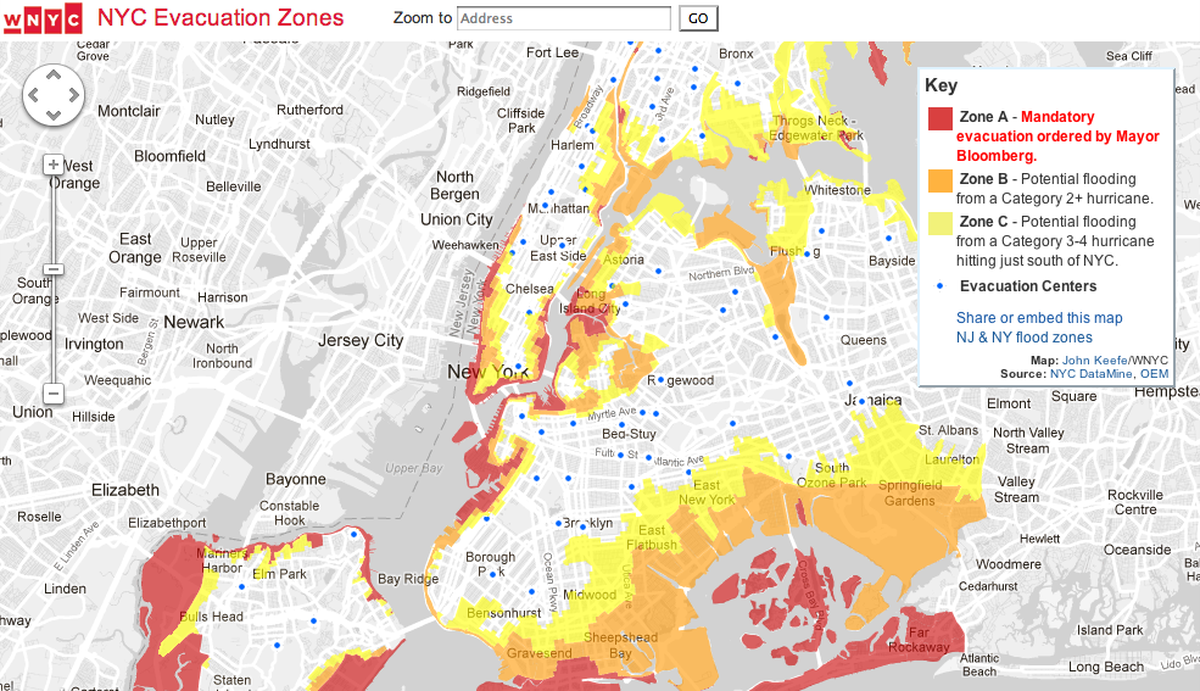
WNYC

WNYC’s surge flooding zones map
At New York public radio station WNYC, John Keefe produced a steady stream of interactive tools for readers, including an embeddable evacuation zone map (above) using Google Maps and data from NYC DataMine and the NYC Office of Emergency Management and a live storm-tracker using Google Maps and data from the National Hurricane Center.
With WYNC’s Steven Melendez, Keefe produced a live flood-gauge map that updated every two minutes using NOAA’s flood gauge data. Keefe, Melendez, and Louise Ma collaborated on New York/New Jersey transit tracking tools using Leaflet and icons from the Noun Project (transit map also available as a PDF).
Finally, Keefe also worked with Vizzuality’s Andrew Hill to create an embeddable storm-surge flood map using MapBox/OpenStreetMap and flood data from the Army Corps of Engineers’ National Hurricane Program Resource Center (NJ data, NY data).
The New York Times

A time-lapse component of the NYT Sandy aftermath interactive feature
The New York Times produced an interactive map of evacuation zones and emergency shelters, a storm-tracker map that included detailed hyperlocal forecast data, and a multifaceted interactive feature on Sandy’s aftermath and early recovery efforts, including extensive mapping of infrastructure damage and a time-lapse of power outages during and after the storm.
The Guardian
The Guardian’s Simon Rogers and John Burn-Murdoch mapped verified Sandy events alongside the storm’s track, including downloadable data for each event in a Fusion table. The feature includes an embedded Google Docs form to collect information from members of the public, which is checked against Wire services and local media organizations before being added to the map. The Guardian team also published and charted data on Sandy-related fatalities throughout the storm’s development, with special attention to the death toll in the Caribbean.
In a fine example of ad hoc media layering, the Breezy Point fire event detail includes a photo not of the fires, but of a television tuned to coverage of the fires. That photo is pulled from a New York Daily News web article, and depicts coverage of the fires on New York’s WNBC.

The Guardian’s verified Sandy events map
USA Today

Sandy aftermath interactive from USA Today
A ten-person team at USA Today created an information-dense interactive map of Sandy’s path up the East Coast of the US using data from the National Hurricane Center and the AP, with layers mapping power outages, deaths, and flight cancellations.
The Rhode Island Providence-Journal

The Providence-Journal’s power outage tracker
At the Rhode Island Providence-Journal, Timothy Barmann created a power outage map and tracker using National Grid data, and including outage density by area, along with expected restoration dates.
More
Other standout projects included Google’s Sandy-specific crisis map, #instacane’s Sandy photostream, and the Hint.FM wind map produced by Fernanda Viegas and Martin Wattenberg earlier this year.
Did we miss your favorite app? Post it in the comments below.
People
Organizations
Credits
-
 Erin Kissane
Editor, Source, 2012-2018.


