Learning:
What If the Data Visualization Is Actually People?
Sarah Slobin discovers that all the facts and numbers didn’t add up to the humans in her story

Julia Cuevas, a child with NPC (Melissa Golden)
“Are we there yet?” It’s a classic question. You’re a kid. And you’re in the back seat of the car. And it’s an endless drive. And you just want to know “When, when, when will the wait be over?” And your parents say “45 minutes” and now you have something to count. And counting is a thing. And a thing is tangible. So the wait becomes more bearable: finite.
That’s what data visualization is; it’s journalism’s answer to “Are we there yet?” It’s turning something we want to know—a count or a number or a place—into a visual object or a quantified answer. And there’s something terrifically satisfying about that. Comforting even, to capture data and shape it into “These things, here. You can see them now, yes? You can sort them or explore them or understand the trend. See?”
Turning numbers into pictures makes us feel a little powerful: to take this abstract thing, math, and turn it into something visceral. When it works, and you learn how to tell stories with data, you get a hit of happiness mixed in with a shot of adrenalin. I’ll admit it. It’s an addiction I’ve been indulging for years as a seasoned journalist, so pretty much since…Mark Zuckerberg was in elementary school. Long time.
And I’m here to tell you it’s a trap.
What I mean to say is that data comes from people. It’s a mark that someone has left behind, or a mark that someone has put their hands on to collect. And in our excitement to harden that data into visualizations we often forget that behind those numbers are human beings. So this is a short cautionary tale of how I fell into that trap recently and found out that making data into a thing is not always the right thing to do.
The Data
Last year I spent a long time on a project, more than 6 months. It was a 10-chapter 17,000 word immersive project at The Wall Street Journal. I was the visual editor for Trials, a story about a group of families with children who have a fatal disease. These families are working feverishly with scientists to change the way that medicine is practiced because they’re trying to save their children’s lives.
When I started working on the story as a graphics editor, predictably, one of the first things I asked was, “Do we have data on these kids?” If you can quantify the state of the children, if you can chart their progress, you can understand the disease better. And yes, just my luck, there was data. One of the doctors working with the children had created an index for exactly this purpose. They were looking at a drug trial and they’d need a benchmark for success to track the disease so he and his colleagues created something they called the Severity Index. Scientists, gotta love them.
The severity index, a system of benchmarks created by Forbes D. Porter for measuring the progression of NPC (Niemann Pick Type C) in patients
So great. I understand indexes. I’ve dissected and visualized all sorts of them, so I knew they are a recipe of different metrics weighed and measured and combined to surface the health of something: the Dow = 30 companies, the Consumer Price Index = what we buy. You can take indexes apart, you can show them over time. They can create meaning.
The Severity Index, though, had all sorts of terms I didn’t understand, so I set about doing my homework. It makes no sense to make something out of numbers you can’t interpret. I interviewed the scientist and his partners, I read several white papers and underlined paragraphs, I looked at studies, I made notes. I got my head around the data.
And over the course of weeks the Severity Index became one of my obsessions. It was such a succinct way to tell the story. It was so directly connected to everything we were doing with the project. (Now remember, this is a long project. Months.)
I kept coming back to that index throughout the process. I was determined that if I could visualize it, it would be a pivotal set of data embedded within the project. All you would have to do was to look and you would understand. I kept it taped up next to my monitor. I gave printouts to colleagues on the project. I shared it, explained it.
The Problem
How to visualize it was the problem.
Did it want to be an explainer? Should I distill the science down so it was easier to understand? Was it a primer?

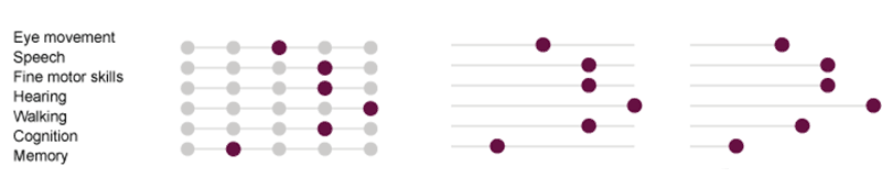
Sketches and concepts for potential graphics of the index
Could I chart it? Could we do spark lines or sliders? Data boxes? What if we found ways to shoot video of some of the measurements in the index? We could have these little graphic motion pictures that we could pair with the data? Could we get data on each of the children? What if each child had a set of charts that accompanied them when we introduced them? What if we paired pictures of the children with the charts?
This went on for months. Hours of attempts accumulating, brainstorms, and sketches. I was in the middle of this huge project, juggling as fast and as focused as I could, and I had this idea of a set of charts stuck in my head that kept resurfacing. And then, as we were heading close to deadline, I realized I couldn’t do it. I failed. I couldn’t make it work. Because…
Because we had pictures of the children, and that was enough.
When you looked at the kids—really looked at them, even though it was hard to look at them—you understood what the data was capturing, how the disease progressed, what it wrought. And you saw these beautiful little people and you understood what the Severity Index was all about without a chart or a visualization or an explainer. I had to let it go. My idea of the quintessential charts.

Children with NPC photographed for Wall Street Journal’s Trials story, photographs by Melissa Golden
The Lesson
Losing the graphics made sense to all of us on the project. What worked best for the story won out, as it should. We didn’t need graphics for the sake of graphics, especially graphics that weren’t working in service of the piece. And photos, while not numbers, are also data in their own right. My own internal calculus, data = charts, was based on habit and that habit had become like armor over time, I put it on without thinking before trudging off to battle. So now, at the outset of each project, I’m working on learning to be really honest with myself each time I sort through a set of statistics; “What does the reader really need here?” Not, “What cool thing can I do with these data?”
Data visualization is a worthy craft. We can tell important stories with data. We can illuminate complex issues and expose lapses. We can inform and delight readers and make good apps. We need to remember that behind the data are stories and inside those stories are people and those people are connected to the statistics in a way that we never will be, regardless of how badass we are with our tools, how rockstar-smart our code is, or how facile we are in manipulating the information.
So, the question: “Are we there yet?” Honestly, I don’t know how long the trip will take. But do me a favor? Stop counting for just a little while. Look out the window. Enjoy the ride. Let me know when you see something amazing and let’s talk about that instead. Perhaps if we’re patient and we see what emerges along the way, we’ll be there before you know it.
Credits
-
Sarah Slobin
Sarah Slobin is a visual journalist working with data & multimedia, a senior graphics editor at The Wall Street Journal. She’s a 2014 innovation teaching fellow @wvujournalism. Former infographics director for Fortune magazine, and a 15 year veteran of the New York Times. Brooklynite since before it was cool, and, struggling parent of a digital native, wife to uber-talent Eric Palma.


