Features:
How We Made the 3D Tour de France Interactive
WebGL and GPS data recreate an iconic stage of the race
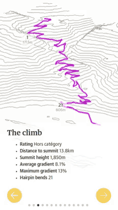
In sports coverage, interactives can convey an event's intensity while also allowing the user to participate. As we considered an interactive for the Tour de France, we knew we wanted something fun and compelling, an interactive that would combine quality writing and photography with real-world data. So we thought about a 3D representation of the most grueling stage, Alpe D'Huez. It’s a 13.8 km climb up 21 hairpin bends to the finish at an altitude of 1,850 m. With some of the steepest climbs in the entire race, including an incline of 13 percent, Alpe D'Huez was the perfect choice for this type of interactive.
Exploring the Data
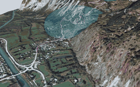
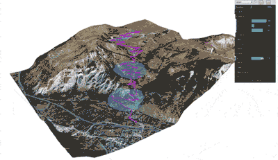
We started by exploring GPS data of the route by importing it into QGIS. QGIS is a powerful geographic tool for editing and manipulating geo-data. Once in QGIS, we could see the location and altitude information for the whole route. We also added a satellite imagery layer to provide context. As you can see below, the satellite layer allowed us to view the surrounding area from both a photographic and terrain perspective.
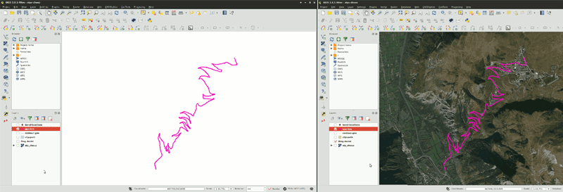
GPS data imported into QGIS
I began sketching out ideas on how to visualize the route. The challenge was to show the intensity of the climb while providing information in an intuitive way. By dividing the route up into a series of steps, I was able to focus on different aspect of the climb. I switched between QGIS and sketching to rough out a simple storyboard, which became the foundation of the interactive.
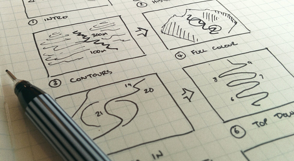
Storyboard
Next, I needed to frame the GPS route by choosing an area around it. The area needed to be close enough to keep focus on the route but distant enough to show off the dramatic inclines. With an area chosen, I could move on to creating the 3D model. For that, I needed NASA’s help.
Obtaining Elevation Data
Creating the 3D terrain around Alpe D’Huez required digital elevation model (DEM) data. DEM is a representation of height information and often seen as grayscale heightmaps. NASA provides DEM data as radar topography imagery for free. I found the easiest way to get this information was through the Global Data Explorer website. You specify a region, choose a map type, and download the image.
The vertical height of terrain is obtained from the DEM layer. It’s important to note that if you are only using a small part of a larger DEM layer, then you'll only be using a small part of the full height range. Standardize the range by cropping the DEM to match the region of interest.
Once the DEM layer was imported into QGIS, I was ready to create the contours and the 3D terrain.

DEM heightmap of Alpe D’Huez
I generated contours using QGIS built-in raster tools and then saved them as a vector layer.
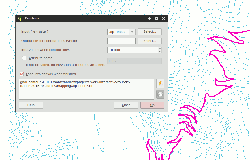
QGIS built-in contour generator
Generating 3D Terrain
Creating the 3D terrain required the use of a QGIS plug-in called Qgis2threejs. It uses the DEM layer to generate a 3D mesh that can be explored in the browser and downloaded. It can also use satellite imagery from the tile-map layer to create an image used to add color to the 3D model, also known as a diffuse map. With the Tour route, boundary, and tile map finalized, I saved out all the assets.
The diffuse map needed editing before we could use it. I applied color correction and scaled the image so that the dimensions were a power of two. While not essential, images in these dimensions take advantage of GPU optimizations and increased compatibility with older hardware.
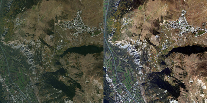
Diffuse map color correction before and after
Optimizing 3D Terrain
To optimize the terrain, I needed to reduce the number of faces. Faces, also known as polygons, are small triangles that make up the surface of a 3D shape. The more faces a model has, the more detail it can show, but it comes at a price—file size and computation. Too many faces and you'll experience slowdowns and stuttering. We used the open-source tool Blender for optimizing.
After importing the 3D model, I could see it was made up of 6,000 faces. Applying a simplify filter allowed me to visually experiment with different face counts. I was able to reduce the face count by half without losing visual detail.
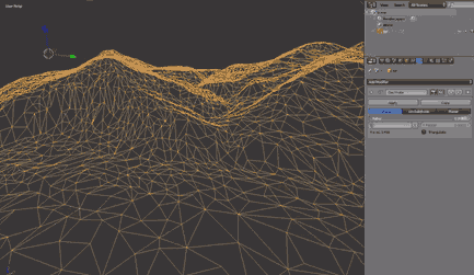
Reducing face count using a simplify modifier
UV Mapping
UV maps are instructions to a 3D model about how to display an image texture. In this case, it was simple: the edges of the image texture matched the edges of the terrain. Blender is able to take the current 3D view and use that as the UV map. This meant I could view the terrain from above and choose from the Blender option “project from view” to get the UV map.
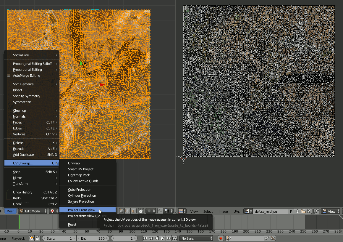
UV map
After previewing the textured model to ensure everything lined up correctly, it was time to export. The three.js Blender plug-in allows you to save scene and mesh data as JSON. With the model optimized, textured, and exported, it was time for the animations. You can experiment with precision values and using the JSON compressed format msgpack when exported to reduce file size.
Building the Steps
Each step in the storyboard needed to be made into a 3D scene. Transitioning between each scene would see the camera smoothly pan while objects changed. We used a tool called dat-gui which allows you to interact with object values easily and in real-time. The camera and objects’ values that made up each scene were saved into a JSON file.
Modifying scene values using dat-gui
Animation
At this point there were scenes that could be switched between, but there was no animation. To transition between each step, tween.js was used. By tweening the object values stored in the current scene to the next, it was possible to create a smooth animation. During this process, I checked the interactive on mobile and desktop devices to ensure it “felt” right. If there were any issues with the transitions, I edited the JSON, previewed again, and re-saved.
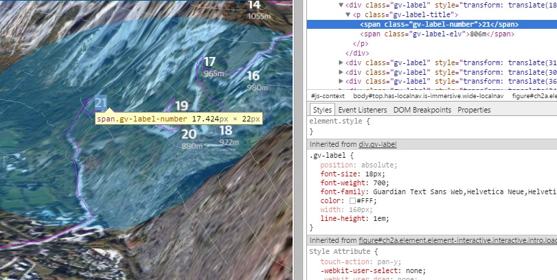
Adding Labels
We used labels to show the hairpin bends and elevation along the route. WebGL doesn’t have a way to render text, but fortunately we can use HTML. Each label in the interactive is a styled HTML element positioned on top of the 3D layer. When the scene transitions, the position of each label is retrieved from the 3D scene, and added to the HTML with a CSS style.
Initially, I used position:absolute to align the labels, but this caused browser repaints, lowering the frame rate, so I changed the alignment to transform: translate which offloads the work to the GPU. I also batched DOM edits together for additional performance improvements.
Labels are an HTML element
Creating the Alternative Image Version
With the animations finalized, I could create an image-based alternative version. Creating a non–3D alternative was important because WebGL is still a new technology and browser support remains limited. The alternate version uses screenshots of the final frame from each 3D transition—for those without 3D support, the animated transitions are replaced with these screenshots, which fade in and out.
Alternative WebGL version using image fading
Adding Navigation
It was important for the navigation to be simple and intuitive. Large, colored buttons allow the user to navigate back and forth. Also, you can swipe and use the keyboard arrows as navigation, which is essential for accessibility and touch interfaces. We made the button target areas much larger than they appeared to the user as well, to prevent users from missing the button when tapping on a small screen.
Testing
We tested the interactive across all major browsers and devices, including the Guardian's native apps for iOS and Android. We would normally use BrowserStack, but it does not support WebGL—this is also true for a lot of virtual machines. Therefore, we had to rely on a combination of real devices and virtual machines.
Launch
The project launched on the morning of July 23, two days before the Alpe D'Huez stage. The reader response was very successful, with over 100,000 unique views in the first week. Device usage was 48% desktop, with the remaining 52% split between mobile, tablet, and native apps.
This was a fantastic project to work on, and it shows that 3D interactives can enhance the narrative of a story and engage the reader. While there remain challenges to overcome before these types of interactives become commonplace, it is another example of how 3D on the web has a bright future.
Learning
If you want to learn more about 3D and WebGL, there are lots of good resources available online. Udacity provides an introductory course called Interactive 3D Graphics that covers the theory and terminology. There is also a large collection of interactive WebGL examples to explore on GitHub.
The biggest lesson I learned during development was the importance of restraint. It’s easy to get carried away with the possibilities of interactives. We could have added video or allowed users to fly around the route but every addition requires more development and risks losing focus on the original idea. Restraint is even more important when developing 3D interactives. 3D isn’t just a third dimension, it’s a whole new knowledge domain. This interactive was kept deliberately simple but still required knowledge on camera properties, polygon counts, texture mapping, and more. Yet, if you keep things simple and use 3D to enhance an idea, it can be a great resource.
If you’re just getting started in this area, I’d advise you to experiment by creating small prototypes. Don’t worry about choosing the right tools or making things work on every device, as that comes later.
What’s important is exploring ideas quickly, iterating, and seeing what works and what doesn’t.
Organizations
Credits
-
Andrew Mason
Creative developer working on VR and interactives. Formerly at the Guardian, BBC, digitaslbi #LOAD”*”,8,1


