Features:
How We Made Losing Ground
Harmonizing satellite imagery, historical maps, academic data sources, and more in one big, beautiful feature

From the Losing Ground interactive.
It began in February 2014. A few of us at ProPublica headed uptown to the Tow Center at Columbia for a two-day crash course that helped define this project. From Lela Prashad, we learned about devices capable of remote sensing—telescopes, satellites, planes, kites, or balloons, anything capable of taking measurements from a distance. We learned how to find public data coming from science-grade satellite sensors. And we learned the basics of how to process the satellite imagery. The training primed us for many of the visual decisions we faced later, critical processing choices about satellite imagery that helped us tell the story best—and put us on the road to becoming space journalists.
The Story of Data
Losing Ground is an award-winning interactive news application produced and published by ProPublica and The Lens in the summer of 2014. The feature focuses on the proliferation of oil and gas infrastructure, the engineering of the Mississippi River, the specter of climate change, and the inhabitants of Southeastern Louisiana, who are experiencing the effects of all three.
This is the story of the project from a data and graphics perspective. We (me—Brian Jacobs, 2014 Knight-Mozilla Fellow on the ProPublica team—and Al Shaw, ProPublica news app developer) worked with Bob Marshall (reporter, The Lens) to join our interactive, data-driven maps and graphics with his on-the-ground reporting.
We processed satellite imagery, revisualized science graphics, and filtered geospatial data to show the past century’s dramatic changes in the Louisiana coastline, the major factors behind those alterations, and projections for future change.
A lot of data went into these graphics. I’m going to walk through every layer, with the tools, techniques, and code we used to produce them. Our data sources include:
- Satellite imagery from Landsat 8
- Historic land cover data from 1932–2010
- Projections of future land cover
- A print map from 1922
- Open vector map data from federal and state organzations
- Canal data from a master’s thesis
- Historic aerial photography
Many of the resources and tools I mention throughout this article can also be found in this resource list created for sessions we recently held at NICAR 2015 (slides here) and MozFest 2014. Al Shaw also presented about similar topics at JPD 2015 (slides) and FOSS4G 2014 (slides, video)
Remote Sensing Data
To begin with, our satellite imagery had to be as up-to-date as possible, with little cloud cover. We wanted it to show a large area, but we also wanted the ability to zoom in closely on specific areas. Most critically, we needed to be able to clearly distinguish between land and water for overlaying historic land cover. (When we use the term “land cover” we’re talking about data that classifies land according to prominent features—urban, forest, desert, agricultural, wetland, etc.).
We would have saved a lot of time by using Google Maps or another source of ready-made images, but the imagery didn’t quite fit the bill. Google Earth (and Mapbox) both provide incredible and recent views of the planet, but their offerings reflect data-processing and visualization decisions meant to provide general-purpose base maps, using true-color imagery as a familiar context to overlay roads or other land-centric features. (True-color imagery depicts land illuminated by the light we can see with our eyes.)
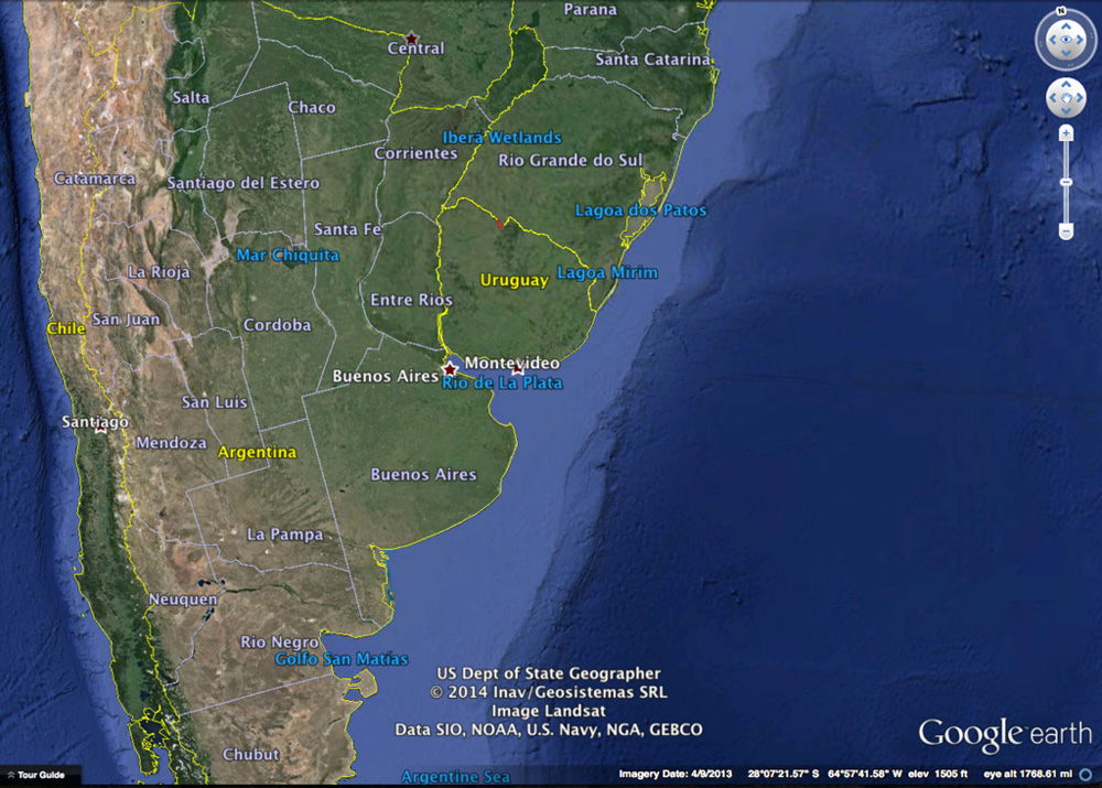
Google Earth uses a smorgasbord of data. In this view, it’s using true-color imagery from Landsat for land, and bathymetric data for the seas. Zoom in within Google Earth, and it might switch to Digital Globe, orthophotography, or uncredited sources. For more control over imagery, Google does offer Google Earth engine.
Satellites—the government-sponsored, non-spy variety whose data is free and open—are designed for scientific purposes and collect much more diverse data than what Google Earth visualizes. Their sight is superhuman, and they have a range of sensors that measure across much of the electromagnetic spectrum, depending on their domain of earthly or celestial study.

The electromagnetic spectrum. By measuring how different wavelengths along the spectrum are reflected, we can reveal features beyond what human vision affords. One can differentiate between rock types, healthy and dying plants, or, as we did, between land and sediment-rich water.
This is where the training session at the Tow Center became so valuable. It exposed us to the data and techniques used to go beyond the stock base maps. By getting data direct from the source (USGS/NASA), we achieved an extra level of control over the specific wavelengths of light we wanted to use, and we closely controlled the time period we would represent. Having control over wavelengths vastly improved our ability to increase contrast between land and water, and to better tell the story.
There are many satellites actively collecting data, but we chose Landsat 8, the newest satellite in the Landsat program. Landsat is the longest-running satellite mission out there, with continuous data going back to the 1970s from different incarnations of satellites and sensors. But we would only need a single recent depiction of the Earth to provide context for other data.
For a particular swath of earth, Landsat 8:
- Revisits it at least every 16 days (the time between recordings is called temporal resolution)
- Measures 11 slices of the electromagnetic spectrum (defined by their wavelengths), ranging from visible to infrared light (known as spectral resolution)
- Records these measurements at 15 to 100 meters per pixel (spatial resolution) depending on the wavelength. For example, one particular slice of visible light can be visualized at 15 m resolution, meaning that if a car is 5 m long, you can fit 3 across one pixel
Every type of satellite will have a different combination of these three variables, which in turn determines what can be visualized. The Rapid Ice Sheet Change Observatory’s satellite metadata page, while not exhaustive, has a decent list of satellite systems and their capabilities. For zooming in on particular areas within Southeastern Louisiana, Landsat 8’s 15–30 m spatial resolution across near-infrared and visible light was important for us, as the near-infrared provided crucial land/water contrast. Had we instead been interested in solely characterizing a wide area without the need to zoom in, the MODIS (Moderate Resolution Imaging Spectroradiometer) sensor on the Terra satellite could have been a good choice at 250 m resolution. It’s less detailed, but from a practical perspective it’s easier to process, as there are fewer images to mosaic together to encompass a contiguous piece of earth, reducing headaches when dealing with large volumes of data. It also encompasses a larger area per a given moment in time, which also has important ramifications when mosaicing images (detailed below). Conversely, if we really needed to look even closer at the Earth, we might have considered going with DigitalGlobe, whose commercial satellites can deliver multispectral sub-meter resolution. That imagery is stunning, but it’s also expensive, and a lot of data to chew through for large areas.
As you can see, there are a lot of factors here—but it’s necessary to know some of the particulars when handling this kind of data. What you get to work with, down to how the data is organized, is a direct reflection of the capabilities of the particular satellite you choose.
Acquiring Imagery
To start downloading Landsat imagery, we used the USGS Earth Explorer (free, but login required for full-res imagery). We set our location and time period of interest and selected our dataset (Landsat Archive → L8 OLI/TIRS. That is, Landsat 8 Operational Land Imager/Thermal Infrared Sensor). At that point, the Explorer’s “Additional Criteria” tab lights up. It’s helpful to use the “Cloud Cover” option to filter for the sunnier days. Clouds can be an obstacle, particularly when using a satellite that collects imagery every 16 days—if there are clouds at a time when you want to see land, tough luck.
The cloud issue gets particularly relevant when mosaicing images. Our area of interest required taking six Landsat scenes and mosaicing them together to form one large image (see progression below). Landsat 8 zips around Earth in a north-south-ish, sun-synchronous polar orbit:

This very long swath of land illustrates the north-south-ness and width of what Landsat 8 collects in its orbit—it collects several such passes per day. Source: NASA Earth Observatory.
The recordings are processed by USGS and NASA and split up into ~1GB scenes for relatively reasonably sized downloads. This orbit means that while north-south scenes will be minutes apart, east-west scenes are days apart. (See visualization of how the whole Earth gets imaged in sequence, especially how even adjacent scenes get imaged in an alternated way). Add clouds into the mix and time periods can get pretty broad. Our six scenes ended up ranging from March 31 to May 15, 2014 to eliminate cloud cover.
Unpacking Imagery
For each scene, we started with a bundle—a ZIP file containing 11 TIFF files corresponding to Landsat sensor wavelength bands, plus QA and metadata files (see table below for samples). The TIFFs are actually GeoTIFFs, meaning they also contain geographic metadata that allows them to be properly positioned on a map. Each filename is comprised of a scene ID and a band designation number (“B1,” “B2”, etc). I’ll make reference to these band numbers in explaining how they’re processed.
| Band # | Filename | Band Name | Wavelength (micrometers) | Resolution (meters) |
|---|---|---|---|---|
| 1 | LC80140322014139LGN00_B1.TIF | Coastal | 0.43 – 0.45 | 30 |
| 2 | LC80140322014139LGN00_B2.TIF | Blue | 0.45 – 0.51 | 30 |
| 3 | LC80140322014139LGN00_B3.TIF | Green | 0.53 – 0.59 | 30 |
| 4 | LC80140322014139LGN00_B4.TIF | Red | 0.64 – 0.67 | 30 |
| 5 | LC80140322014139LGN00_B5.TIF | NIR | 0.85 – 0.88 | 30 |
| 6 | LC80140322014139LGN00_B6.TIF | SWIR 1 | 1.57 – 1.65 | 30 |
| 7 | LC80140322014139LGN00_B7.TIF | SWIR 2 | 2.11 – 2.29 | 30 |
| 8 | LC80140322014139LGN00_B8.TIF | Pan | 0.50 – 0.68 | 15 |
| 9 | LC80140322014139LGN00_B9.TIF | Cirrus | 1.36 – 1.38 | 30 |
| 10 | LC80140322014139LGN00_B10.TIF | TIRS 1 | 10.6 – 11.19 | 100 |
| 11 | LC80140322014139LGN00_B11.TIF | TIRS 2 | 11.5 – 12.51 | 100 |
| - | LC80140322014139LGN00_BQA.TIF | QA | - | - |
| - | LC80140322014139LGN00_MTL.txt | metadata | - | - |
Each TIFF is a 16-bit grayscale image whose pixel brightness represents intensity within a particular wavelength range. Every feature on Earth will reflect more or less light, resulting in the recorded brightness.
Nerdy confession: 16-bit imagery kind of blows my mind. Instead of the typical 256 variations of intensity per pixel (0–255, from black to white) that the typical 8-bit image provides (from most digital cameras), a 16-bit image allows 65,536 variations per pixel. This distinction is known as radiometric resolution. It allows for incredibly precise measurements from $650-million-dollar spaceships, while adding a lot more wiggle room in data processing (and, while also slowing down Photoshop and bloating file size). It’s worth noting that GIMP forces a conversion to 8-bit, making it a less ideal environment for processing.
You can think of a single GeoTIFF band as representing a single color, even the bands that go beyond the range of the Roy G. Biv of what we can see. Our screens depict color as a combination of red, green, and blue, so we need to take three GeoTIFFs and apply them to red, green, and blue channels to create an RGB output. Using exclusively the visible spectrum (e.g., red/green/blue wavelengths, or, bands 4, 3, and 2, applied respectively to red/green/blue channels) will yield a “true-color” image. Applying any other combination or including infrared bands yields a “false-color” image.
Because Landsat 8 has 11 different bands, they can be combined in different ways to express certain earthly attributes. Snapsat has some great examples of this concept.
| Able to visualize | Band combination |
|---|---|
| Natural Color | 4 3 2 |
| False Color (urban) | 7 6 4 |
| Color Infrared (vegetation) | 5 4 3 |
| Agriculture | 6 5 2 |
| Atmospheric Penetration | 7 6 5 |
| Healthy Vegetation | 5 6 2 |
| Land/Water | 5 6 4 |
| Natural With Atmospheric Removal | 7 5 3 |
| Shortwave Infrared | 7 5 4 |
| Vegetation Analysis | 6 5 4 |
We ended up using both the 4–3–2 (true-color) and 7–5–3 (natural with atmospheric removal) combinations to create our final image, as detailed.
Processing Tools
There are a lot of methods to combine these single-channel images together, and we experimented with all of them.
- Command line: Use GDAL. Mapbox has fantastic tutorials on this, and there’s a great cheatsheet by the New York Times’ Derek Watkins. You can also automate in the command-line: Dan’s GDAL scripts or Development Seed’s Landsat-Util (which I really wish had been released before we published…).
- GIS: Use software like QGIS or ArcGIS. Trying with QGIS worked but was confusing and did not give phenomenal results (see also).
- Photoshop: NASA Earth Observatory has a great tutorial on this, essentially the method we used to process single scenes, by Rob Simmon. Rob also consulted with us on this stage of the project, which was incredibly valuable.
Unfortunately, Photoshop has no native GeoTIFF support—anytime you re-save a GeoTIFF, the metadata disappears. Two solutions:
Photoshop in conjunction with the command line: Use
listgeo original.tif > original.geoto dump metadata to a file. Edit normally in Photoshop. Then usegeotifcp -g original.geo modified.tif modified_geotiff.tifto dump the data back in. This does get hairy when mosaicing and resizing images.Big-money method: Get the Photoshop plugin Geographic Imager. It maintains the metadata throughout opening and saving and adds a suite of geospatial raster transformation tools directly into Photoshop. It costs several hundred dollars but likely saved us countless hours and aggravation by keeping the processing workflow in one place.
Caveats aside, I love that there are so many ways to approach processing this imagery because it means that designers, developers, and analysts have all the tools and potential to generate incredible images of the Earth. We used Photoshop at this stage because it gave us quick feedback on color correction and let us more seamlessly blend adjacent scenes together using alpha blending.
It was released after we’d have needed it, but if you’re doing this kind of work, also check out ProPublica’s open-source schooner-tk to programmatically mosaic, color correct, and remove clouds from Landsat scenes. It’s a crazy tool that likely would have saved us much hardship during certain parts of this process had Jeff programmed it already. C’mon Jeff.
Processing Imagery
We started by combining bands 4 (red), 3 (green), and 2 (blue) together into a single true-color file without any other adjustments, using Photoshop (Again, see Rob Simmon’s tutorial for a detailed step-by-step on this workflow). The output isn’t much to look at:

In this initial image, only the brightest areas are visible, a result of the sensitivity of Landsat sensors. Because we’re manipulating a 16-bit image, we can do a “contrast stretch” to bring out detail in the dark areas without fear of distorting the image. We do this by using the curves panel. At this stage we also set a white point to color-balance the scene. This yields a much nicer result:
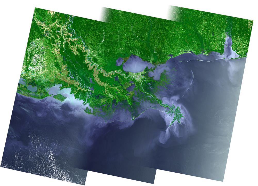
We’ve also applied an alpha gradient to the left edge of the scene. This allows the image to blend much more smoothly into the adjacent scene to the left, which is actually from a different time period and may have different weather and lighting conditions. Vertically adjacent scenes will blend seamlessly without this gradient due to how data is continuously collected north to south. We repeated this contrast and blend process for all six scenes to get the following result, weighing in at ~18,000 pixels wide at 30 m resolution:

We’re now at a point where we can achieve the impossible dream. We can double the resolution of this image to ~36,000 pixels wide without losing detail.
If you take a look at the list of TIFF files downloaded above, all bands (minus TIRS) have 30 m resolution except the panchromatic band, at 15 m—which means it includes four times the amount of pixels (think twice as wide and twice as tall). The panchromatic band is special: It corresponds neatly with the combined wavelength range of red, green, and blue bands, meaning that the data recorded by the panchromatic sensor corresponds to the same features as those detected by the RGB bands—it’s a more detailed black-and-white photo of a given area. This matters because we can use the panchromatic band in a powerful technique called “panchromatic sharpening,” in which we “sharpen” true-color band combinations into images that are twice the resolution of the original. This was really important for us as we zoomed closely to certain areas within Losing Ground and wanted maximum detail without having to use other datasets like aerial photography. We took the panchromatic band for each scene, mosaiced them together as described previously, and used this technique within Photoshop to apply the sharpening to the true-color image.
We now have a huge image. Gigabytes upon gigabytes. It’s stunning. You can easily see New Orleans to the north, but also the large plumes of sediment hugging the coastline—which was not ideal for us, if we could avoid it. The presence of sediment tints the water a variegated tan, making it look more like land, reducing the effectiveness of a contrasting visualization layer. After consulting with Rob Simmon, he suggested we try another combination of bands, particularly the 7–5–3 or “natural infrared” combination, comprising short-wave infrared, near-infrared, and green light:

Very vibrant. You’ll notice a stark contrast between developed land (following the Mississippi), vegetation, and water, and comparatively little visible sediment in the ocean compared to the previous image, leaving a deep blue color. But there’s a downside to false-color for us. The 7–5–3 bands in this image, because they reflect wavelengths outside of the visible range, should not be pan-sharpened because it would accentuate features that don’t actually exist in the underlying image, creating visual artifacts. We tried it anyway (YOLO).
It’s 15 m resolution, but the result is a bit psychedelic, it loses a bit of the contrast we were seeking—but most importantly, it’s a total misappropriation of the panchromatic band. Note the white-ish plumes of sediment that appeared in the Gulf. So without pan-sharpening, we’re left with the 30 m resolution from the previous image.
This is a dilemma. What we really wanted was a combination of the first two mosaics: detailed land from true-color, the low sediment dark seas from false-color. In this tutorial by Tom Patterson, the 5 (near-infrared band) was used as a mask to precisely select and adjust the color of water areas. This was a path worth pursuing and pushing a step further. We took the 5 band, adjusted levels, and mosaiced the 6 scenes together:

A contrasty near-infrared 5 band.
Instead of just using this mask to select water, we could use it to clip our respective mosaics. We took the false-color (7–5–3) imagery and pasted it into the water part of the mask, and took the true-color (4–3–2) imagery and pasted it into the land part of the mask.
After a few rounds of refining the mask, the final result is our holy grail, 15 m land resolution with high contrast water:

Up close in the red square, before and after:
It’s a hybrid of imagery, but it’s not unprecedented. Google Earth uses a similar technique in order to paint a more dynamic picture of the entire planet—true-color imagery of continents, bathymetry data for the high seas, where Landsat provides less relevant data.
Maps of an Engineered Coastline
We wanted to start the feature with a far view, visually explaining the factors involved with land loss in the region. With the Landsat graphic as a backdrop we produced a series of maps, stepping through the past, present, and potential future.
For the imagery in this view, we’re layering large images atop each other, as opposed to layers of images broken up into smaller tiles. Tiling is an obvious choice when using an endlessly pan-able or zoom-able map, to load imagery on demand, but we were constraining this view to a single area. By loading in large images for the first view of the app, it would allow us to preload map imagery more reliably, avoiding the sometimes chaotic appearance of waiting for tiles to load in.
Past
For the past view, it started with some research, looking in Louisiana and Alabama library collections, as well as the Library of Congress. We turned up some great stuff from eras earlier than I expected. From 1721, 1778, 1839, a bird’s-eye view from 1871, and a slave density choropleth from 1860, but let’s not get off track.
Geographical accuracy was our most important goal, so we got in touch with John Anderson of the Louisiana State University Library for help finding the earliest but most reliably surveyed historic map. John pointed us to a 1922 USGS map in his collection, and the library scanned it for us.

We georeferenced the historic map—which means that we added control points to warp and place it accurately on digital maps—using QGIS. We were able to use the map’s graticule (or grid) to determine precise geographic locations for our control points. When using the georeferencing tool in QGIS, using more control points leads to a more accurate transformation when warping the map to different projections.
We then pulled the map into Photoshop for cleanup and editing, increasing contrast, removing the ocean, empty paper, and superfluous labelling:

This map was also used to create a boundary of the 1922 coastline to use as reference in the present and future slides. Using the cleaned up and extracted version, I used the “Blending options → Stroke” effect (to create an outline of the shape), set the fill opacity to 0%, and exported the file to be run through a command-line script (as a Rails-style rake task) with the other regional maps, as detailed below.

Present
A major contributing factor to coastal land loss is the canals that have been dredged in the past century in order to drill oil and gas wells. We were hoping to use the National Hydrology Dataset (NHD), filtering it down to visualize all canals in the region—and ideally, to animate them over time as they were dredged. The NHD is an impressive dataset that contains every documented water feature in the country, natural or artificial. It can be used to create river maps like this, (code on GitHub).
Every feature in the NHD has an “FCODE,” corresponding to a feature type, and there are feature types named “canal/ditch,” which we could potentially have used for our purposes. For Southeastern Louisiana, it turns out this classification is woefully inadequate. While we can see that there are many straight-line features in the dataset (presumably canals), only a small portion of them are classified as canals and few include “canal” in their title. This indicates that canals have been misclassified as natural water features, leading us to a dead end.
We followed up with the Army Corps of Engineers, and it became clear that a comprehensive digital map of canals for the region doesn’t exist. Options we discussed:
- Manually trace canal features from historic USGS survey maps
- Devise a method to programmatically extract and classify straight-line features from the NHD
- Digitize what were often handwritten canal construction permits in the USACE’s possession and match them with entries in the NHD.
Each of these options were serious undertakings beyond the scope of this project. It would have been incredible to visualize the appearance of canals as they were constructed over the century, but we were forced to compromise, showing a smaller geographic area and modern view. Even to accomplish that, we needed some help.
The Lens’s Bob Marshall pointed us in the direction of a master’s thesis by Andrew Tweel of Lousiana State University. For his thesis, Tweel had extracted canal features from a subset of the area: Barataria Bay between the Mississippi River and Bayou Lafourche. His work shows a much more representative canal density than that visualized from the limited classifications within the NHD. We contacted Tweel, and he supplied us with a raster file of the canals in his paper. We cleaned up the file within QGIS and recolored the output within Photoshop.
The NHD did prove useful for showing levees, the large mounds preventing the Mississippi from overflowing its banks. We filtered down the dataset using the proper FCODE.
To complete the engineering picture, we wanted to fully visualize the scope of the oil and gas industry. We looked to a series of geospatial datasets (shape files) all pulled into QGIS: pipelines and offshore platforms from the Bureau of Ocean Energy Management; oil and gas wells (from Louisiana State GIS). National Geographic did a beautiful map showing similar data, which served as inspiration, but we wanted a more stripped-down look that focused less on off-shore features.
Generally, we used QGIS to more quickly visualize these datasets, try different color schemes, and do sanity checks on the data before pulling all of the shapefiles into a Postgres/PostGIS database and using SimpleTiles/SimplerTiles to render out imagery.
SimpleTiles, developed by ProPublica, works great for minimalist vector cartography tasks, is super fast, and integrates well into a Rails workflow. That said, using Mapbox Studio or CartoDB may work better for more complex cartographic scenarios or for those less comfortable with coding, using the more expressive CartoCSS. In raster news, we upgraded SimpleTiles for this project to support raster data. For our satellite image base, we’re using it to read directly from a 4GB GeoTIFF and spit out tiles that we then cache.
This particular task loops through shapefiles of the NHD and inserts them into a Postgres/PostGIS database using shp2pgsql, reprojecting the data (originally recorded in EPSG:4269) to a common coordinate system (EPSG:3857) in the process. The data is needed in this particular coordinate system in order to map points according to the Web Mercator map projection, the way to plot data within web-mapping libraries like Google Maps and Leaflet. While Web Mercator introduces landmass distortion around the poles and in global maps, it’s not a terrible choice for our regional scale at a Louisiana latitude and enables us to use the ever-so-useful Leaflet without using tricky plugins (Proj4Leaflet can extend Leaflet’s projection capabilities). We used similar rake tasks for other vector datasets, ensuring this common coordinate system, and inserted them into their own tables.
  PSQL = "psql -U propublica -h localhost invisiblecities"

  desc "Import USGS hydrolines (NHD)"
  task :hydro_lines => :environment do
    puts "#{HydroLine.columns_hash.keys}"
    fields = HydroLine.columns_hash.keys - ["id"]
    HydroLine.delete_all

    Dir["#{Rails.root.to_s}/db/initial/usgs_nhd/lines/*.shp"].each_with_index do |shp, idx|
      puts "#{fields.join(", ")}"
      system "shp2pgsql -W LATIN1 -t 2D -I -c -g 'the_geom' -s 4269:3857 #{shp} hydro_lines_tmp_#{idx} | #{PSQL}"
      HydroLine.connection.execute("insert into hydro_lines (#{fields.join(", ")}) select #{fields.join(", ")} from hydro_lines_tmp_#{idx};")
      HydroLine.connection.execute("drop table hydro_lines_tmp_#{idx}")
    end
  end
This next code, as part of an image generation task, queries levees within our NHD table by using the FCODE “56800,” and a series of styles handed off to SimpleTiles to render the lines in an image. Instead of using SimpleTiles to generate a tiled map (the most common use), we used it to generate large images with a specified width and height.
  bounds = [-9893091.69689379, 3586425.367140467 ,-10169487.99117299, 3219527.6313716234]
  filename = "levees"
  puts "=====BEGIN WRITING======"
  map = SimplerTiles::Map.new do |m|
    m.srs     = "EPSG:3857"
    m.width   = 1200
    m.height  = 1593
    m.set_bounds(bounds[2], bounds[3], bounds[0], bounds[1])

    queries = [
      {
        :q => "select the_geom, fcode from hydro_lines where fcode = '56800' and the_geom && ST_GeomFromText('#{m.bounds.to_wkt}')",
        :s => {"stroke" => "#611d4eAA", "weight" => "2", "line-join" => "round", "seamless" => "true"}
      }
    ]

    queries.each do |query|
      m.ar_layer do |l|
        l.query query[:q] do |q|
          q.styles query[:s]
        end
      end
    end
  end
  File.open("#{Rails.root.to_s}/db/st_raster/overlays/web/#{filename}.png", 'wb') {|f| f.write map.to_png }
Future
To give readers a sense of what the coastline might look like in the future, considering the current state of restoration projects and potential sea-level rise, we looked at projections published in a study by Brady Couvillion, et al. The study used models that consider the variables contributing to land formation, erosion, subsidence, and sea-level rise to produce maps showing the projected state of the Southeast Louisiana coastal wetlands in the year 2060. It compared these to a model that takes into account the projects that the proposed Coastal Master Plan would implement. We requested the data from these maps from Couvillion, and he supplied it to us in the form of ERDAS Imagine raster files that corresponded to Figures 3 and 6 of his paper. Luckily, QGIS opens this proprietary format. For this project, we only considered Figure 3, the scenarios showing a “future without action” (our follow-up piece, Louisiana’s Moon Shot, used data from Figure 6, focusing on the Master Plan).
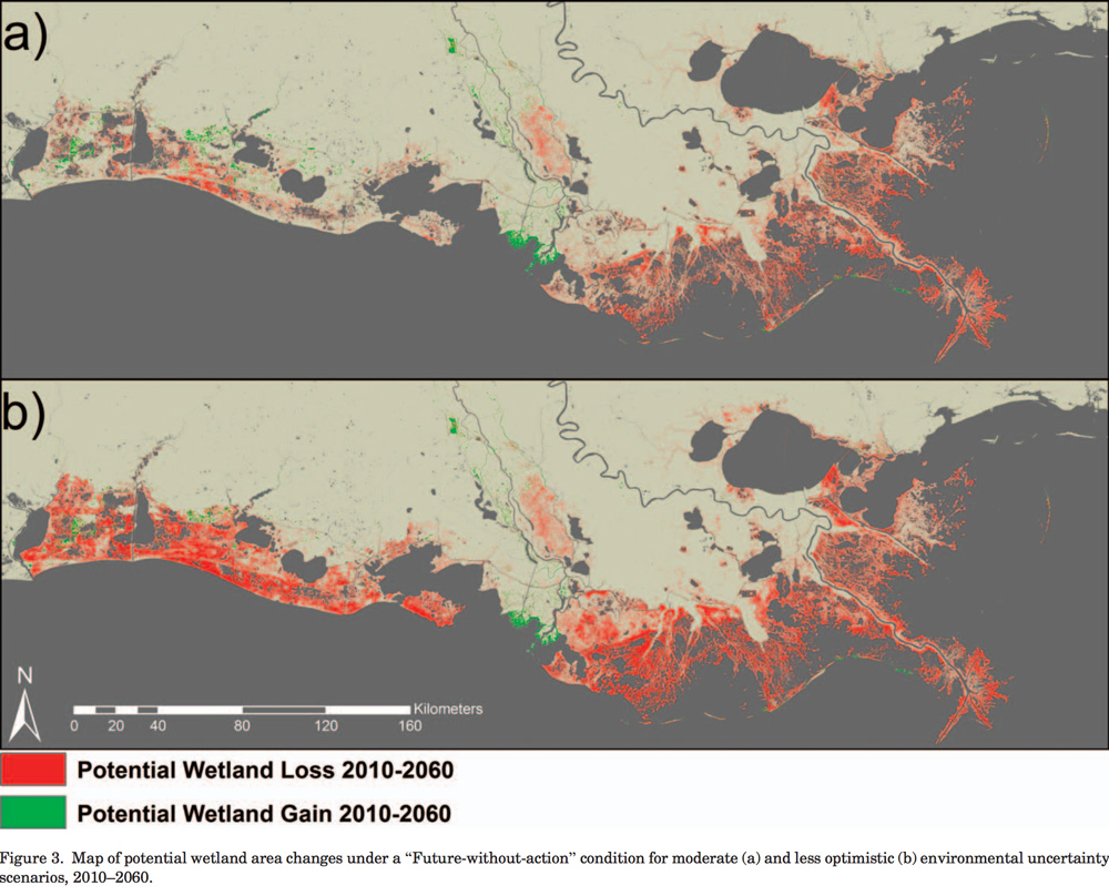
Figure 3 from Couvillion et al.
Raster data like this is more than just imagery—its pixel values represent data, and we can see concretely in QGIS how the different colored pixels in the image are assigned different values of land loss and gain. Because we can see the breakdown of this classification, it means we can break the file apart into multiple GeoTIFF files according to its colors. This was important for us because we wanted the flexibility to render loss and gain layers independently in our app and recolor them according to our desired color scheme.
For basic recoloring, we used ImageMagick, the Photoshop of the command line, and its incredibly descriptive convert command. We used the following task to run through a few folders of images and paint all of the opaque pixels a new color:
task :change_2060_color => :environment do
  gain = ENV['GAIN'] || nil
  raise "no gain color" unless gain

  loss = ENV['LOSS'] || nil
  raise "no loss color" unless loss

  Dir["#{Rails.root.to_s}/app/assets/images/*_2060_*gain.tif.png"].each do |png|
    out = png.gsub(/\.png/,"_colorchanged.png")
    `convert \\( #{png} -alpha extract \\) -background "#{gain}" -alpha shape #{out}`
  end

  Dir["#{Rails.root.to_s}/app/assets/images/*_2060_*loss.tif.png"].each do |png|
    out = png.gsub(/\.png/,"_colorchanged.png")
    `convert \\( #{png} -alpha extract \\) -background "#{loss}" -alpha shape #{out}`
  end
end
To run this we would type rake change_2060_color GAIN=#44567d LOSS=#47c844. For more advanced modifications (like adding texture, as chronicled below for visualizing land cover) it makes more sense to bring these into Photoshop, but scripting allowed us to more quickly iterate color changes and show the output in the app itself.
We processed files for data corresponding to moderate and severe projection scenarios and allowed the user to see both in the context of current satellite imagery, reflecting the variation in possible futures:
2060 loss/gain projection.
Visualizing History
We wanted the project to go beyond a regional overview of change and focus on a smaller, human scale. We worked with The Lens to identify a few critical areas that have undergone dramatic change, or are significant in future projections. We then visualized a few key datasets in those areas to highlight concretely what changes have occurred.
Land Change Over Time
The satellite imagery we processed provides a present-day baseline for historic land changes as we allow users to interact with a timeline control, toggling the state of land cover as it previously existed.

The information being animated is derived from a USGS study from Brady Couvillion, John Barras et al., that used historical surveys, aerial photography, and satellite imagery to classify land cover across the 20th century. The study presented these changes in a single map (informally and endearingly called the “Mardi Gras map”) as a festive rainbow of color breaks, each color representing a slice of land change within a particular time range.

See PDF of map for more detail and legend.
Matching the figure, the data was provided to us as a single image (another ERDAS Imagine raster file). We needed to do a few rounds of processing on this image to split out each color and re-composite them to more clearly show change over time.
First, we turned the ERDAS file into a GeoTIFF and used ImageMagick to split each color into its own file. Every color corresponds to a particular time range of land loss or gain:
    colors = {
      "1932-1956-gain"   =>    "srgba(0,66,0,1)",
      "1956-1973-gain"   =>    "srgba(28,102,0,1)",
      "1973-1975-gain"   =>    "srgba(51,135,5,1)",
      "1975-1977-gain"   =>    "srgba(76,168,10,1)",
      "1977-1985-gain"   =>    "srgba(102,201,15,1)",
      "1985-1988-gain"   =>    "srgba(109,165,28,1)",
      "1988-1990-gain"   =>    "srgba(109,150,33,1)",
      "1990-1995-gain"   =>    "srgba(107,135,38,1)",
      "1995-1998-gain"   =>    "srgba(102,119,40,1)",
      "1998-1999-gain"   =>    "srgba(96,107,45,1)",
      "1999-2002-gain"   =>    "srgba(112,114,45,1)",
      "2002-2004-gain"   =>    "srgba(135,132,43,1)",
      "2004-2006-gain"   =>    "srgba(147,117,43,1)",
      "2006-2008-gain"   =>    "srgba(153,104,43,1)",
      "2008-2009-gain"   =>    "srgba(104,79,33,1)",
      "2009-2010-gain"   =>    "srgba(114,79,33,1)",
      "1932-1956-loss"   =>    "srgba(137,0,0,1)",
      "1956-1973-loss"   =>    "srgba(239,71,84,1)",
      "1973-1975-loss"   =>    "srgba(211,94,43,1)",
      "1975-1977-loss"   =>    "srgba(219,132,35,1)",
      "1977-1985-loss"   =>    "srgba(229,165,25,1)",
      "1985-1988-loss"   =>    "srgba(255,198,17,1)",
      "1988-1990-loss"   =>    "srgba(244,242,10,1)",
      "1990-1995-loss"   =>    "srgba(168,255,255,1)",
      "1995-1998-loss"   =>    "srgba(2,191,201,1)",
      "1998-1999-loss"   =>    "srgba(5,163,229,1)",
      "1999-2002-loss"   =>    "srgba(10,130,234,1)",
      "2002-2004-loss"   =>    "srgba(76,30,242,1)",
      "2004-2006-loss"   =>    "srgba(198,153,239,1)",
      "2006-2008-loss"   =>    "srgba(168,38,204,1)",
      "2008-2009-loss"   =>    "srgba(130,51,137,1)",
      "2009-2010-loss"   =>    "srgba(107,7,168,1)"
    }
We extract all pixels matching each color from the original image and save to a new file for each color, repainting the opaque pixels in each new file a uniform green.
This is the tricky part. Each file now represents a time period of land change. If we were to animate just these the changes according to time period, it would only show small slices, as a visualization of only the land that was gained or lost during a single period. Instead, it made more sense to take these snapshots of change and composite them back together to visualize the changing land mass. After some trial and error, we did the following to create a new image for each time period:
- Combine land-loss layers from the current period to the last period
- Combine land-gain layers from the first period to the current period
The result was dramatic when overlayed atop a present-day satellite image. Areas that are water where there was once (wet)land would be filled in green. With a few notable exceptions, the land shrinks away, turning into open water over time. We’re not fundamentally changing the USGS’s data, we’re just visualizing it in a way that they hadn’t.

First stab at land cover layer. Depicting the scene in 1932.
Visually, the uniform green color we used for these layers looked a bit blocky and harsh, so we wanted to see what we could do to make things look a little more organic—more like actual land shrinking away.
To accomplish this, we took an output of the above process—what the land looked like in 1932—and brought it into Photoshop, using the satellite imagery as a background layer behind it to get a live preview. We applied a series of noise filters to apply some texture to the layer, and applied some anti-aliasing to smooth out harsh edges. We also further refined the color and transparency of the image to more carefully blend with the satellite imagery in the layer behind it. We recorded each of these steps in a Photoshop “Action” and then bulk-applied them to each of the layers to be animated. This made a huge difference in the presentation of the output.

Note: Use discretion when anti-aliasing raster data. By softening edges, you’re losing scientific precision at the expense of aesthetics, blurring the lines between data visualization and illustration.
Historic Places
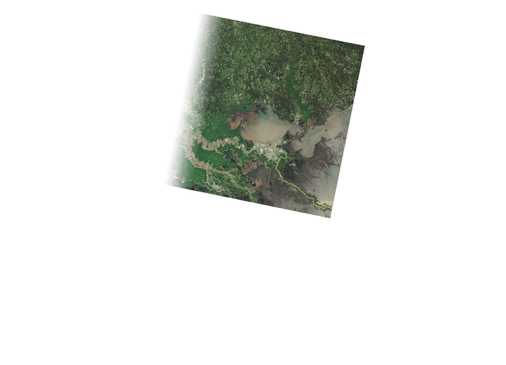
One more dataset that proved worthwhile was the historic subset of the Geographic Name Information System (GNIS). GNIS is the federal database of all official place names belonging to the US, whether cultural, political, or physical. The historic subset, in their words, are “features that no longer exist on the landscape or no longer serve the original purpose.” Losing Ground shows historic land forms turning into open water, and using this dataset enabled us to show the lakes and bays and bayous that once existed. You can see this clearly in the Buras scene; the orange locations no longer exist on today’s maps:

The use of this dataset was one of the original concepts for this project, but as with the misclassified canals of the NHD, datasets often fail to meet expectations. For many of the areas we looked at, we expected to find more wetland features that had been de-mapped over time. While the NOAA made a few additions to the database in 2013, a casual look at historic maps found features aren’t represented in the historic GNIS.
That said, there are many features in GNIS that aren’t relevant to our story, so when we previsualized the entire Louisiana dataset in QGIS, it was necessary to filter out a lot of noise. In our final presentation, we didn’t use this dataset extensively, but when we did we ran into some cartography issues as seen in Buras, like place names colliding with each other given our desired zoom level and minimum font size. We resolved (most of) this with a combination of a collision-detection algorithm and some good ol’ manual shifting.
Aerial Photography
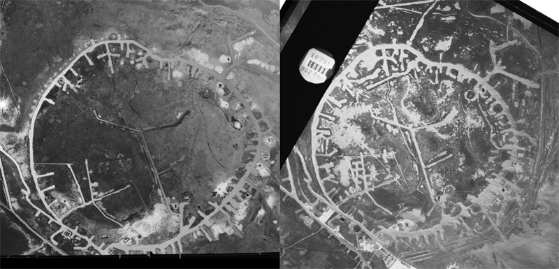
“The wagonwheel” in 1956 and 1973.
The aerial photography of “the wagonwheel,” seen in Venice and West Bay, predates satellite imagery, but it was also accessible via the USGS Earth Explorer. Searching by a date that predates relevant satellites (1970)—and prefiltering by available datasets within search criteria—exposes a wealth of geotagged (and sometimes georeferenced) aerial photography within the “Aerial Photo Single Frames” category, all in the public domain. These photos, while geotagged, are not georeferenced, which means you can’t just throw them on a map straight from a download. In the image above, you’ll see that we manually rotated one image to match the other.
The Release and the Lessons Learned
Although we’ve chronicled the creation of our maps and graphics in a linear way, the actual progression of the project was anything but. It was a challenging sequence of trial and error, and we refined (or redesigned) our prototypes as we uncovered new data, or learned techniques that made new visualizations possible. We also received regular feedback from our editors, Scott Klein at ProPublica and Steve Myers at The Lens, and considered how Bob Marshall’s reporting, our graphics, and Edmund Fountain’s photography would play off one another. Ultimately, the process was one of discovery—not a prescribed course of action—and we experimented our way to solutions. There were a lot of moving pieces to fit together for our August 2014 release.
On release, Losing Ground was a success, becoming one of ProPublica’s most visited stories in 2014. Of course, there are things we could have done differently. The site is responsive, but hardly a “mobile first” design—it would have been worthwhile to start using Adobe Edge Inspect or BrowserSync earlier in the prototyping process to be more aware of small-screen weaknesses.
With the help of ProPublica’s design director, David Sleight, we user-tested the project via screenshare to identify UX issues. This was so helpful that if we did it over again, we’d want to get the site in front of users earlier and more frequently. We also would have loved to integrate more event-tracking analytics, to better track how users are clicking through the site—and integrate UX lessons learned here into future projects.
When it comes to processing satellite imagery, computer speed can be a serious bottleneck, and we learned it the hard way. The 16-bit images were huge, and doing transformations on them was very resource-intensive. If you take on a project like this, max out your RAM, and free up a ton of disk space—and, for Photoshop, either provide ample scratch space or make friends with the “Purge” menu. Using the very best computer you can get your hands on will hugely reduce frustration.
More than a few people have asked how long this project took to complete, and it was on the order of months, not weeks. We took the time to learn techniques, understand datasets, refine workflows, experiment with visualization styles, and document our approach (you’re reading that documentation). It’s not a timeframe that works for every project or organization, but the deep dive let us create a feature with a breadth and depth that matched the topic’s complexity. And for us—the developers and data journalists—it was an enriching process, leaving us with skills that we’ll use in future projects for years to come.
Credits
-
 Brian Jacobs
Brian Jacobs is a Senior Graphics Editor who designs and develops interactive maps and graphics for National Geographic Magazine. Brian uses open source visualization and data processing tools to create and envision custom editorial experiences across platforms. He was previously a Knight-Mozilla fellow at ProPublica, where he worked on “Losing Ground”, an interactive story about the slow-motion environmental catastrophe taking place in southeast Louisiana. Find him at @btjakes.


