Features:
2012 in Review: Ryan Pitts
Utilifonts, development tools, beautiful apps, and a philosophy of cooking
The NYT’s Snow Fall
As we reach the end of 2012, we’ve asked a few designers and developers working in journalism to talk about a few projects and posts they loved—and didn’t work on themselves. Ryan Pitts, developer at the Spokesman Review and here at Source, digs deep into his bookmarks to haul out some of the year’s treasures.
Year-end lists are tough if you didn’t take good notes all along, but grouping helps me think. So here are three things from 2012 that help me do my job better, and three things from 2012 that inspire me to do better at my job.
Help!

ProPublica’s StateFace
Utilifonts
There are a handful of these icon sets packed up into font files, making it easy to add visual language to your apps without having to wrangle a set of pngs. And even better, because they’re vectors, everything’s ready for retina screens and you can resize with impunity. My two favorite packages like this were released in 2012. StateFace is a collection of state shapes from ProPublica; it’s not just for election apps, but sure was handy this past November. And FontAwesome is a set of more than 200 all-purpose icons, covering everything from interactions to social-media logos. We use it on this very page (and everywhere else on Source).
Firefox’s Responsive Design View
I’ve been a Firefox user for years now, despite the sidelong glances from my team of Chrome users. (Splitters!) I stuck with the browser primarily because I didn’t want to rebuild prefs and drop my well-worn Firebug workflow, but this year Firefox added a shiny toy that’s so useful during web app development. When you trigger responsive design mode, Firefox pulls the page you’re on into an inset frame with handles for easy resizing. There’s a dropdown to quickly flip between screen resolutions common to various devices, and a toggle for portrait vs. landscape orientation. I’d hate to design an app without it.
This could have just as easily been filed under “things that inspire me to better,” but I’m putting it here. It’s been open in one of my browser tabs ever since Chris Groskopf added the repo to GitHub, and it’s a constant reminder that although there are plenty of right ways to do things, some of them are just righter than others. And in a team environment, consistency is something worth striving for.
Inspiration
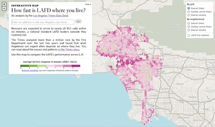
The LA Times’ LAFD response map
I remember the first time that junior-high, D&D-playing me got ahold of a pad of hex paper; that was some next-level dungeon mapping right there. I felt the same way when I saw Ben Welsh’s layer of hexes showing emergency response times across Los Angeles. It’s just so perfect … but then so is the rest of the app. There’s wonderful attention to detail on the underlying tiles and map interactions, and this data is so important to local readers. The Data Desk’s story is already having an effect on local agencies. Excellent execution and a measurable impact: I’m not sure what more you could hope to see from a news app.
Bonus inspirational map from 2012 (I think): the La Bella Italia demo map from Gregor Aisch’s Kartograph project. So beautiful.
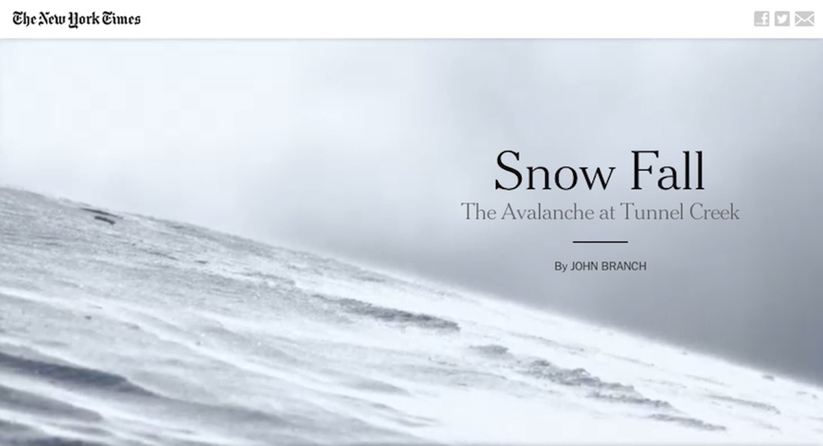
Snow Fall: The Avalanche at Tunnel Creek
I mean, come on, if you’re interested in storytelling on the web, this has to inspire you. And maybe there aren’t many teams that can generate their own 3D mountain flyovers, but I can’t be the only news dev who hit “view source” on this story and thought, “ooh, we could do some of this.” The multimedia link treatments, full-width videos, motion thumbnails instead of static poster frames, pagination that felt right, the breathing room for readers. All things that I’ll be thinking about next news app design.
Yeah, maybe I’ve mentioned this one before, but I do love finding inspiration in fields that, on the surface, might not have much in common with web development. Cooking is an obvious one, and I’m fascinated by chefs who are fanatical about execution and detail, and whose creativity flourishes despite limitations. “Mind of a Chef” explores all that. Here’s a quote I wrote down from the episode in Tokyo:
There are countless restaurants in Japan. People don’t decide what they want when they go to a restaurant. They already know what to eat when they go out. Today is yakitori, tomorrow is sushi, another day is unagi. They expect to eat what they came to eat when they get to the restaurant. In other words, you cannot betray what they expect … but you have to go above it in some way, too. — Chef Toshiro Wada, Bird Land, Tokyo
Yes, I do believe there’s something there for news developers, too.
Credits
-
 Ryan Pitts
Ryan Pitts is a developer and journalist in Spokane, WA. He’s the director of network development for OpenNews, a nonprofit organization that helps newsroom developers, designers, and data analysts collaborate on technology and support each other as a community. (OpenNews also publishes this website.) Ryan is a board member and developer at Census Reporter, and was the senior editor for digital media at The Spokesman-Review.


