Features:
COVID-19 story recipe: Analyzing disparate impact based on race, poverty, and vulnerability in your area
Where to find the data, how to explore it, and questions to ask to reproduce the story for your community

Hannah Recht found that in Mississippi and many other areas of the country, there was an outsized COVID-19 burden among black residents. Learn how to do this analysis yourself below.
Health disparities in the U.S. are well documented. Stroke, diabetes, maternal mortality—nearly all hit minorities the hardest, even when accounting for income. Structural racism and the social determinants of health affect every facet of health care, from medical care to insurance access to hospital-bed availability to being able to wash your hands for 20 seconds. Telling that story is a crucial part of explaining why COVID-19 case rates and deaths are disproportionately affecting minority communities in the U.S.
As new COVID-19 hot spots popped up across the country and states began to release data by race and ethnicity, my team at Kaiser Health News saw the need to report on why the illness was striking Black, Hispanic, and Native American communities so intensely. To identify regions for reporting, I pulled together a large national database using multiple data sources to identify vulnerable communities that had a growing number of COVID-19 cases per capita.
The story we found
Our compiled data revealed that many communities outside the national spotlight are grappling with serious outbreaks and have a range of barriers to stopping COVID-19’s spread. As Dr. Thomas Frieden, a former CDC director, said in our story, “most epidemics are guided missiles attacking those who are poor, disenfranchised and have underlying health problems.”
Our story focused on three regions that all had growing rates and were at high risk for even more severe outbreaks: Mississippi, Navajo Nation, and Memphis, Tenn. All face serious challenges that make controlling the virus harder, including poverty, infrastructure problems, and high rates of underlying health conditions.
To identify these regions, I created a dataset that combined COVID-19 data with information on demographics, income, poverty, health insurance, hospital access, and social vulnerability. We skipped areas with very high case rates that had been well-reported, like New York and New Orleans.
How you can analyze the data
We published a county-level dataset in our story that includes uninsured and poverty rates, median household income, percent elderly, and race/ethnicity breakdown. It also includes COVID-19 cases, deaths, and case rates per 100,000 at the time of publication.
(Note: For our national story I analyzed data for commuting zones, which are groups of counties that make up local economies. I wanted to look at larger areas than counties, but needed a geography definition that covered the entire country, unlike metropolitan areas. You can see those CZ boundaries in the choropleth map and CZ identifiers in our dataset.)
Another important source to explore is the CDC’s Social Vulnerability Index, which rates communities on their ability to handle disease outbreaks and disasters.
The CDC publishes two versions of the SVI: national and state-based. The state-based version ranks areas within a state against each other; you’ll want to use that if you’re reporting within just one state. Both versions can be downloaded at the census tract or county level.
Now, let’s get you started on analyzing this data yourself:
- Download and unzip the county-level file KHN published, which is in our story, but here’s a direct download link for the data as you follow this recipe. Make sure you agree to the terms of use in the zip file, and that you read the documentation for source notes.
- Since COVID-19 rates are changing every day, get the latest data by downloading the county file from the New York Times. Click the
us-counties.csvfile and hit the download button. (If your browser opens the csv in a new tab, you can right-click on the download button and “save as” instead—you want a local copy of the file.) Make sure to read the geographic exceptions section of their documentation, particularly for New York City and Kansas City.You can also use the Big Local News map for a quick look at county rates in your area without having to do any analysis, since the map also pulls in the latest data from the Times.
- Download the SVI for your region. Download the 2018 documentation first, and then select data. If you’re reporting within a single state, choose your state name in the geography dropdown. If you’re reporting in multiple states, choose United States. Choose counties for geography type, CSV for file type, and hit “Go.”
NOTE: We used the national, county-level version for our broader story, but local reporters may want to look at census tract state-based scores. If you’re experienced with map-making software like QGIS or ArcGIS and prefer to view the data on a map, you can download a shapefile instead.
- Open up your analysis program of choice. We have instructions using two options: Google Sheets and R. If you’re familiar with R, jump to the R Instructions. If you’d like to follow along using Google Sheets, open up this file we created specifically for this recipe.
Google Sheets Instructions
- Make a copy of the sheet so you can edit it by going to
File>Make a copy. We’ve already loaded the KHN dataset into a sheet calledData, as well as its terms of use and methodology. Please note that we’ve also removed the original COVID case data in this sheet, since you’ll soon be importing the latest numbers instead. Also note that the FIPS code information is missing leading zeros, but that will make joining the data later on easier in Google Sheets.If you’re using a single-state version of the SVI data, you’ll want to delete other states from your KHN
Datasheet. This will make joining the three datasets easier. Select all rows besides your state and the header, right click, and delete. - Import the two additional datasets you’ve downloaded by going to
File>Importand then clicking onUploadso you can select the SVI data for uploading. Next, Google Sheets will ask you how you want to import the file. Then pickInsert new sheet(s)as the Import Location and leave the rest of the form alone. When you clickImport Data,this should create a new sheet in your file that has the same sheet name as the csv file you uploaded. (If you’re using the national county-level data, that’sSVI2018_US_COUNTY.) - In the SVI data, look for two columns: FIPS, the county identifier, and RPL_THEMES, the overall Social Vulnerability Index variable. (Keep scrolling past RPL_THEME1 through RPL_THEME4 to find the RPL_THEMES column—it’s really there!). Drag those to the left so they’re your first and second columns. Then, sort this sheet by the FIPS column by right-clicking on the column header and selecting
Sort sheet A → Z. Doing this will save you from a big headache later. - Going back to your
Datasheet, create a new column to the right offips_countyby right clicking on column A and selectingInsert 1 right.Name this columnsvi. In the next empty cell (which should be B2), paste in the following formula, replacingYOUR_SVI_SHEET_NAMEin both places with the name of your own SVI sheet:=INDEX(YOUR_SVI_SHEET_NAME!B:B, MATCH(A2, YOUR_SVI_SHEET_NAME!A:A, 0))Since we’re using data for the entire country, our formula looks like this:
=INDEX(SVI2018_US_COUNTY!B:B, MATCH(A2, SVI2018_US_COUNTY!A:A, 0))If you instead downloaded data from a single state, such as Connecticut, your formula should look something like this:
=INDEX(Connecticut_COUNTY!B:B, MATCH(A2, Connecticut_COUNTY!A:A, 0))This formula is helping us say:
=INDEX(Return the SVI value, MATCH by(Look at the fips code in A2, Search inside the first column of YOUR_SVI_SHEET_NAME for the same fips code, exact matches only))Apply this formula to the entire column by selecting the cell you just created (B2) and doubleclicking the small, blue square on the bottom right corner of the box. This is called a “fill handle.” When you doubleclick it, it fills in the rest of the column with the same formula.

Doubleclick on that blue box to use your formula in the entire column.
The SVI data goes out to four decimal points, so make sure to click on the “Increase decimal points” icon to see the full number.

Click on the icon with a gray background to see more decimal points.
- Next, we’ll load in the latest COVID-19 data from the NYT. Importing the data will be similar to what we did last time. Go to
File>Import, then clickUploadand select theus-counties.csvthat you downloaded earlier. PickInsert new sheet(s)again to add it to your Google Sheets file. This should create a new sheet in your file namedus-counties. - In the
us-countiessheet, we only want the data from the latest day, so we’re first going to sort those to the top. Right click on the date column and selectSort sheet Z → A, which should shuffle rows with the most recent date to the top. - Now, going back to the KHN
Datasheet, we’ll merge the two datasets like we did last time, by using INDEX-MATCH. Create two new columns to the right offips_countyby clicking on column A and selectingInsert 1 rightand then doing it again. Label the first cell in your first blank columncovid_casesand the secondcovid_deaths.In B2 again, paste in the following formula, which will bring in the latest cases data:
=INDEX('us-counties'!E:E, MATCH(A2,'us-counties'!D$1:D$2887, 0))This time, we refer to cell 2887 because it’s the last row of data for the latest date in our
us-countiessheet. Please check to see if this is the case. If not, change 2887 to whichever row is the last row of data for the date you’re looking at.Apply this formula to the entire column by selecting the cell you just created (B2), and doubleclicking the small, blue box again to apply it to the entire column. You’ll see some cells with N/A where there haven’t been any reported cases in the New York Times dataset.
In C2, paste in this formula, which will bring in the latest deaths data:
=INDEX('us-counties'!F:F, MATCH(A2,'us-counties'!D$1:D$2887, 0))
(If you changed the reference to cell 2887 before, you’ll need to change it here, too.)Apply this formula to the entire column by selecting the cell you just created (C2), and doubleclicking the small, blue box again to apply it to the entire column. Congrats, you have successfully joined all three datasets!
- Finally, we’re going to create our own column to calculate the number of COVID-19 cases per 100,000 people for every county. Once again, insert a new column, this time, to the right of the
covid_casescolumn. Name itcovid_cases_rate. To calculate this number, we’re using going to do: (cases/population) * 100000, so the formula to use is:=(B2/L2)*100000Just in case you haven’t been putting your columns exactly in the same place as this guide, you want to do:
=(cases column/population column)*100000Again, to apply the formula to the whole column, select the cell you just created and doubleclick the small, blue box. Now you should have the COVID-19 case rate per 100,000 people for every county. Jump past the R instructions below to see how we can make sense of this.
R Instructions
We’ll combine our datasets with a short program. I’ll describe each step we’ll be doing first, and then I’ll show you how to do it in R:
- First, we’ll load the three datasets you now have downloaded into R. To make things easier, make sure you have these three datasets in the same folder for your R working directory:
- KHN_County_vulnerability_data.csv
- SVI data from the CDC
- COVID-19 data from the NYT
- Next, we’ll join all three datasets together.
- Using FIPS codes, join the SVI data to the KHN data. From the SVI data, we want the overall Social Vulnerability Index variable, named `RPL_THEMES`.
- Filter down the COVID-19 case data so we’re only grabbing the latest day of COVID-19 cases, which we can find by filtering or sorting on the date column.
- In the combined SVI/KHN dataset, remove the original columns that contain COVID-19 data,
covid_cases,covid_deaths, andcovid_cases_rate, since those will be out of date. - Join the filtered down COVID-19 case data with our combined SVI/KHN data.
- Once the data is joined, we can easily calculate the case rates per 100,000: (cases/population) * 100000. You can now also look in the data to see which counties in your coverage area have a higher number of cases per capita and higher social vulnerability. You’ll also be able to immediately see the population’s racial breakdown, income and uninsured rates.
- Now, to take all those steps yourself, copy this entire block into a new R script and run it in R. You can also run each section one at a time if you’d prefer, but it will also work all together!
# Loading the dplyr R package
# If you don't have it installed yet, first run: install.packages("dplyr")
library(dplyr)

# Loading in the KHN data
county_dt <- read.csv("KHN_County_vulnerability/KHN_County_vulnerability_data.csv", stringsAsFactors = F, colClasses = c("fips_county" = "character", "fips_state" = "character", "cz_code" = "character"))

# Loading in the SVI data - if you downloaded a state-based file you might have a different file name
svi <- read.csv("SVI2018_US_COUNTY.csv", stringsAsFactors = F, colClasses = c("FIPS" = "character"))

# Loading in the New York Times latest COVID-19 case data
# You can load the version you downloaded, or directly from their github like I did:
covid_full <- read.csv("https://raw.githubusercontent.com/nytimes/covid-19-data/master/us-counties.csv", stringsAsFactors = F, colClasses = c("fips" = "character"))

# Join overall SVI score to the KHN county data
svi_min <- svi %>% select(fips_county = FIPS, svi = RPL_THEMES)
county_dt <- left_join(county_dt, svi_min, by = "fips_county")

# Clean up COVID data for joining
covid_full <- covid_full %>% mutate(date = as.Date(date)) %>%
    rename(fips_county = fips, covid_cases = cases, covid_deaths = deaths)

# Get just the latest day, just necessary columns for joining
covid_latest <- covid_full %>% filter(date == max(date)) %>%
select(fips_county, covid_cases, covid_deaths)

# Remove older COVID data from county dataset and join the latest
county_dt <- county_dt %>% select(-starts_with("covid_"))
county_dt <- left_join(county_dt, covid_latest, by = "fips_county")

# Calculate and store the number of cases per 100,000 for every county
county_dt <- county_dt %>% mutate(covid_cases_rate = (covid_cases/population) * 100000)

# Select just your state, for example Texas. Using April 30th data we saw covid_cases = 6161 and covid_cases_rate = 130.7 in Harris County, TX. Your newly updated numbers will be a little different.
texas <- county_dt %>% filter(state_code == "TX")
Analyzing the Data
With our KHN, CDC, and NYT datasets joined together, we’ve already created some powerful reporting tools. Here are the new data columns we could start using right away:
- covid_cases: Raw number of cases.
- covid_cases_rate: Rate per 100,000 people gives us a way to compare the outbreak’s spread in large and small counties.
- covid_deaths: Raw number of deaths.
- svi: This score from the CDC ranges from 0 to 1, with 1 being the most vulnerable to disease outbreaks and disasters.
Next, we’ll look for another important figure, the racial and/or ethnic breakdown of COVID-19 cases in your area.
Check your state, city, or county COVID-19 resources to see if they’ve released cases by race and/or ethnicity. If they have, you can now compare them to the data you have on overall population in your region. If you don’t have COVID-19 data by race and ethnicity, you can still do this story. (Though ask your local officials for the data—they should publish it.) In our story, we first chose regions to focus on by overall COVID-19 case rates and the other data discussed here, including poverty, hospital access, social vulnerability, demographics, and infrastructure. We used cases and deaths by race to supplement that social determinants data, but we could have told the story without it.
In our story, we presented race and ethnicity data for Mississippi and Shelby County, Tenn. Both showed an outsized COVID-19 burden among black residents.

Some states, like New York, combine race and Hispanic ethnicity in their reporting while others, like Tennessee, keep them separate. Most records keep race and ethnicity as separate variables. If your state combines them, jump straight to Scenario 2, where we explain how to handle that.
Scenario 1: Separate race and ethnicity
If your region reports race separately from ethnicity, you’ll find race data in ACS table B02001, and data on Hispanic or Latino origin in ACS table B03003. (You can also get this data from data.census.gov, but I find censusreporter.org much easier to use! Or if you program, use the Census Bureau APIs.)
For example: Tennessee reports COVID-19 data for Hispanic ethnicity and for race separately. In the April 30 data, 27% of cases had pending race. We’ll want to exclude those for comparisons, so we only added up cases with a known race for our denominator.

Enter the number of cases by race, excluding pending, into an Excel or Google Sheet or your favorite statistical program. Then make a percentage column that divides each case number by the total. These numbers should add up to 100%. See columns A, B, and C below:
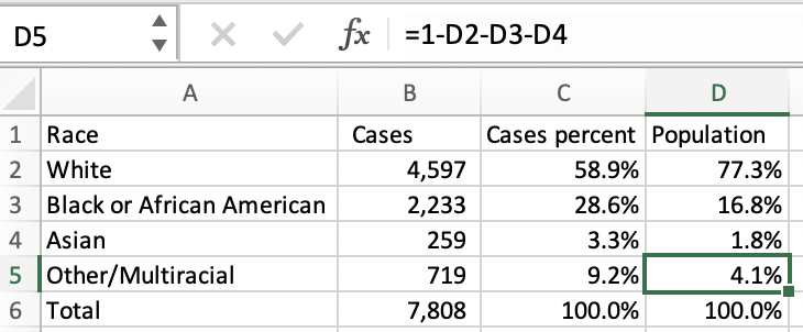
Then we can compare these COVID-19 percentages by race to the state’s racial makeup using the ACS data in Census Reporter. (Enter your own county, city, or state name in the “Add a geography” field on the left to view data for your area). Enter these percentages into Excel too, for any groups that are reported in the state data. We did that in column D, “Population.”
Unfortunately Tennessee, like most states, does not report COVID-19 data for American Indian and Alaska Native or Native Hawaiian and Other Pacific Islander populations. Take 100% minus the other groups that are available to make your “Other” group percent number.
If the COVID-19 distribution mirrored the state’s population you’d expect to see these percentage columns look roughly the same. Now you can see black residents make up just 16.8% of the state’s population but 28.6% of cases. You can do the same calculations for deaths by race.
Now we’ll repeat this process for Hispanic ethnicity in a separate tab, using ACS table B03003.

In Tennessee, only 5.5% of the state’s population is Hispanic or Latino, but 13.3% of residents with COVID-19 cases are.
Scenario 2: Combined race and ethnicity
If your region reports combined race and ethnicity, use American Community Survey table B03002, Hispanic or Latino Origin by Race, for comparisons. This is included in the KHN county-level dataset.
New Jersey reports COVID-19 deaths with combined race and ethnicity (scroll down to the dashboard and click demographics.)

Enter these cases numbers into a spreadsheet and make a percentage column, with each race’s case number divided by their sum. We’ll add population numbers from ACS table B03002 into a new column.

Notice that the ACS breaks down Hispanic or Latino by race. Since New Jersey just reports Hispanic or Latino overall, we’ll also use the ACS’s overall number: 20.6%. Then, add in non-Hispanic white, black, and Asian percentages. New Jersey doesn’t report numbers for all groups, so like Tennessee we’ll make the other percentage for comparison by subtracting the groups in our data from 100%.
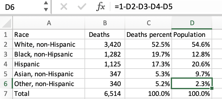
In New Jersey, white and Asian non-Hispanic and Hispanic residents make up a smaller share of COVID-19 deaths than their population percentages. Black, non-Hispanic residents make up just 12.8% of the state but 19.7% of deaths.
Where to look for your story
You’ll want to look at the data in a few ways. What counties have the highest COVID-19 case rates? The highest poverty rates? The highest social vulnerability? Are there differences in the racial and ethnic makeup of the hardest-hit counties and those with lower case rates? Check out your local state, county, and city COVID-19 data pages too—many are releasing case rates by race and some are even releasing data for smaller geographies. Are rates higher for non-white residents? What communities in your area are being hardest hit?
Once you’ve found some areas to report on, ask why those places have such high rates. Are families living in more dense or overcrowded housing? Do multiple generations live together? Are rates of underlying conditions higher? Do residents have easy access to health care? Are jobs that can’t be done from home more common? When we identified our three areas of focus, my colleague Liz Szabo also interviewed residents and experts in those communities to answer these types of questions.
Some more resources to use in your search:
Talk to residents, local advocates, and experts on public health, housing, and disparities in your area. I hope this data and information is useful, and look forward to reading your local stories.
Additional Coverage Resources
Now that you have experience with the SVI dataset, here’s another story recipe on how to use SVI data to identify communities at risk from the pandemic and its economic fallout.
Find more step-by-step COVID-19 data story recipes like this one. If you have questions about a story you’re working on, our free peer data review program is here to help.
Programs like these are part of the OpenNews COVID-19 community care package. If you’re using this story recipe, please let us know — we’d love to promote your work! If you’ve got a story recipe idea, we’d love to hear about it. Drop us a line at source@opennews.org.
Organizations
Credits
-
Hannah Recht
Hannah Recht is a data reporter at KHN. Before joining KHN, she worked at Bloomberg News as a data and graphics reporter, covering topics including health insurance policy and gender equity. She developed censusapi, an R package for easily retrieving U.S. Census data, and is an avid R programmer. She previously worked at the Urban Institute, including two years as a programmer on the Health Insurance Policy Simulation Model. She graduated from the University of Rochester with a bachelor’s degree in mathematics and statistics and a minor in epidemiology.


