Features:
How The Los Angeles Times Transformed its Publishing Tools with a UX Design Approach
We put reporters and editors at the center

The backend interface of the Los Angeles Times’ liveblog publishing system in use on election day. The system powered its 2016 campaign coverage blog, the Trail Guide.
When I arrived at the Los Angeles Times two years ago, there was a real sense that editorial staff felt far removed from the system they used to publish news online. The content management system they were using was developed to satisfy the demands of creating and sharing content across many different media outlets throughout the country. The platform, which fulfilled the goal, seemed to leave reporters and their editors fending for themselves to wade through myriad unused form fields, copying and pasting stories between separate print and budgeting systems, and spending an inordinate amount of time writing and responding to a deluge of repetitive production-related emails.
Something had to give. The newsroom was dead set on moving away from a print-driven production cycle and writing conventions, to increasing its digital footprint and telling stories in new, creative formats on a more regular basis.
Time for a Change
A dedicated real-time desk, staffed by journalists from across the newsroom, was created to focus on reporting breaking news as it happened. Posting on events from around the L.A. metro area to national stories, the idea was to report on verified facts as they came in, supported by media from around the web—tweets, Facebook posts, YouTube videos—as well as charts and graphics produced by the Times. Still, the team sensed that their hands were tied by publishing tools designed for something else.
When the 2014 midterm elections rolled around, it became clear that we needed to do more. We needed something that would fit the look of our website, allow staff to report quickly, and allow for engaging elements like social media and graphics. Editors decided that a liveblog would be the best format. The Times, like many others had in the past, leaned on off-the-shelf embedded tools, but those came with limited SEO, pre-canned styling and workflows that weren’t geared for large news organizations.
So when the newsroom was faced with a problem lacking outside solutions, web producer Evan Wagstaff and digital designer Lily Mihalik got to work. Piggybacking off of a free-form HTML content type that the site’s CMS did offer, they created a simple code generator, with an admittedly rough interface, that anyone in the newsroom could use to stitch together various elements into well-designed “cards.” Initially though, it meant copying chunks of code into a stack. When copy or line editors had changes, Wagstaff was tasked with going back into a mountain of HTML to hand code the modifications. Not exactly the workflow boon people imagined.
But it didn’t matter— the liveblog looked great and readers loved the experience, triggering traffic that far surpassed expectations for midterm election coverage. Reporters and editors enjoyed having a tool that allowed them to easily capture fleeting moments from evolving stories, in ways that the typical article geared towards print couldn’t.
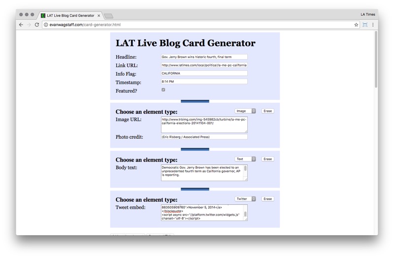
The earliest iteration of the Times’ liveblog application used for the 2014 U.S. midterm elections.
With a prototype tested in the wild, we began to see the real value of our own tool. Having the ability to publish updates in an end-to-end editorial pipeline–from input interface to reader display–allowed for journalists to organize their thoughts on their terms. For example, editors could flag posts as being “called” which allowed readers to scan the list of cards to just see races that had a winner. Also, having a free form text box for categorization allowed editors to sort content as being related to California or national races to distinguish cards even further. In the future, these organizational features could be adapted for specific editorial goals for other events, like award show winners or football game scores.

Liveblog cards could be categorized depending on each event’s particular needs, allowing readers to browse for important or relevant updates.
Proving the concept, we knew, wasn’t going to be enough. We needed to make the workflow of creating and editing cards much easier to really get reporters and editors on board. And to adopt the new tool for other types of coverage, like planned events or breaking news. We needed to iterate.
If There’s an API, There’s a Way
At the time, I was an intern looking for a project to sink my teeth into. I knew, along with the rest of the team, that if we put some care into designing not only the reader experience, but also how journalists interacted with the liveblog, we could start bridging the disconnect many in the newsroom felt between the existing toolset and the need to tell stories in new, relevant ways. So, with some of my time cut out from my regular duties, I jumped in to help solve some of the basic workflow problems we were facing from the cobbling together of big blocks of relatively complex HTML and JavaScript.
Thankfully, as any techie knows, if there is an API, there is a way. Sure enough, we had access to an API to talk to our CMS. Within a couple months, we had a small Python Django app that automated away the need to copy and paste code into a stack of other liveblog cards.

The group instant message app, Slack, is used in place of email to automate workflow notifications for copy and line editing.
From there we slowly started to build up more logic to handle publishing JSON to Amazon’s storage solution, S3, to enable pushing updates to readers as they were produced, instead of on refresh. To facilitate a better workflow, we started notifying copy desks automatically when new cards were ready to be edited, first by email, then by Slack a short time later.
Meanwhile, at every step of the way we kept getting direct feedback from staff on their experience using the app to inform the front-end design. Carefully, we designed each part of the production interface to be relevant to journalists. Everything from the labelling of form fields to the placement of buttons was considered through the lens of editorial goals. Emphasis was placed on previewing what readers would ultimately see in order to focus producers on the end-product instead of on just punching the right buttons and checking the right boxes.

Each aspect of the interface was designed to encourage engaging liveblog posts. Widgets allowed for variety within each update, form fields were limited to free users up to focus less on process and more on content, and a WYSIWYG preview was prominent to emphasize what readers would see.
Seeing the Potential
It wasn’t long before the liveblog began powering coverage that had never been anticipated. Midway through 2015, as presidential hopefuls began announcing their candidacies, the Times launched a daily blog dedicated to covering the 2016 election, named Trail Guide. Using the liveblog, politics staffers were able to cover campaign moments as they occurred and aggregate longer stories and analyses, giving readers one place to follow the race.
By the fall of 2015, we realized that journalists enjoyed working with the platform and were starting to stretch the limits of what a “liveblog” was. Seeing the potential in the approach, Times managing editors decided they wanted the team to build a new tool to encompass more production needs. So designers and developers huddled, and pretty soon the creation of a more general purpose storytelling app was underway.
Touching on more aspects of the production cycle than the liveblog, the new tool would have to accommodate the workflows of not only digital staffers, but also photographers, print designers, and section editors. And instead of being created for smaller pieces of content, it would become the dedicated writing and editing platform for daily articles and long-form narratives. With the larger scope in mind, Wagstaff, Mihalik, product developer James Perez, and Data Desk editor Ben Welsh, set out to build it.
Rolling Out a New System

SNAP launched to Times staffers in the spring of 2016, fusing story production with print, budget, and communication systems.
Six months later, the newly christened SNAP, or Simple News Assembly Platform, rolled out to sections across the Times’ newsroom and bureaus. It tied together several disparate systems that teams relied on to budget, to communicate, and to produce the print paper. The volume of production-related emails dropped enormously and the need to copy and paste between tools lessened. Finally, the Times’ journalists had a voice in designing the systems they worked with each and every day.
The Times’ parent company, Tronc, took notice, too. Executives enlisted developers from other projects to work on SNAP to bring it to its other publications, which include among others, the Chicago Tribune, the Baltimore Sun and the San Diego Union-Tribune. Several are now using SNAP, and the work to add more is underway.
For those interested, SNAP does not have its own database, as it serves primarily as an interface between several APIs. It fuses numerous production and communication systems: our CMS, which is used to authenticate users and to read and write stories; Slack, to notify various production groups about the status of stories; Desk-Net, for scheduling budgets; and CCI’s NewsGate, for print design. It uses Backbone.js to model data from the servers on the client side and provide a framework for views and History API URL routing. Flask powers the server to handle client requests and facilitate API communication.
Intuitive Publishing Software = Better Journalism
No feature is sacrosanct. Just as every article the Times publishes goes through several layers of rigorous checking, editing, rearranging, and improving, so do our applications. When staff members come to us with questions, suggestions or feedback, we step back and evaluate how we can make their experience better. When I see us revisit a confusing modal or look at why a new feature isn’t being understood, I’m reminded that shedding attachment to the first idea (sometimes even the second or third idea) can actually be quite liberating and spur some amazingly creative solutions.
The Los Angeles Times’ unlikely journey to designing and developing its own software stemmed from a realization that having reporters and editors feel at home with their tools is a crucial step to publishing great journalism. When someone, anyone, depends on a piece of software for their job that’s limiting, inefficient or designed for different purposes, their day-to-day work experience suffers. Creative energy gets diverted to debugging technical issues, remembering the order of buttons to click, or onboarding new people with lengthy instructions. And when it comes to time, it’s truly a zero-sum game. If someone spends 10 minutes an hour on solving mundane technical problems, that’s 10 fewer minutes they can spend on imagining creative solutions to problems and tasks they’re actually being paid to solve. Journalists are no different. When you couple great journalists with intuitive systems that enable expressive storytelling, the resulting stories are all the more compelling and have readers coming back wanting more.
Credits
-
 H. Charley Bodkin
H. Charley Bodkin is a product developer for the Los Angeles Times. In addition to cranking out code for the liveblog, he also assists in the user experience design across several projects at the Times. In his spare time, you can find him hopped up on caffeine or out hiking. Contact him on Twitter @charlex or on email at charley.bodkin@latimes.com.


