Features:
How We Built a Database from Thousands of Police Reports
How the Star Tribune used readily available tools to analyze sexual assault cases in Minnesota.

One of my colleagues at the Minneapolis Star Tribune came to me last year wanting to find a way to use data to answer the question: Why are so few sexual assault cases being prosecuted?
This summer, reporters Brandon Stahl and Jennifer Bjorhus and I published the first stories stemming from this question. Our series, “Denied Justice,” will continue to roll out throughout the year.
But before we even got started, we quickly realized that this would be a big undertaking. We needed to measure how law enforcement handles these cases, and what the final outcome was. Yet there’s no structured dataset we could request that tracks cases from start to finish.
In other words, we needed to read police investigative reports, search court records, and build our own database.
Managing Records and Docs
Fast forward a couple of months, and we were faced with the reality that we had requested about 2,000 reports from 20 agencies across Minnesota. Let that sink in for a minute: 2,000 police reports, with potentially hundreds of thousands of pages. (We’re still waiting for nearly half the reports).
From my past experience working with a team of people, plus vast quantities of documents rolling in at a staggered and unpredictable pace, I knew that this would be a complete train wreck unless we instituted a process for managing these PDFs and efficiently turning them into data.
We needed:
A single place where the documents would be stored that everyone on the team could access.
A way to easily see which reports our team members had read versus those that they had not.
An easy-to-use data entry tool with strong quality-control features and the ability to edit existing records.
Repeatable data cleanup and analyses as new data was added each week.
A way to share key data findings with a large team of people with limited data skills.
My data team colleagues Chase Davis, Alan Palazzolo and I pondered the idea of building some custom internal tools, but we realized that we needed to move fast, and there were readily available options that we could essentially glue together to solve our needs.
Our ultimate solution included Dropbox, a professional version of Adobe Acrobat, Open Semantic, Airtable, R, and an AWS server. But keep in mind, there are alternatives for nearly all of these that would likely do the same job.
Here’s how it all came together:
We ended up turning to Dropbox for our first hurdle—a place to store all these documents—because the OneDrive for Business that our company recently deployed doesn’t allow for sharing folders that are synced on your hard drive. You can only access shared folders via the OneDrive web browser interface.
The reporters on the project found OneDrive far short of optimal. Trying to operate through a web browser was not only confusing to them, but also made it really hard to open and edit shared documents.
So we paid for a Dropbox Pro account where we stored everything for the project—the police reports, audio files, video files, interview notes, story memos, rough drafts. The reporters synced the Dropbox account to their computers, making it possible for them to work in a directory-style structure that they were already comfortable with.
We set up one folder in Dropbox to hold the police reports. Most of them were coming to us electronically as PDFs, but we did have a couple agencies provide paper copies. (Side story: One of our larger agencies said they had to give us paper documents because their redaction process involved printing out the reports, using tape to redact private information and then making another copy on a copy machine).
Each time we got a new batch of documents, we ran them through optical character recognition (OCR) using a professional version of Adobe Acrobat (which we already had in-house), just to be sure that they would be fully searchable. Then we put them in the Dropbox folder.
Setting Up a Workflow
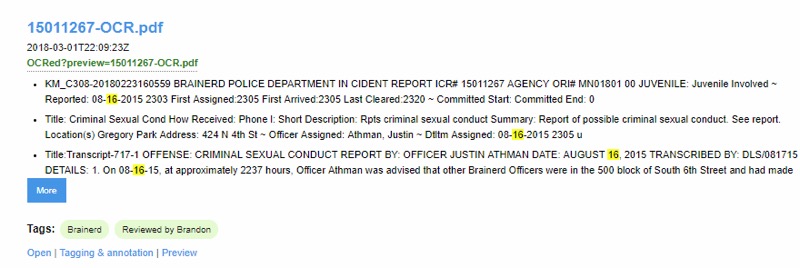
OpenSemantic tagging.
Next step: How to keep track of which police reports had already been read and which had not. I thought this was one of the most crucial steps, so we didn’t have people wasting their time reading a report that someone else had read and then entering the same case a second time into our database, which we’d created with Airtable.
To manage the workflow for this stage of the process, Chase Davis recommended we set up our own instance of the open source tool, Open Semantic Search. Open Semantic has several great qualities for managing PDFs, but the one I saw as the most beneficial is that you can add “tags” and then be able to filter to only documents with a particular tag.
Chase set up a script for Open Semantic to monitor the Dropbox directory, and every 15 minutes it indexed new files, plus tagged them as “Needs review.”
Team members simply had to go into Open Semantic and click on the “Needs review” tag to find documents that hadn’t yet been read. Once they found a new document, their first step was to tag that document as “Read by MaryJo” (we each had our own tag) and remove the “Needs review” tag so that others knew you were already working on that one. Clicking on the link to the document in Open Semantic launched it right from Dropbox.
This did fail a few times, resulting in two data entries for the same report. Most likely, multiple team members were reading reports at the same time and likely clicked on the same report before the “Needs review” tag got removed. But still, it proved to be an immensely useful step.
Data Entry With Airtable
For the data entry part, I initially thought we could use Google Forms. But it has one big limitation: It isn’t very easy to search for and edit existing records. You have to wade into the spreadsheet and traverse your way through many rows and columns to find the bit you want to edit.
Alan Palazzolo introduced me to Airtable. It allows you to set up a data entry form that’s even slicker than a Google Form, and then it also allows you to set up different “views” of your underlying data that make editing far easier.

AirTable data entry.
One view is a traditional spreadsheet look. Another is a “gallery” where you can have it display only certain fields, and each record is shown sort of like an index card. I also like “Kanban” where the records are again shown like mini index cards, but you can put them into groups based on a field in your data.
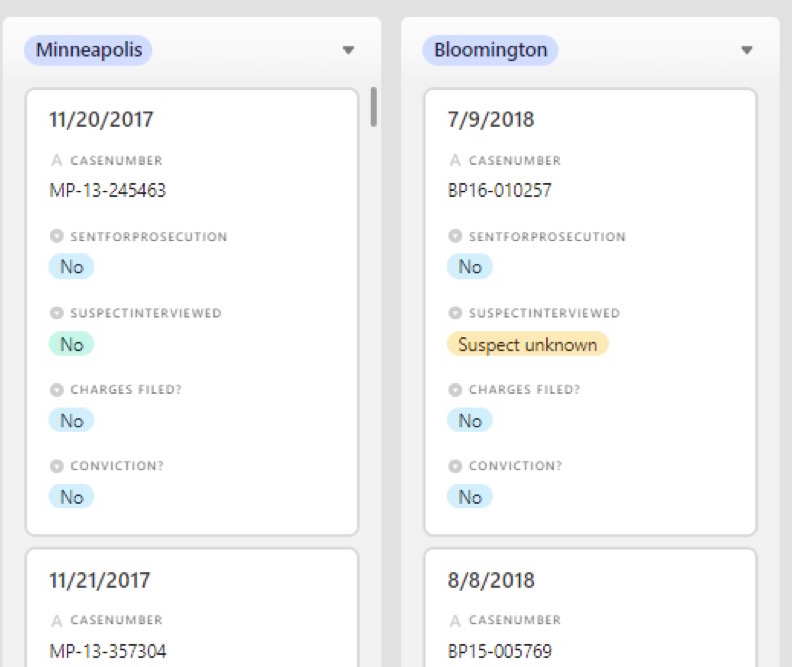
AirTable, Kanban view.
For any of these views you can turn on one or more filters, and it’s easy to click into a record and make any necessary edits. It also tracks edits and who made them.
The data entry form is easy to set up and has a lot of nice features that streamline data entry. If you have a field with a multiple-choice option, it shows each option in a different color. You can customize a field to be a number, or phone number, etc., and it doesn’t allow the user to put in an alternative option, which really helped with data standardization.
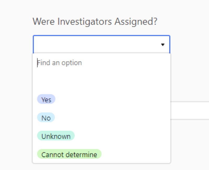
AirTable, pull down menu.
My one gripe with Airtable is that the data entry form page will refresh after some period of time and anything you’ve typed in will be lost. In other words, don’t get distracted by a phone call while you’re entering a record.
Each user within your Airtable account can have different permission levels, too. For example, some people might be restricted to only data entry and would be prohibited from adding or deleting fields.
Airtable has a free tier for up to 1,200 records per “base” (dataset), but we surpassed that and ended up paying the $20 per month, per user fee.
Tracking What We Wanted to Say
We also faced a challenge in figuring out what fields of information should be included in our dataset in Airtable. One of the reporters had started a spreadsheet tracking a few cases to get a feel for what he would find in the reports, so we started with that.
Then we also consulted experts and organizations, like the International Chiefs of Police, that had developed best practice guidelines regarding sexual assault investigations and document writing. This gave us an idea of what police officers were supposed to be doing and including in their reports.
Obviously there were basics to include: law enforcement agency name, case number, date reported, and incident date.
Then we sat and thought about what we wanted to be able to say as a result of our analysis. This was key in deciding what to include. For example, we knew we wanted to say “X percentage of cases were sent to prosecutors,” so we needed a field that said either “yes” it was sent to prosecutors or “no” it was not. (For this and many other fields, we found we needed an “unknown” option because the reports were often too incomplete). We used multiple choice— especially yes/no—options for as many fields as possible.
We ended up tweaking our database structure several times after trying to enter a few cases. And there were times where the reporters chimed in with suggestions of new things to track after coming across so many instances. Unfortunately, each change meant we had to go back through all the cases already entered and fill in the new field.
Clean, Analyze, Repeat
The next step was to set up a repeatable data cleaning and analysis process. A couple months before we set this up, I had started learning the R programming language (and the RStudio interface), and I quickly realized this would be the solution.
I wrote a script in R that pulled in the data from a comma-separated value file that I downloaded from Airtable, did some cleanup on it (such as dealing with null values), and recoded some of the variables as needed for my analysis.
The only hiccup in this was that I had to go into Airtable and launch a new download for each update. We looked into connecting with their API, but we found it is a bit limited and would have required significant work for us to be able to get all the data into R using it.
Showing Our Work
Then I set up RMarkdown pages showing my analysis results, either displayed as tables or charts (using ggplot). My R code included a snippet that pushed the HTML pages to an AWS server where my colleagues could see it.
I had one page that showed very high-level results, intended for top-level editors and sources that we interviewed for the story. And then I had a series of pages that were more detailed and focused on different topics that we were pursuing as potential stories.
The reporters and editors loved having these web pages full of results to pore over instead of trying to decipher Excel spreadsheets. It also saved me a ton of time because updating my analysis results was simply a matter of downloading new data from Airtable and pushing “run” in my R project.
Trusting the Process
My biggest regret is that we didn’t get this process set up fast enough. We got Airtable set up quickly, but we didn’t have the other pieces in place.
In the meantime, reporters were eager to get moving and had developed their own process for managing the inflow and reading of police reports. One of them begged me to let them continue with their old process—which involved a lot of emailing back and forth and moving files from one directory to another. But I pushed them into the new process.
A week or two later, the reluctant one sent me an email simply saying: “Thank you!”
Credits
-
 MaryJo Webster
MaryJo Webster, the data editor at the Minnesota Star Tribune, has been a data journalist for nearly 20 years. Previously, she has worked at USA TODAY, Digital First Media, St. Paul Pioneer Press, Center for Public Integrity and Investigative Reporters and Editors. She started her career as a reporter at small newspapers in Minnesota and Wisconsin.


