Features:
How We Made It: Your Hospital May Be Hazardous To Your Health
Frontline + ProPublica + Ocupop + one week

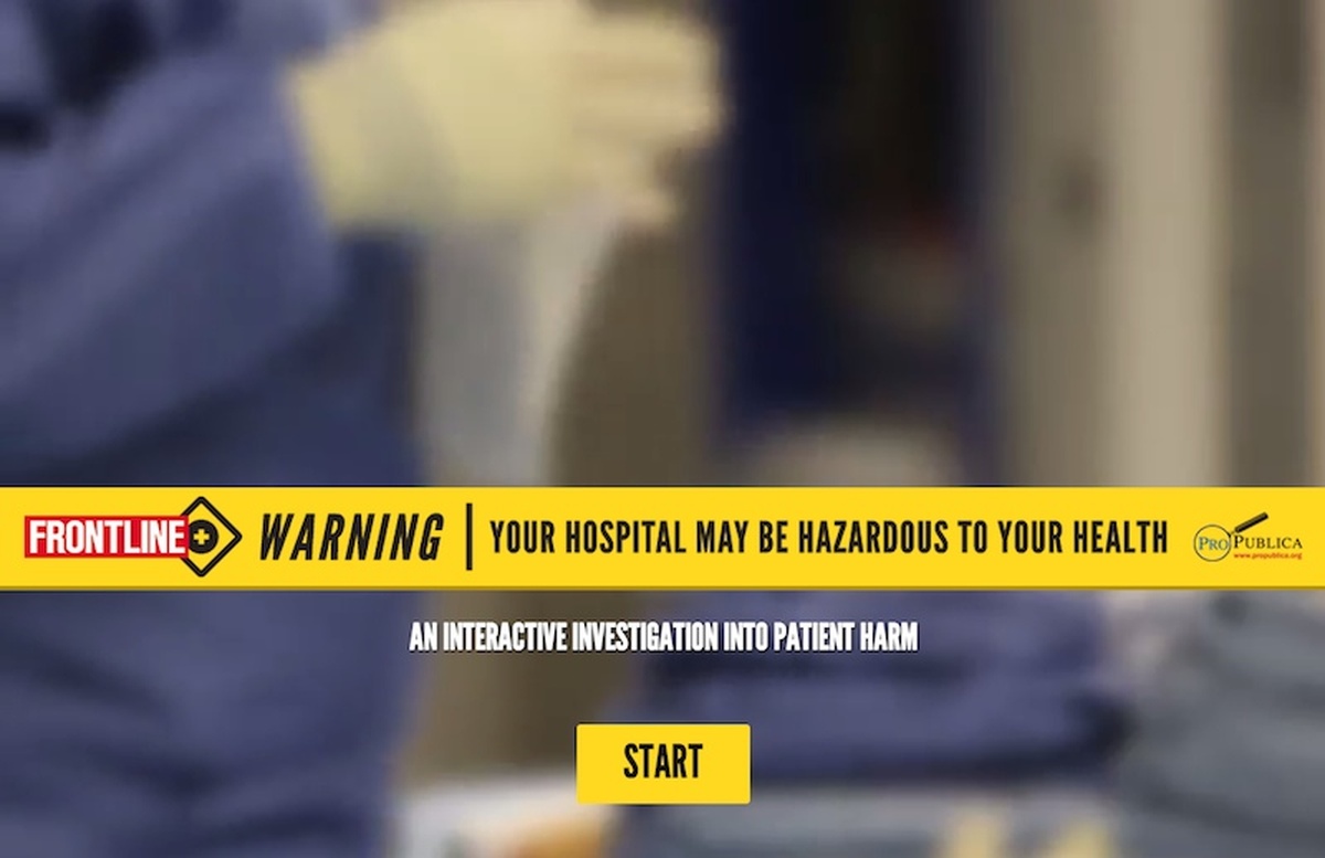
The entry point of Your Hospital May Be Hazardous to Your Health
Your Hospital May Be Hazardous to Your Health is an interactive web presentation on the widespread danger of in-hospital injury, featuring video, infographics, and a choose-your-own-adventure-style malpractice-lawsuit minigame. It was built in a single week at the Tribeca Hacks Storytelling Innovation Lab, in a collaboration between PBS Frontline, non-profit news organization ProPublica, and design agency Ocupop.
Frontline and ProPublica had previously worked together on A Perfect Terrorist: David Coleman Headley’s Web of Betrayal, built with design agency Secret Location over the course of a month after originally prototyping it at a Mozilla-led hack day.
For their next foray into interactive media, they took ProPublica’s ongoing research on patient safety and brought it to the Storytelling Innovation Lab, where they and several teams of documentarians were paired with web developers and designers. Their goals were ambitious—there would be even more interactivity and deeper information density—and it would finished by the end of the week.
Accidentally Agile

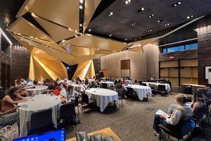
Our team at work
The extreme deadline meant that we had very little time where we were not all working together; we just didn’t have time for Big Design Up Front. We were constantly editing and reworking; the original narrative for the main video was thrown out by lunchtime on Day One and repeatedly rewritten by the whole team right up to its filming. (Even the title comes from a round of Google Docs shenanigans between myself and the art director, which also included “Hospitals: A Prescription for Death” and “Hospitals Are Just Graveyards.”)
Our organization (see full team credits) was like a single organism; every step necessarily involved each part of the team: the reporters fact-checked the producers, who storyboarded the animations with the designers, who sketched out the interactive segments with the developers, and so on. Artists and coders collaborated on the same SVG file; the former in Illustrator, the latter in a text editor.
These tight quarters were the secret to the success of this project. I’ve worked on “agile” projects before, but this was the first time I really got to experience the power of real-time collaboration. Being able to size up features as soon as they were proposed and explain alternative methods of conveying the same information both saved us from so many Simple Matters of Programming and freed us to create features that might not have even been considered otherwise.
We spent an incredible amount of time together that week; often after 12 hours at the hackathon workspace we would continue working throughout the night at the producers’ offices. By the final all-night push before the deadline, I was delirious from sleep deprivation and the staggering amounts of Diet Coke I had been drinking. And even in these last hours as we were scrambling to finish like contestants on Top Chef flinging ingredients onto the plate before the buzzer, we were still making copyedits, color-correcting video, and designing new graphics. We were still committing bugfixes at the hotel while getting dressed for the presentation at the Ford Foundation.
Putting the “Hack” in Hackathon

Doing all the things
Our project is not without its shortcomings. We faced a lot of the same challenges as one does with responsive design: both require a lot of abstract thinking about the separation of presentation from content, and designing in tools meant for delivering flattened assets—like Illustrator and Photoshop—can lead to flattened thinking. One of the greatest ways this project suffers is that the design and the content are so dependent on each other; it really only works in one viewport size, in modern browsers, and for fully sighted and hearing-capable users. (I wouldn’t be surprised if something breaks if you have the browser window zoomed.) While much of this was due to time constraints, the greater contributing factor is that we have not yet trained ourselves to design from the inside-out.
As a developer, I underestimated the level of interactivity we would need. Popcorn.js helped greatly with coordinating the interactive elements to the main video, and we acheived most of our visual effects either with CSS3 or rendered in the video itself with After Effects, but I didn’t realize until the project was done that we had really created a tiny app. As much as I love jQuery, there’s so much going on in these projects that they really need to be built with an app framework like Backbone or Angular.
And we should have built more tools and scaffolding as we progressed. It’s easy to dismiss that as unneccessary meta-work while under the time pressures of a hackathon, but we would have ended up saving time had I built something as simple as a set of visual debugger controls to keep track of and manipulate page state, so the other developers and I weren’t constantly fiddling in the console or navigating through the app again and again. Regardless, we definitely didn’t have the time to make a reusable product; we built only enough to get this one-off to function.
Tools for Thought

Interactive features appear inside the video
If we keep building these as one-offs, we’ll never be able to transcend what has been done before. We’re working on the cutting edge, which by definition means going down unexplored paths where convenient tools don’t yet exist. In order to progress further, we need to build those toools—not just to help us build these projects faster, but to give us the power to concieve of these projects in an entirely new way.
We’re already catching some glimpses of the future here; for example, see ScrollKit, infamously used to assemble an ersatz Snow Fall (faux-fall?) in an hour. But these tend to focus on the superficial trappings of interactive media; the future of journalism is not parallax-scrolling background images.
The tools we’re more sorely lacking are on the backend; we need content managemnet systems that aren’t just a reflection of 20th-century publishing. Today’s blog platforms are still in the “horseless carriage” stage; the platforms we are eventually building interactive content on will be completely alien to contemporary publishing systems.
Interactive articles and videos are only the first step. While this is technically still a living project—we’re still tracking bugs on Github—the content for this project is done. Yet the story doesn’t end here; ProPublica continues to study patient safety and members of their patient harm Facebook group are still sharing their experiences.
These kinds of projects could be timeless and immersive; not just stories, but worlds. To borrow the parlance of 1998, this could be a “portal” into an ever-expanding network of interactives, with continuous updates and additions. The tools we have now, however, are built for self-contained articles and hierarchical structures; the frameworks we need to build will draw as much from Wikipedia as they do WordPress.
Gaining from Reduction
The unifying idea of this project, much like its predecessor, A Perfect Terrorist, was that one could gain from reduction. We took what would have otherwise been an hour-long news show and instead made a three-minute video, with the opportunity to explore further with the interactive segments and copious footnotes. One can see the whole story in a glance, but closer examination reveals layers upon layers of finer detail.
Yet our current conversation about interactives like this project or Snow Fall misses this and focuses on the special effects and “high production values.” But the superficial aspects of this project are what will date it; when we reflect upon these we’ll instead realize that these are where journalistic storytelling finally embraced the nature of the web and replaced the flat with the fractal.
Credits
-
Justin Falcone
Avatar by @emilywithcurls


