Features:
How We Made Our School Segregation Interactive
A Q&A with Vox’s Alvin Chang

Our Q&A
Source: How did this project get started? And about how long did you spend on this piece, start to finish?
In the middle of 2017, I started a series with an overarching theme that the American education system is designed to entrench structural inequalities. The first piece I wrote was about the evolution of school segregation. Shortly after that piece was published, Tomas Monarrez, a UC Berkeley Economics PhD candidate, reached out to me and shared some of his work—and I was blown away.
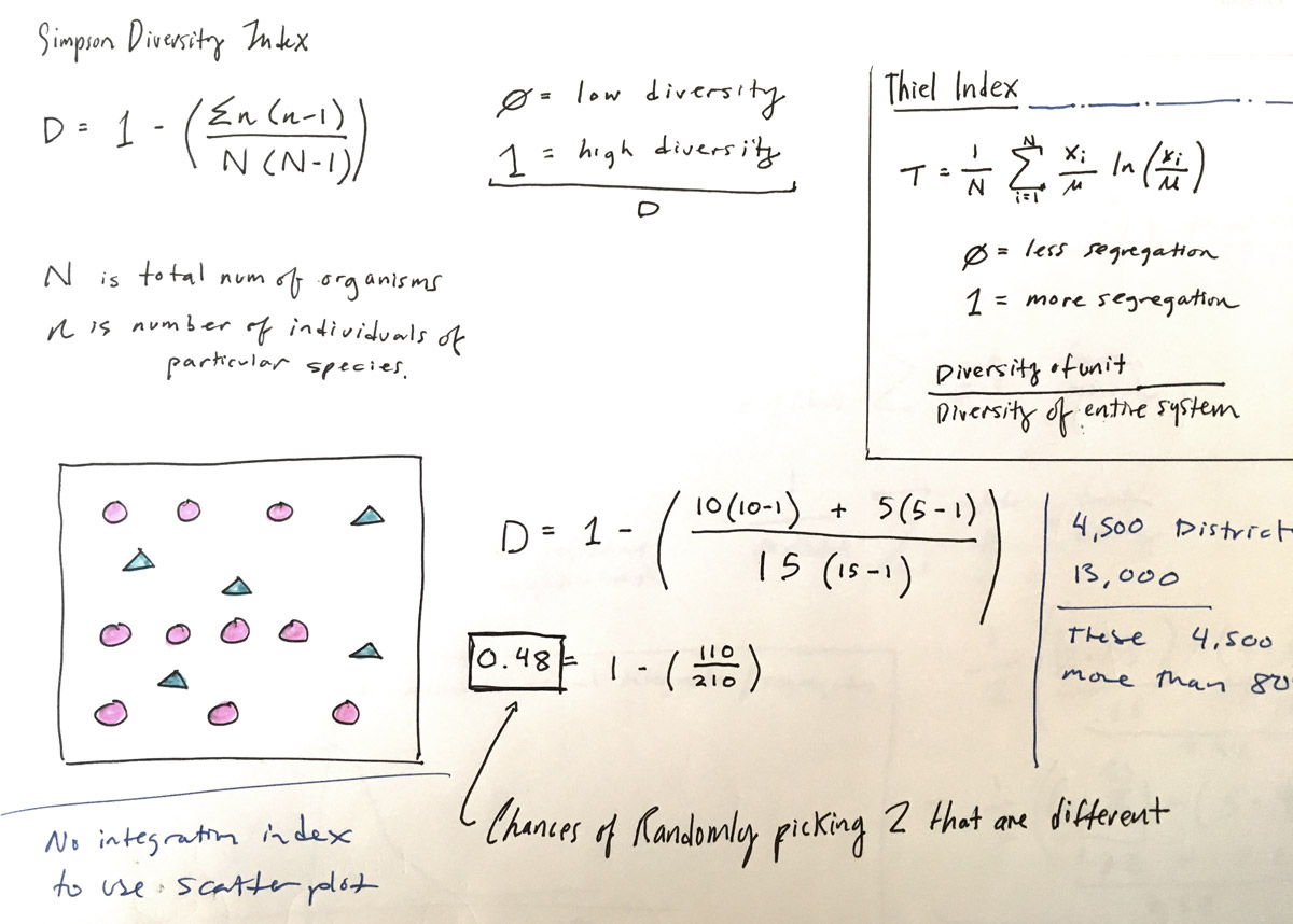
It’s often hard for people to figure out whether their school district perpetuates segregation, but Monarrez had built on some previous research to create a dataset that answered this exact question. I had an initial conversation with Monarrez in August, with the promise that I would reach back out to him when I was ready to work on this piece. In early December, we had another phone call and created a plan to move forward. And from there, it took about a month, on and off, to get to the finish line.
This obviously doesn’t take into account the massive amount of time and effort on Monarrez’s part, as well as the massive amount of innovation and time from previous researchers who made this possible. I feel as if I’m merely bringing some of this incredible research to light. (I want to add high up that Monarrez is currently on the job market!)
Math sketching (Alvin Chang)
Source: Can you talk a bit about how you and Monarrez collaborated through the project’s development, process-wise?
Monarrez first sent me the data files for three districts. From there, I wrote a script to convert the files to the correct format (since I would have to do this eventually for all districts) and then started creating the front-end storytelling component. Once I had something for Monarrez to look at, I sent him the visual, and it really helped him see the vision for the project. From there, he sent me the rest of the districts.
It took a few back-and-forths to clean up the data correctly. Much of it was writing scripts and waiting for data to be churned through our computers. I’m really grateful that Monarrez was willing to work with me on this, because it wasn’t trivial work.
Working with the Data
Source: Could you tell us a bit about this data and some of its quirks? For example, one of our colleagues noticed that his local school district was not a selectable option, but many smaller outlying districts nearby were available. What’s going on there?
It wasn’t until recently that we could really analyze school attendance zones, because comprehensive data didn’t exist. It was Sal Saporito at the College of William and Mary who first started chipping away at this almost two decades ago, and eventually the feds worked with him to create their own dataset using data that is self-reported by districts.
So this answers the question about the missing districts. It’s likely that they didn’t submit their district bounds to this survey. (You should bug your districts to submit!)
Source: How did you generate the “nearest school” versions of the attendance zones, for comparison?
The idea of generating the “nearest school” in order to get a baseline was first used by SMU’s Meredith Richards in a 2014 paper. Monarrez then used a similar method for his analysis. It’s a matter of looking at every Census block and figuring out which is the closest school.
Like I said, so much of this is bringing this incredible work to light and providing the context that helps people understand the importance of what they’re looking at. This was a wonderful collaboration in that Monarrez and I were able to speak a similar language in talking about both the technical and substantive aspects of this project.
Source: If a reader’s school district turns out to be less segregated because of their school zone’s boundaries, there’s not a ton of information about that. Can you talk a little about how you handled those choices?
I think there’s a temptation to set the bar at, “Does my district make the underlying residential segregation better?” That’s a terribly low bar. Even in districts that reduce segregation, there’s often still quite a lot of segregation. So, yes, I do want the reader to see that their districts are zoning to reduce segregation—and how that’s being done. But didn’t want the takeaway to be, “Well, our job here is done.” I think all of the arguments about districts perpetuating or exacerbating segregation still stand for other districts.
Framing the Data
Source: There are two major arguments that weave in and out of this piece. The first is about the makeup of school populations—which is what we expected to see when we started reading—and the second is about how neighborhoods got segregated to begin with, and how they stayed that way. Was it challenging to decide how much context to include?
In order to have productive conversations about exclusion and discrimination, we need to have a shared and accurate history. That’s why I think it’s crucial to talk about the underlying housing segregation and how they were socially engineered by racist American policies, as well as the court cases that have helped entrench the segregation in schools. If you didn’t have the proper context, this changes the meaning of what you see in the maps of your neighborhood. So that context is the story, and the maps of your neighborhood are merely adding to this timeline.
Source: How did you decide when to bring in the cartoon illustrations to break concepts/maps/data down more simply?
I think of the cartoons in two forms. One kind of cartoon is a teaching tool—essentially, a fancy diagram. They help give a spatial element, in cartoon form, to what are spatial concepts. Secondly, I think of cartoons as telling a corollary story; the characters in these cartoons often have their own mini storyline, their own personalities, and their own conflicts. Scott McCloud, author of the indispensable book Understanding Comics, talks about different ways in which pictures and words can interact. And I often opt for the “parallel” technique, where the pictures and words follow a different path without intersecting too much, but hint at the same theme from similar angles.
All of these things end up melding at certain points in the piece, but the ultimate goal is to help readers be critical, yet empathetic, learners. That’s what I strive to be as a journalist—which involves being a professional learner—and I want to impart that to those who take the time to read my work.
Source: What advice would you give to others in newsrooms, who are thinking of working with someone in academia? Do you have any thoughts on collaborating across institutions, building trust, or parsing each others’ work?
I think it’s crucial for journalists to be respectful of an academic’s work. If a researcher works years to conduct a rigorous piece of research and write a comprehensive paper, it’s important for journalists to read that paper and spend the time to understand what it’s saying. I spend a lot of time watching YouTube videos of lectures to learn about the various concepts researchers use in their papers. I think it’s disrespectful to not make that effort.
I think it also makes us better journalists. When we talk with academics, it allows us to ask the right questions, to tell the right stories, and to speak the same language. These are the building blocks of trust.
Credits
-
 Alvin Chang
I’m a senior graphics reporter at Vox, covering policy and politics with data, charts, and cartoons. I’ve also been a data journalist at the Boston Globe, Connecticut Mirror, and ESPN, and I have a master’s degree from NYU’s Interactive Telecommunications Program.
-
 Erin Kissane
Editor, Source, 2012-2018.


