Features:
How We Made the Washington Post Eclipse-Scroller
Google Maps, lots of layers, giant images, lazy loading, and two rubber bands

The idea for our eclipse-shadow project was loosely inspired by Josh Begley’s Google Maps border wall video that went viral last fall. With the coming eclipse, we wanted to build a very detailed map of the parts of America that would experience totality. We also wanted to show what the shadow of the eclipse would look like as it traversed the country.
We started with the idea of displaying pure satellite data from services like Landsat or Sentinel. After tinkering with the imagery, we landed on using Google Earth imagery with layers of shaded relief and detailed hydrography, as well as USGS land cover data in order to build a high-resolution atlas-style presentation. We also decided that we would label as many locations and landmarks along the path as possible. Very early on, we experimented with different ways to get a long, straight image that would serve as our map. After some small-scale exercises, we settled on our method: taking dozens of screenshots from Google Earth and then stitching them together.
Why screenshots and Google Earth? Because that was the simplest and easiest way to create the basemap imagery.
Building the Basemap
First, we downloaded several 90-meter USGS digital elevation files from Derek Watkins’ SRTM Tile Grabber. We merged these DEM (Digital Elevation Model) files and then converted them to grayscale shaded relief files. We used this shaded relief to synchronize the highlights and shadows on the terrain throughout the piece. In the past, we’ve used shaded relief on top of satellite imagery to add depth and dimension. We also tweaked the land cover data to have a more subtle and natural color profile. We exported all of these raster files from QGIS as separate geoTIFFs.
Because this is such a large map, we knew we needed to optimize our data as much as possible. We downloaded some eclipse-path shapefiles from NASA and expanded the shape by about 30 miles to create a buffer around the path of totality. Using GDAL, we used that buffer as a clipping path to restrict all our raster imagery to just the areas we were displaying.
gdalwarp -cutline clipping_polygon.shp INPUT.tif OUTPUT.tifWe ended up using this same concept to clip some of the high-detail vector layers—such as highways, roads, rivers, and water features—as well.
ogr2ogr -clipsrc clipping_polygon.shp OUTPUT.shp INPUT.shpNice and tidy, right? Yes, but the files were still huge, and Google Earth didn’t play nicely with them. We tried importing the clipped geoTIFFs several times, each time crashing the program. So we had to trim them each further. We opted to create a vector grid in QGIS and split the large eclipse strip into six segments. (We could have also split them by state borders.)
Once we chunked the images, we combined them in Photoshop. Here is what our basemap file layers looked like:
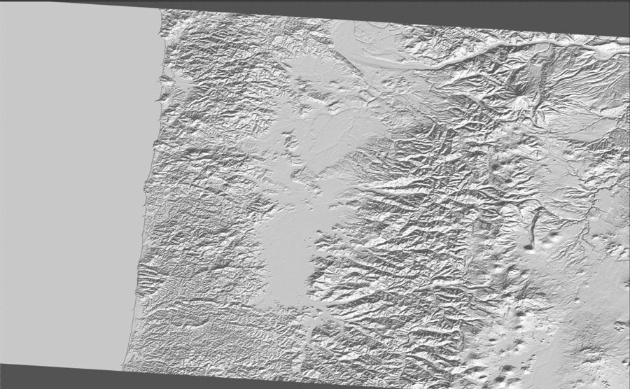
Relief
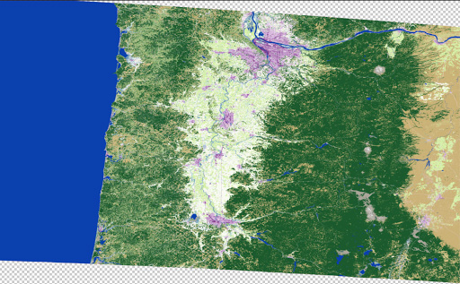
Land cover

Result after some toning.
Since we had six pieces of the eclipse path, we had to make sure we toned each slice exactly the same way so they would seamlessly align.
Then, we saved the resulting images as geoTIFFs. An important note: this only works if you have the Geographic Imager Photoshop software plugin. This will maintain the geographic properties of the geoTIFF. Using Photoshop without that plugin will wipe out these properties, and the file will not have any geographic awareness.
Next, we imported our styled raster files into Google Earth and adjusted transparency to make them look good with the underlying imagery. Then, we imported vector layers (streets, etc) and adjusted styles to make them look good. Next we brought in the umbra path and adjusted the transparency to be barely visible—this was the guide to help us stay on track and follow the path of the eclipse.
The Capture
We turned off all the normal Google Earth layers, like cities, roads, etc. We left state borders on but styled them to be very subtle so that we could use them as a reference in future steps. Then we expanded Google Earth to be full-screen, and turned off sidebar panels. We lined up the path of the umbra and made sure it was as close to vertical as possible, then used rubber bands stretched around the monitor to keep ourselves on track and to ensure that we kept the same amount of space on either side of the eclipse path.
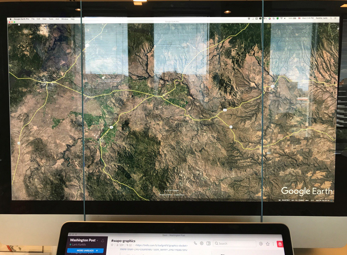
We took screenshots of the full window, using command+shift+4+space. This saved the screenshots as a PNG file on our desktop. Then, we slowly moved the page down. We kept capturing screenshots of the full screen, moving slowly between each, making sure there was plenty of overlap between screenshots until we got to the other side of the country. This overlap would make it possible for us to merge the screenshots together smoothly.
The Merge
In Photoshop, we opened one of the screenshots. I created a new Photoshop action and started recording as I cropped the screenshot, making sure to crop out any toolbars or navigation elements that came through with the screenshot. Since all the images were captured in the same way, I was able to run this action in an automated batch and ended up with all my images cropped to the same dimensions. As part of the action, I saved the cropped versions into a new folder.
We took these newly cropped images and stitched them using Photoshop’s Photomerge tool. This step took a while, but eventually lined them up pretty well because we made sure to have substantial overlap of each image while capturing. There were a few places that didn’t automatically line up perfectly, but we were able to adjust the layer masks correct them. You may also need to go back to Google Earth and retake a few screenshots if you find substantial holes (we had to do this once or twice).
At this point, we had a very tall, long, stitched image. We made sure there were no seams or other defects before we went any further, then we flattened the whole thing. Once flattened, we straightened the angle of the eclipse path. It (very subtly) drifted to the left, so we skewed the entire file by a degree or two to make the path as straight as possible (when viewed over the entire width of the country, we determined that the skew wasn’t noticeable enough to really matter). Next, we split the image into thirds because it was too tall to fit into a single Illustrator document (Illustrator was literally like “nope, this is too big”). These panels were what we imported into Illustrator.
In Illustrator, we modified our standard ai2html template to accommodate the larger image size. I imported the first panel into Illustrator and scaled it down until the width fit in my largest artboard, at 1180px wide. Now, we had to expand the artboard to fit the image so that all the art would be rendered when we ran the script. Instead of expanding a single artboard to fit the image, which would be several thousand pixels tall and a very large file size, we made many artboards for each panel. For example, the largest panel has 21 artboards that are 1180px wide and only 500px tall.
The trick to making these work is to make sure that they are exactly lined up. When one ends, the next must start at the very next pixel. At this point, all the artboards are butted up against each other and named appropriately. Some simple CSS modifications ensure that all artboards have no margins and appear/disappear at the proper breakpoints. A little more CSS allows the three individual panels to butt up against eachother without any gaps.

Each of the largest artboards are only 500px tall. There are 21 of them. The red box is one artboard.
In Illustrator, we added state borders for national parks, forests, military bases and Indian reservations. In order to make that job a little easier, we exported a map from QGIS using the
Europe_Albers_Equal_Area_Conic projection, which gave us a roughly straight eclipse path that was mostly vertical. From then, it was a matter of manually transforming the polygons until they aligned with the existing geographic waypoints in the background file.
Since the background image was not georeferenced at all (remember, it was built from screenshots), there wasn’t any way to automatically align anything, but we used the state boundaries that were left on during the screenshots as reference points. Since the state borders were so light in the background image, our new borders covered them up completely.

Our nearly vertical path.
Labeling was done by hand. Using shapefiles in our GIS library, we built a makeshift atlas in QGIS, making sure that we labeled all the features. We labeled national parks, forests, mountain ranges, peaks, rivers, water bodies, cities, states, and major roads. We followed the path and printed out 37 pages worth of labels, then painstakingly labeled and confirmed each point.
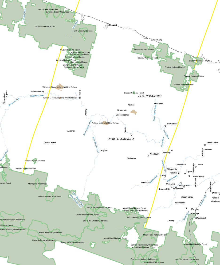
Here is a simplified view of an area near the Oregon coast (land cover background removed for readability).

Here is how the printed atlas looked. This is also in central Oregon.
Once the largest sized artboards were given a thumbs up by the copyeditors, we copied and scaled everything down to fit smaller screens. We removed features as the screen size decreased to maintain legibility.
Next, we ran the ai2html script, which flattened all the artwork and rendered all the text elements in HTML text. The script, which completes in seconds for a normal file took nearly 15 minutes to process every time we ran it.
Front-End Production
Once we got the images on the page, we thought about what other context we could provide. We knew we needed some sort of minimap that showed you where you were in the overall path of the eclipse, but we also wanted it to be a kind of tour, pointing out interesting places as you rode our magic eclipse bus across the country. Bonnie Berkowitz found a number of gems in the eclipse path, including “Carhenge” in Nebraska and the Danish Baker in Dannebrog, Neb., where the owner who is neither Danish nor (primarily) a baker will be selling his famous pizza slices the day of the eclipse (but not during it, because he’ll be watching).
Because the images weren’t georeferenced, we again ran into the issue of needing to know where you are on the page. Luckily, since this was a linear experience that was almost exactly the same length in all viewports (give or take some pixel rounding) we could calculate the scroll distance of the user’s position from the top of the images as a percent of the total height of the images to determine where you are at a given time. We used this to determine where the tour notes would go, how to update the shape of the umbra, and where to place the dot of the minimap. When the user scrolled, we calculated and updated the percent and flowed that into the various elements on the page.
To manage such a heavily scroll-based interactive, we used a combination of scrollMonitor, a JavaScript library that sets and controls various “watchers” on HTML elements, and manually triggered and throttled scroll event listeners.
Updating the dot representing your current position on the minimap was fairly easy—we simply used the percent of how far you’ve scrolled compared to the total length of the eclipse, multiplied that length vs.
the total length of the SVG path element that served as the total length of the eclipse and used the
.getPointAtLength() method of an SVG path to get the coordinates for that point.
You can also click on the minimap though, and that was more complicated, since the map then auto-scrolls you to a certain point. We used D3’s tween and
interpolate functions to animate the scroll of the window and the minimap between your current position and where you clicked.
To mimic the shape of the umbra in the graphic, we first added the umbra shape at five-minute intervals into the ai2html file by importing NASA data and manually georeferencing them.
Then, we created a fixed position div on top of the images and used the browser inspector to change the CSS of the div—specifically height, width, left position, and transform skew—to match it up as best as possible to the baked-in shape of the umbra. Keeping these CSS values in stored in a JSON, we could then trigger the CSS values with scroll at the appropriate locations along the path. Once the values were collected, we removed the umbra shapes from the ai2html files and re-ran the script.
Lazy Loading
As mentioned above, a single ai2html file was 21 images. Multiply this by the three files that made up the total path of the eclipse, and you have a major image load problem on your hands—the image files alone could be 30MB or more on a desktop!
We knew lazy loading the images would have to be part of the solution, and ai2html does have an option to output files prepped for lazy loading with lazyload.js, but the image files were still big enough that we didn’t want the flash of a transparent placeholder gif being replaced with our high-res jpeg. Instead, we saved each image file as a 100px thumbnail (each of which was < 10kb,) and also saved the full-resolution images as progressive JPEGs. This created the effect of a blurred terrain that snapped into focus as the image was loaded, and also has the added effect of providing a low-res detail of the terrain if you’re scrubbing back and forth quickly across the interactive.
Takeaways
This project came to us from a free-for-all brainstorming session earlier in the year and it was something we kicked around in our free time. It wasn’t until we started building it, piece by piece, that we realized just how it would all come together (and we didn’t see the light at the end of the tunnel until we were actually there). We affectionately refer to the project as a “stack of hacks” because it’s so loosely held together–one change in the way we captured the screenshots, or how we set up the Illustrator files or how we structured the code could have brought the entire thing to a halt. As we built, we encountered problems (holy crap these images are huge!) and we came up with solutions (we’ll lazy load them!), which then created more problems (the placeholder gif is throwing the placement of our markers off) which led to more solutions (let’s make super low-res placeholders instead).
We took chances and tried new ideas. We dared to suck but ended up with a project that was pretty cool.
Organizations
Credits
-
Bonnie Berkowitz
Washington Post graphics reporter. Lover of science and running and pretty much anything that combines the two.
-
 Armand Emamdjomeh
Armand Emamdjomeh is a graphics reporter at The Washington Post. Prior to joining the Post, he was the Deputy Director of Data Visualization at the Los Angeles Times, and also worked on the L.A. Times Data Desk.
-
Laris Karklis
Mapping for the Graphics Department at the Washington Post!!!
-
 Denise Lu
Graphics reporter at The Washington Post.
-
 Tim Meko
Tim Meko designs and develops maps, data visualizations, and explanatory graphics. Before coming to the Post he led the visuals team at the Urban Institute and was an infographics artist at the Columbus Dispatch.


