Features:
How We Made “The Year in Push Alerts”
Miniaturizing the experience of the news since Inauguration Day

A few weeks ago, Slate published a year-in-push-alerts feature that captured much of the sense of escalating anxiety and unreality produced by the last year in breaking news. Naturally, we wanted to know how they did it, and the team graciously agreed to share their process with us. —eds.
Introduction—Laura Bennett, Features Editor
As the anniversary of Trump’s election approached, we knew we wanted to tell the story of what it was like to live through this year’s breakneck, assaultive, anxiety-inducing, occasionally exhilarating news cycle—and we realized that we might be able to do this using push alerts as a framing. We realized that, though, when there were only a few months left in the year, and we hadn’t collected any data. So we reached out to the New York Times. Generously, they agreed to send us an archive of all their alerts. (The Washington Post also sent us their alerts, which we used elsewhere in the package.)
We wanted there to be a prominent interactive, but it was tricky to design: It had to be legible and interesting while still conveying the chaos and invasiveness of a billion text bubbles blaring “breaking news!” In addition to the interactive, we assigned a series of short essays about the news onslaught. CNN commentator Bakari Sellers wrote about being a black TV pundit called on over and over again to discuss the president’s racism on TV. Reihan Salam, a conservative critic, bemoaned the stifling effect that this year has had on intellectual debate. Leon Neyfakh reported a piece on the plight of self-described “news addicts” who found their lives so consumed by reading the news that they could hardly focus on their jobs. Stephen Sestanovich reflected on the arc of the Russia scandal by close-reading every single Russia-related alert from the Times and the Post. Dahlia Lithwick wrote movingly about covering the criminal justice system at a time when it felt like both the law and journalism were under threat.
Overall, we set out to capture the overwhelming feeling of being relentlessly pelted with “breaking news”—while also giving readers the context and analysis to help them process this unprecedented year.
Building the Interactive—Andrew Kahn, Assistant Interactives Editor
As Laura indicates, we wanted to make an interactive animation that struck a balance between chaos and order. The usual Tuftean rules about clarity and concision in presentation didn’t apply because those weren’t our only priorities.
One thing I ought to note: We decided early on that it didn’t make sense to develop a mobile version of this interactive, as we do for all our other interactives. That’s because this interactive aimed to take an experience, push alerts, that had originally been mobile—and zoom out. Any animation we made for mobile devices would just feel like an ersatz of the original. The mobile version of the package includes the full text of the essays and a video made by our video team with a handpicked selection of alerts.
The Idea of the “Miniature”
Data, as a rule, is valued for its aggregate properties. People collect and organize observations in the hope that those observations will reveal previously unseen relationships: to time, to space, to each other. Most data visualizations, including most of mine, emphasize relationships. Many of them also provide access to the underlying observations as a secondary feature: “Mouse over a point to see more details.”
Once in a while, when you have a special dataset and a lucky idea, it’s possible to make something closer to the observation end and further from the relationship end of the spectrum. Such a thing cannot tell the complete story of every datum, nor can it convey a complex abstraction. What it can do is compress vast tracts of space or time, and their contents, into one human-sized experience: a miniature. If the data concern past events, the miniature is a sort of historical reenactment. Though it may not assert an intellectually rigorous synthesis, it can suggest, on a sensory level, order emerging from chaos—in which case it might feel like watching a dance or a stampede.
Datasets conducive to “miniaturization” are rare. The observations must be totally granular, essentially complete, and immediately interesting to everybody. Two out of three is easy. Government data is often complete and sometimes interesting, but the kind that’s public is usually not granular: It will tell you how many murders occurred in a given year in a given city, but not much about them. There are plenty of academic datasets that are complete and granular but uninteresting to the average reader, who won’t look at a census of the potsherds of colonial Williamsburg—no matter how comprehensive—without a very persuasive invitation. And a collection of granular observations that is interesting but incomplete is called a newspaper.
Before the push alert project, all of the datasets I had been able to miniaturize were academic. “The Atlantic Slave Trade in Two Minutes,” published in 2015, uses data collected over a fifty-year period to show the voyages of 15,790 slave ships between 1545 and 1860. Each ship is represented by a black dot, sized according to the number of captives aboard, and follows the arcs of the trips recorded in the dataset. The flow of vessels starts as a trickle, swells to a torrent, and finally tapers off.
The design concept here was apparent as soon as I encountered the dataset. The most important feature of each voyage was its trajectory, over time, in space—which could be conveyed in very few pixels, just a dot moving along a path. (Tooltips gave more detailed information.) The push alerts, on the other hand, resisted shrinking: Their significance lay in the text, which wasn’t readable if was too small or if it vanished too quickly.
Still, we did need to compress the experience we were simulating—a year’s worth of breaking news—and we wanted to. We considered it a positive if the reader felt overloaded. The main question of the design process, then, was how to balance readability and dynamism. We also wanted to give users the right amount of control over the experience, enough that they could navigate the animation but not so much that they could tame it.
It took us a few tries to find something that worked.
Choreographing the Animation: Take 1
When we first started designing the animation, we imagined it wouldn’t run longer than a few minutes. Since we had so little time to work with, we had to be frugal with space. The alerts, luckily, had no spatial data attached to them, just timestamps, so we could position them wherever there was room on the screen.
Our first prototype smushed the year into three minutes. Each alert faded in—in a random position—at its designated moment, lingered for a few seconds, then faded away. Words that showed up in multiple visible alerts were highlighted. (No effort was made, in this rough sketch, to prevent overlaps.)

This idea didn’t quite work. It was nebulous in space and smeared the alerts across time. We wanted something that would evoke that old push-alert feeling: Every day is a crisis, and it’s unfolding in my pocket. I made another version that, instead of splattering the alerts across the screen, slotted them randomly into individual “phones” (represented here by the thick rectangles).
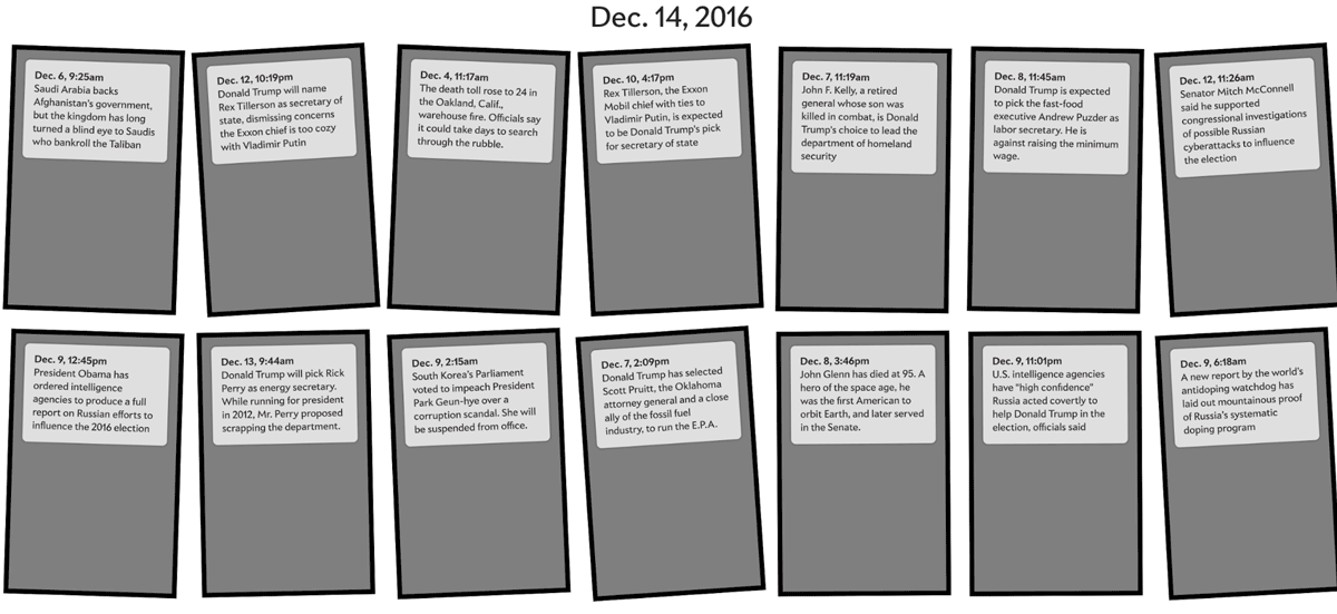
This didn’t do it for us either, largely because it suggested a nonsensical visual metaphor: Were these supposed to represent actual phones and, if so, why were they all getting different batches of alerts?
Choreographing the Animation: Take 2
For the next experiment, we decided to discard our time constraint and let the animation play out more slowly. The horizontal dimension of the animation became a sort of scrolling timeline, with each alert sliding into view as its moment arrived, like a musical note on a piano roll.
One upside of this design was that it showed the sequence and pace of alerts pretty clearly. The rhythm of the news was visualized in space. The major downside was that many of the alerts overlapped, particularly at the beginning of the animation, which dealt with the election and its aftermath. We could stretch out the time axis to solve this problem, but then we would have to prolong the animation even further or scroll it along more quickly.
And it still wasn’t capturing the bumpy subjective experience of the news cycle.
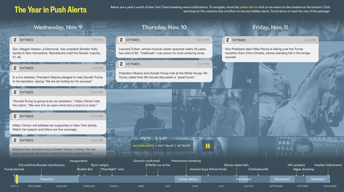
Choreographing the Animation: Final Take
We got it on our third try, with an assist from our design director Jason Santa Maria. Jason suggested grouping the alerts into columns by day. As each column made its way across the screen, the corresponding day’s alerts would unfurl. The columns resembled phone screens, but not in the literalistic way that had gotten us into trouble before. (We also prototyped a timeline, to be used for navigation, and a few other controls—speed-up and slow-down buttons, alert filters. Those aren’t shown here.)
This design finally captured the experience we cared about: a new volley, almost every day, of catastrophes and maybe-catastrophes, and the mental chore of having to pick out the truly important ones. The major disadvantage of this layout was that busy days—long columns—would get cut off. I ultimately built a feature that let users drag hidden alerts back into view, but we were comfortable letting them slip away by default. That was part of the fun.
Styling the Animation—Holly Allen, Web Designer
For the overall look of this piece, we wanted to tap into the visuals of literal push alerts because they are instantly identifiable, of course. The sheer volume of them is overwhelming, which is just what we wanted.
In the interactive, we opted to pepper the background with notable news images from the year in various sizes of blocks to correspond with the chaotic rhythm of the push alerts. The soothing blue tint was added to take the focus off the imagery and keep it on the actual notifications.
The timeline at the bottom of the interactive fit a lot of content into the tiniest of spaces. The combination of “event” dots and “era” bars ended up successfully showcasing the year’s news in context and at a glance—and the visual joke of Anthony “The Mooch” Scaramucci’s nickname name being longer than his era still makes me laugh.
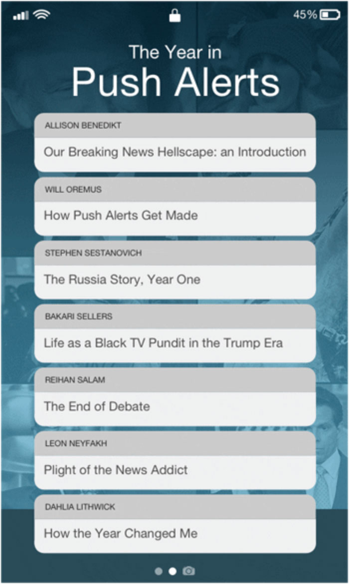
We repeated the push alert motif in the internal navigation for the package, which doubles as our table of contents, placing the title of each essay into its own notification bubble surrounded by the familiar environment of an iPhone screen. We even added a little Easter egg, setting the battery power to 45%, as a nod to the POTUS.
Coding the Interactive—Andrew Kahn
I built the interactive using vue-cli, a scaffolding tool for Vue.js projects. (The scaffold I used was a customized version of vue-cli’s default Webpack template.) The interactive as a whole is one Vue component with two subcomponents: the main animation and the timeline at the bottom. The timeline is a bunch of SVG elements rendered using D3 and, since I was already loading D3 to draw the timeline, I used it throughout the interactive.
The overarching component serves as a kind of event bus for the animation and the timeline, which need to update in tandem as simulated time ticks by. A D3 scale converts between real time and simulated time, and vice versa, and the current simulated time is shared with each subcomponent as a Vue prop. To keep track of the real time elapsed, I used a D3 timer, which is more respectful of computational limits than setInterval.
The animation itself uses an additional D3 scale to shuffle the columns along as time passes. That scale converts between simulated time and horizontal space. The scale updates whenever the timer ticks, as do the columns, each of which is bound to the date it represents and positioned according to the scale. Each column must be showing all of its alerts by the time it has traversed a quarter of the screen.
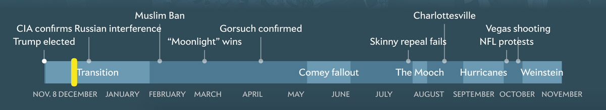
It was tricky to position the labels on the timeline, which designate key news events (like the Vegas shooting) and periods (like the presidential transition). I took two measures to prevent overlap while showing as many labels as possible. First, I randomly assigned each label to one of three vertical positions. Second, I checked each pair of labels for a collision and, if there was one, hid the less important of the pair. In order to do that, it was necessary to rank all of the labels by importance. Here’s how the timeline renders at my screen’s full width:
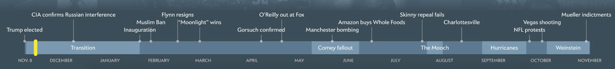
…at a narrower width:
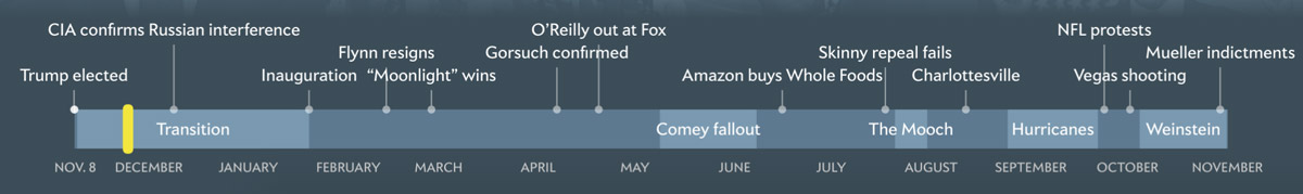
…and at the narrowest width the interactive allows:
Conclusion
Our goal with this interactive was to reawaken a feeling—dread—that many of us had experienced repeatedly throughout the year. That dread had sharpened and softened as we lost our senses of scale, of importance and of time. As my colleague Ben Mathis-Lilley had written in May, “Time is dilating, just like Einstein said it could, as each moment is filled with more and more Trump news. Everything feels like it happened forever ago.”
We hoped that by miniaturizing the year’s chaos we could restore some of the perspective that had been lost—and maybe guide our readers to some insights about how media technologies were shaping their lives.
Credits
-
 Holly Allen
Holly Allen is a web designer at Slate.
-
 Laura Bennett
Laura Bennett is features director of Slate.
-
 Andrew Kahn
Andrew Kahn is the assistant interactives editor at Slate.


