Features:
Mapping Made Simple, Now with Bonus UI
Simple Map D3 + Tulip = Easy Data-Driven Choropleth Maps
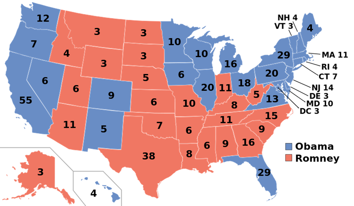
A choropleth map of 2012 US Presidential Election results (Wikipedia)
When many people think of mapping on the web, they imagine something like Google Maps. These “slippy map” interfaces let you explore huge sets of images, known as tiles, almost limitlessly. But you don’t always need a this functionality to highlight a geographic area; sometimes you want to tell a simple, specific story with geographical data.
Choropleth maps are a common way to do just that. For instance, the map above is a look at the 2012 presidential election vote by the electoral college.
You can create this style of map using a tool like Leaflet or Google Maps, but they have drawbacks. Changing the map projection can be difficult, and the street-level basemap can be distracting. There’s also a problem with map projections: the Web Mercator projection—a common default for tools and libraries like Google Maps and Leaflet—preserves geographical direction, but does not preserve area. This presents itself as the Greenland problem. In order to represent data accurately on a choropleth map, ensuring that area is preserved is very important.
The popular data visualization library D3.js offers a great alternative for creating data-driven choropleth maps. It also has excellent functionality for handling different map projections.
At the end of last year, following the horrible incident at Sandy Hook Elementary, the MinnPost data team wanted to do an infographic piece about guns in Minnesota. Part of the project involved creating a simple map about permits to carry in Minnesota counties. We built this in D3 because of its excellent geographical functions and the ability to make the map a bit interactive (namely, tooltips).
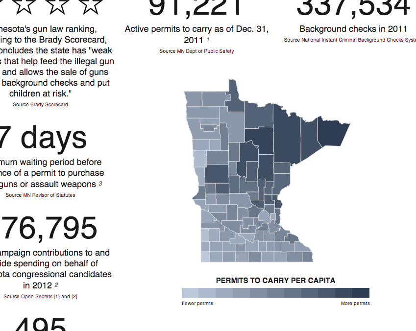
Minnesota gun data choropleth map
While working on that project, I encountered some of the complexities of mapping with D3.js—complexities that inspired me to create a tool that would make the process easier.
Simple Map D3 is born
I started working on Simple Map D3, a JavaScript library aimed at making choropleth-style maps in D3 as easy as possible. At the bare minimum, you give it a container (DOM element) and a data source (GeoJSON or TopoJSON) and you are all set.
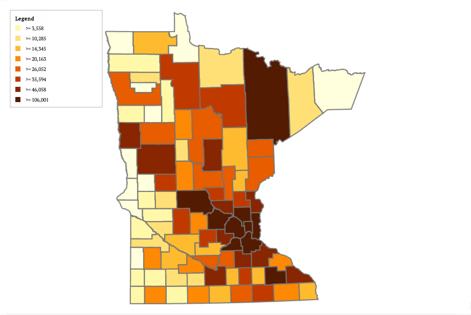
A Minnesota population choropleth map created with Simple Map D3
There are many options that allow you to customize the map. Simple Map will take a property in your data file and color the map accordingly, allowing you to use ColorBrewer colors or your own color set; it will also add graticule lines and create a legend, and has many other nice features.
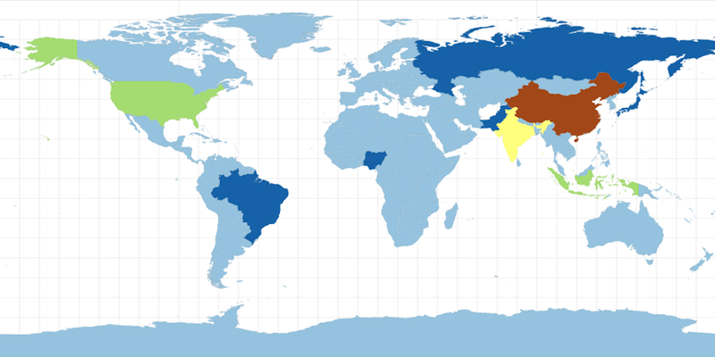
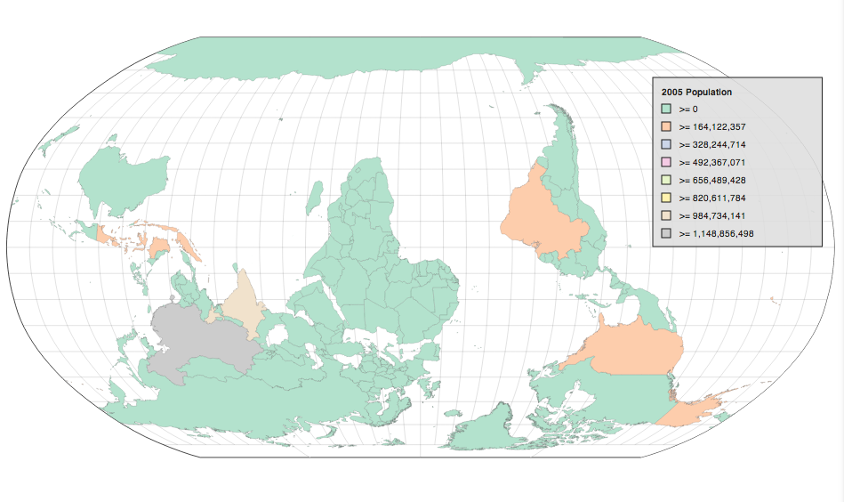
A Simple Map D3 map of 2005 world population with graticule and globe options turned on
The Simple Map site has a complete list of options, a number of examples, and instructions on how to use and install it. The code is all open source, and contributions are always very welcome. Simple Map is still a pretty young project and has not been fully tested, but it has been used in production.
But wait—that’s not all.
The Impossible Black Tulip
Recently, the team over at Quartz open sourced a tool called ChartBuilder, which is an application for creating charts and exporting them as static images for use in stories. This project is meant to be deployed by other organizations and encourages reporters and editors to create their own charts, while keeping design and functionality consistent. Overall, an excellent idea and project.
I thought, why not do the same thing for Simple Map? And thus, Tulip was born. Tulip is an interface on top of Simple Map that makes the production of choropleth-style maps even easier. Almost all configuration options have been incorporated into the interface, so anything you can do with Simple Map, you can do in Tulip. And, as with ChartBuilder, you can export your map as a static image, making the maps easy to embed in stories.
Tulip is a simple, front-end, web application that can easily be included into a page with something like Bower. It is built with Backbone and utilizes Backbone.stickit to bind data input and output; it also utilizes Noah Veltman’s recent Pancake.js project to easily turn SVG into static images. Tulip is meant to be used like a library, not a project to fork, and more configuration options will be added soon. This allows it to live within existing pages if that fits your organization better.
This is a fledgling project, and there are many features that have not been implemented yet. In the near future, we plan to add options for creating organizational style guides (much like ChartBuilder). Instructions on how to deploy Tulip and contribute to the project, along with examples of maps, can be found on the GitHub page.
Here are a few Tulip map examples I put together quickly:
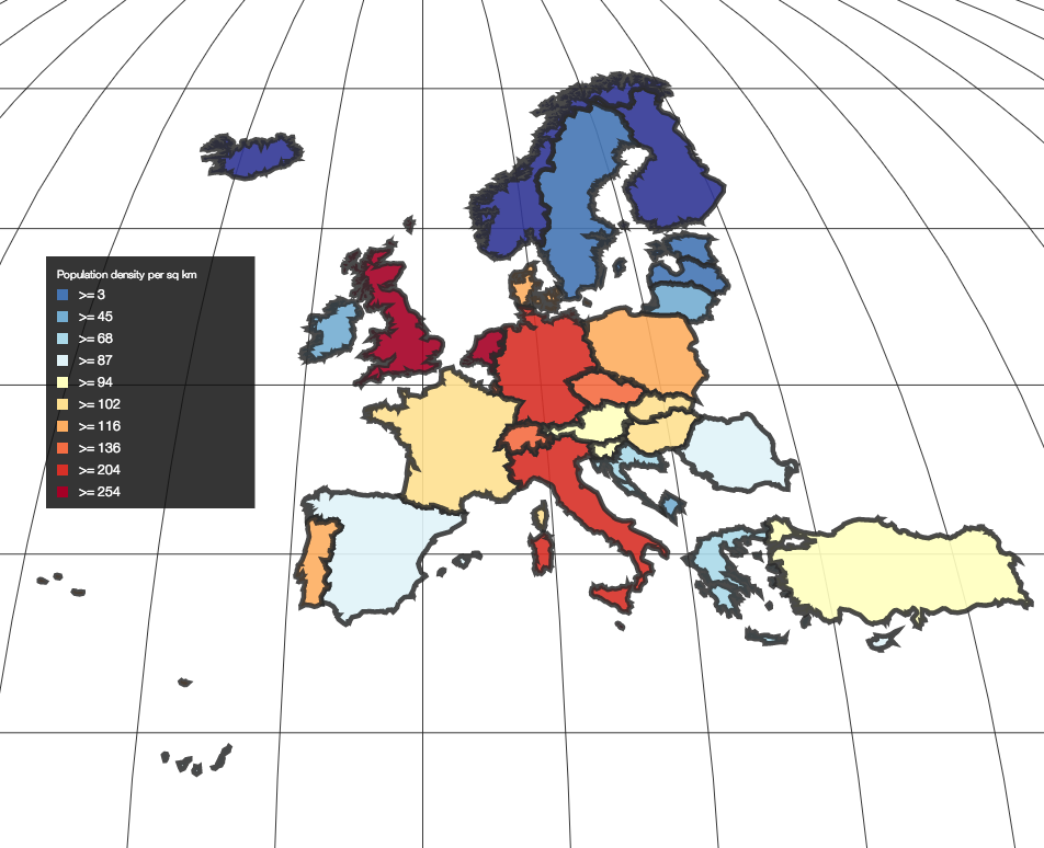
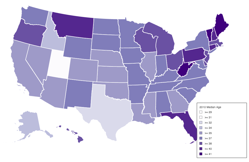
Example maps produced using Tulip
It is pretty exciting to see what can be done quickly, and as Simple Map and Tulip grow, the kinds of maps they can produced will grow with them. Let us know if you build any cool maps with Tulip.


