Features:
Playing with Suspense in Data Visualizations
How we conveyed the bewildering speed and volume of a trolling attack
Spoiler it feels bad. (BuzzFeed)
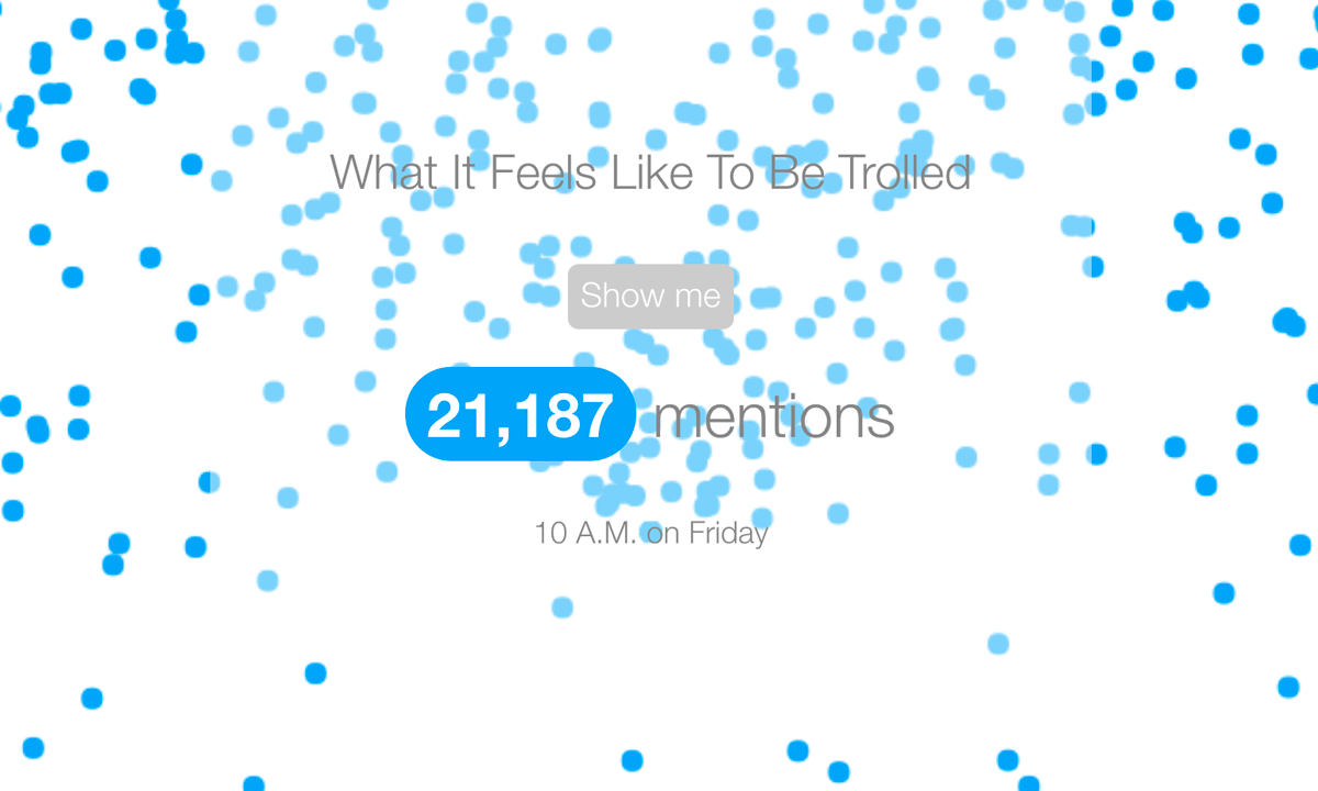
For a recent story about how Washington Post editor Doris Truong became the center of a partisan online flame war, we wanted to illustrate what happens when a person becomes part of a viral false story and is subjected to online trolling.
One of the key aspects of Truong’s experience was that a barrage of mentions hit her out of nowhere and with the force of a thousand tweets—literally! In just … minutes her online life went from that of an average Twitter user to that of a major public figure. We wanted to recreate this moment for people to evoke a sense of empathy. And so we made this data visualization:

My favorite thing to do with this graphic was to show it to people, have them click on the button that started the animation, and watch their faces. Once the animated graphic began, people watched with curiosity until the tweet storm hit. Then came an exclamation, something like, “holy ___” (insert whatever profanity is safe for your workplace).
Data visualizations are a wonderful way to understand larger statistical contexts and to intellectually process complicated issues. But as someone who has spent four years of her early career telling stories with videos—linear narratives that unfold over time and that are centered around human experiences—I have always been fascinated by the idea of making use of data in ways that leverage the immersive qualities of the moving image, by telling data stories with suspense.
How can suspense help us captivate an audience that has become accustomed to consuming only the first ten seconds of a video, reading just the headline of an article, or glancing at a data visualization only for a brief moment?
The Element of Time
A key instrument in playing with suspense is time. In data visualizations, I can use time to show changes over a specific period. Often this is manifested in the temporal scope of the data as well as in the format I choose to display it. But we can also deploy time in conjunction with animation, as a way to create anticipation and suspense.
If we use the linear passage of time to create tension, we can look for guidance in fictional narrative structures. Gustav Freytag, a 19th century German novelist, summarized one of the most popular narrative structures through this diagram (you may recognize this structure from action flicks, rom coms or other narrative fiction):

One of my favorite examples for using this kind of structure is Pitch Interactive’s Out of Sight, Out of Mind, an interactive graphic that animates U.S. drone strikes over time.
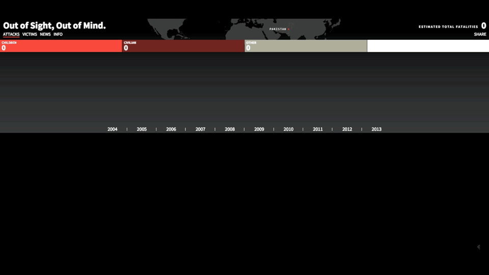
A sped-up animated GIF of the data visualization Out of Sight, Out of Mind
Pitch Interactive’s Wesley Grubbs at a Creative Mornings Oakland event, talking about the importance of time in his company’s work.
Even in the most simplified way, this was the approximate structure of the data visualization we had for Truong.

Animating Data Without Killing Your Browser
One of the decisions I’d had to make early on was about picking the right JavaScript libraries. The core of this story was the deluge of mentions, which meant that visualizing the data as bar charts or bubble charts would take away from the emotional experience we wanted to convey.
But how do you visualize and animate roughly 24,000 data points?
Even though I ended up only animating roughly 5,000 dots, I still had to make sure I wasn’t going to stifle my browser—especially on mobile phones—with a bunch of DOM elements floating across my screen.
Like many other graphics editors, I often use D3.js—which stands for data-driven documents—for highly customized data visualizations. Here’s a thing you need to know about D3: the library makes it really easy for you to take values from a spreadsheet and bind them to an object, like a circle for bubble charts or a rectangle for bar charts. D3 then takes each value you want to visualize and produces an SVG (Scalable Vector Graphic) for each data point.
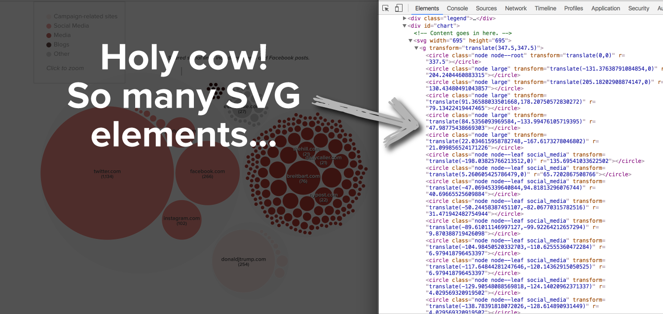
One of the graphics we did for our first project. See how every circle on the graphic is represented as a circle SVG in the DOM?
The issue with creating an SVG for each data point is that it can become too much for your browser to handle when you reach a few thousand data points. Imagine having your browser go through 24,000 lines of code to render each circle, and make each circle move the way it did for that animation.
Enter canvas! Canvas HTML5 elements are actual tags that allow you to manipulate pixels. The concept is a little bit like using an Etch-A-Sketch to draw something—you change every single pixel till you get the desired image:

To animate each dot then, you only have to update your Etch-a-Sketch every few milliseconds. So instead of moving around 5,000 individual HTML elements (SVG tags), you’re simply changing what’s shown in the one canvas element you make.

The way this works is like animation used to work in the old days when Walt Disney and his pals used to draw 20-plus individual frames for each second of animation footage. Below is a video that’ll illustrate what I mean:
If you want to make a graphic like the one we made, please find the code with instructions here.
Many thanks to Eric Haseltine, the JavaScript instructor who introduced me to the joy of canvas and whose in-class exercise I’ve modified to make this graphic.
Organizations
Credits
-
 Lam Thuy Vo
Lam Thuy Vo is a senior reporter at BuzzFeed News. You can follow her work on Twitter @lamthuyvo.


