Features:
Introducing Pulp and Pulp Press
How we made our first comics-journalism feature—and the tools for you to make one, too
From Terms of Service at Al Jazeera
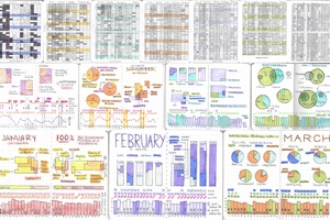
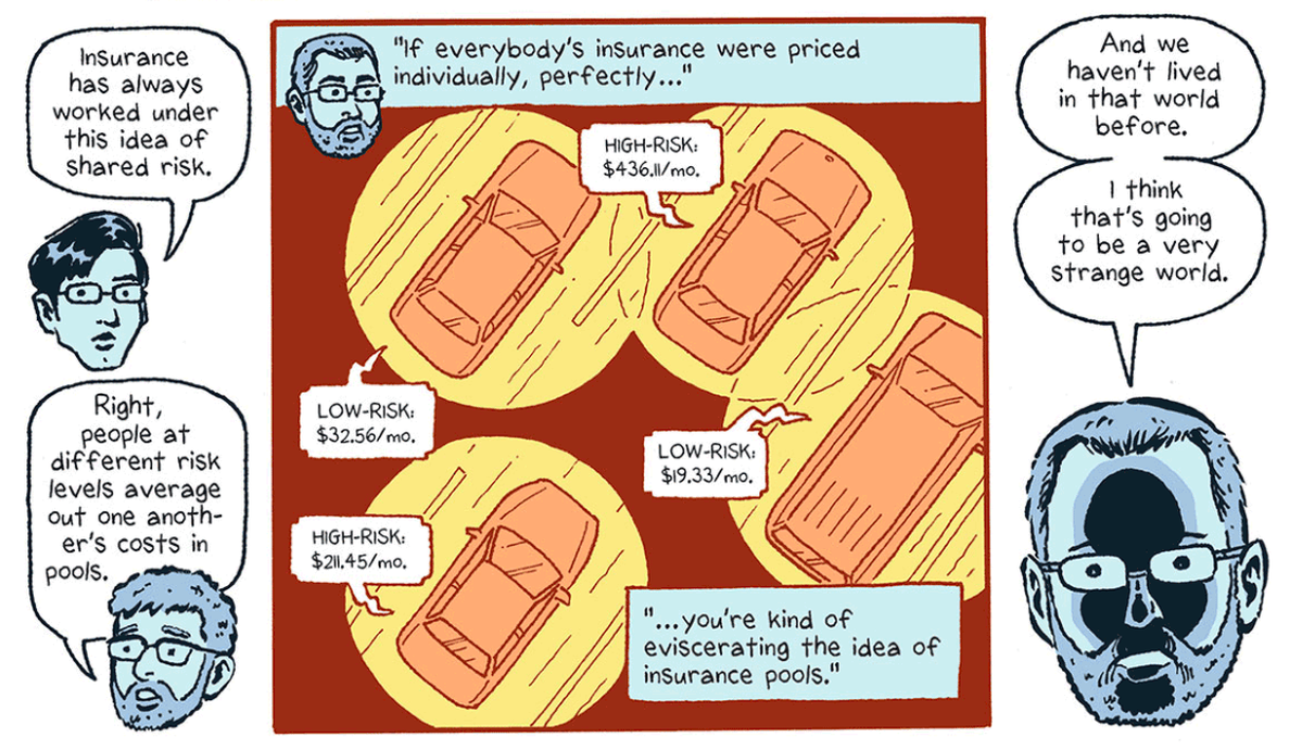
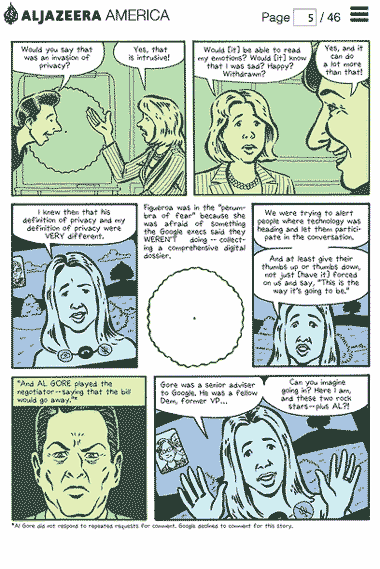
Last week, Al Jazeera America published its first piece of comics journalism—a co-production between reporter Michael Keller and cartoonist Josh Neufeld. “Terms of Service: Understanding our role in the world of Big Data” is an illustrated look at privacy and technology in an age where people are putting more and more of their personal information online, or using new devices like sensors to record their exercise and sleeping habits.
One of our big questions was how this comic would look online and on phones. We thought we would walk through some of design process and also document some of the code tricks we learned along the way.
The final products are a web viewer, Pulp, and the comic-maker interface, Pulp Press, that we have just released as a free and open source project.
The Design Process
One of the powerful tools in comics is the ability to tell a story on multiple levels—from the smallest element of the balloon text, to the artwork in the panel, to multiple panels forming a page, to two facing pages forming a spread.
In designing our web interface, we wanted to preserve this structure since it’s a valuable tool in constructing scenes and controlling everything from story pace to the overall message of the piece.
Our guiding principle was “Narrative above all.” Most of our design choices came out of the idea that the reader should only have to focus on the story. Anything extra on top of that should be cut.
With this in mind, we looked at a number of the existing web and tablet comics and platforms such as Comixology and other, more scroll-based projects.
Although it would have been very simple to put all of the page images in one long scroll, some pieces that took that approach were hindered by the constant requirement to navigate. We wanted to put the most information on a page at once so a person could read the story and not have to worry about constantly interacting. Similarly, to make clicking easier, the navigation buttons are two large divs that sit completely on top of the pages—letting the reader click anywhere on either half of the page to go back or advance.
One element that worked well on mobile comic viewers was panel to panel zooms, which we implemented. In order to maintain a sense of place within the overall page, the reader still sees the full page layout when a page loads. This approach seemed to represent the best trade-off in reading experience versus legibility.
The other element we needed to tackle was hyperlinks. Because we were first and foremost producing a work of journalism, we didn’t want to sacrifice any ability to properly source material because of novelties in the medium.
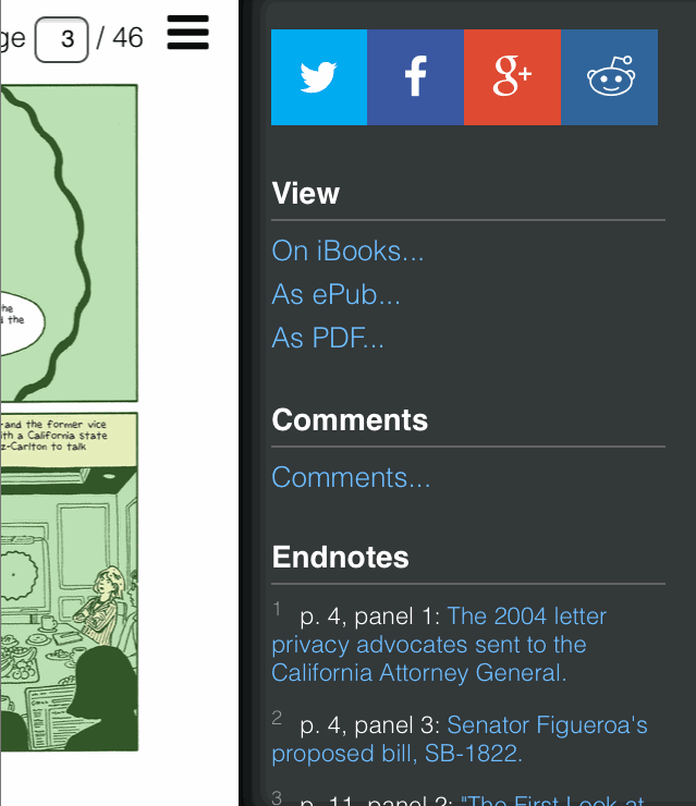
We experimented with having the comic’s text be a web font but that approach was too unreliable at different widths. We also experimented with adding an underline and a clickable box for hyperlinked text but it didn’t look very good and was awkward if a word or sentence straddled two lines. Keeping our main design principle in mind—keep the reading experience first—we ended up putting numbered endnotes in the text and including the hyperlinks in a drawer that the reader can open at any point in the story.
The Build Process
Largely, the viewer works by adding a viewing class to the appropriate image container depending on the page number. Pulp also keeps track of the window width and applies viewing to the next page if the window is wide enough to show two pages side-by-side. On mobile, the viewer zooms from panel to panel by pre-defined regions (we’ll get to that in a second) that are set as absolutely positioned divs (with the units being percents so it’s still responsive).
Most, if not all, of the viewer’s states are set through data attributes on the body. This pattern worked well for Pulp because it allowed us to use the JavaScript to manage state (whether we were in double, single or mobile page mode, whether we were transitioning pages, drawer open / closed etc.) and then define the proper layout for those states in the CSS. That setup helped keep things easier to understand: the JavaScript sets a layout mode, the CSS adjusts the layout through CSS keyframes.
For example:
- You navigate from page 3 to page 4
- The browser width is wide enough to support a single page
- The JavaScript determines which page is entering and which is exiting
- Page 3 gets an
exit-to-leftclass - Page 4 gets an
enter-from-rightand aviewingclass - After the transition, Page 3’s
viewingclass is removed along with the enter and exit classes.
All of the pay positioning is defined in the combinations of CSS classes. If we were in double page format, we would enter enter Page 5 as well and give it a right-page class.
Here’s an example of how these combinations were handled in the CSS for pages exiting to the left in single page mode.
.page-container.exit-to-left{
    animation: exit-to-left 500ms cubic-bezier(0,0,.2,1);
}
And the CSS animation that is enabled
@keyframes exit-to-left {
    from{
        left: 0;
    }
    to{
        left: -100%;
    }
}
Here’s the more complex example for the right hand page in a double layout that’s exiting to the left. Bookend is the state for the cover page.
body[data-format="double"][data-bookend="false"] .page-container.right-page.exit-to-left{
    animation: double-right-exit-to-left 500ms cubic-bezier(0,0,.2,1);
}
The animation double-right-exit-to-left looks like this:
@keyframes double-right-exit-to-left {
    from{
        left: 50%;
    }
    to{
        left: 'calc(-50% - %s)' % gutter_width;
    }
}
Here’s an example of these classes at work with the page transitions slowed down.
We used a CSS preprocessor called Stylus with a plug-in called Nib that handled vendor prefixing and proved to be indispensable. Getting the page transition animations to feel right took a lot of trial and error. Without a CSS preprocessor that gave us variables and took care of prefixing, we would have had to change dozens and dozens of lines of CSS during testing, which would have dramatically slowed down the process and limited experimentation. One @keyframe block, like the one above, is turned into five such blocks with various vendor prefixes such as Webkit and Firefox. As in illustration, Stylus sheet is 900 lines and the process CSS sheet is 1800.
(I hear similar plugins exist for SASS. I use Stylus, which is Node.js, because, like a percentage of the world’s population, my ruby installation hisses and growls whenever I go near it and the prospect of taming it gives me the chills. Less.js also exists but that’s a whole other discussion.)
Mobile Interaction
We employed a few tricks to get the viewer to feel native on mobile. The first was finding a good library for detecting swipes.
Swipe Detection
Hammer.js came recommended but we couldn’t get it to work quite righ. We found a lighter weight solution called detect_swipe.js, which got us most of the way there. We forked the original repository and added a couple key features.
The first was pinch detection and the other was a new option we named swipeExceptionCondition—essentially a way to set a state where the library would ignore swipes. This exception condition was a useful way to disregard swipes during page transitions (to make things smoother) or when the endnotes drawer was open (since that container had its own vertical overflow scroll).
This is what the swipeExceptionCondition function looked like for our use case. It says, ignore swiping when the drawer is open or when we’re changing pages.
$.detectSwipe.swipeExceptionCondition = function(){
    return ($('body').attr('data-side-drawer-open') == 'true' || $('body').attr('data-side-drawer-state') == 'changing' );
}
Scrolling
Setting overflow: scroll; on iOS can be a huge pain, especially if you want it to have momentum and rubber banding. In our case, we had this drawer on mobile that needed to scroll independently. This setup works fine on desktop but can cause the whole page to scroll on iOS.
If you ever need this type of functionality, the magic in the scrollFix library can get you most of the way there. You might also want to apply the CSS rule -webkit-overflow-scrolling; touch; to your container.
Tapping
In its wisdom, iOS devices wait 300ms after the physical tap and the firing of the click handler. This delay is so that the device can wait to see if you’re double tapping. However, this delay leads to a really annoying user experience,as well as an odd gray selection box around your target.
The Financial Times Labs team has a really great library that removes this delay, called FastClick. It made our “tap the panel to zoom” feature and our “open drawer” handler feel like a real native app and not the sluggish bore of its previous life.
“What if you want to double tap” you ask? Our use case didn’t have a different behaviors for tapping vs double tapping and no consensus existed on whether “tap to zoom” or “double tap to zoom” was the more expected gesture. We went with a single tap since it requires less work and if you erroneously double tapped at the beginning, you would quickly learn that you only needed to single tap, whereas you couldn’t as easily intuit the reverse.
The other design feature we included are subtle page masks, which measure whether the panel is vertical or horizontal and extend the appropriate masks covering out the rest of the page.
They’re highlighted in magenta here so you can see how they function.
Building Your Own Comic
We mentioned above that the mobile version of the viewer zooms from panel to panel. How does it know where your panels are?
You define those regions through the maker interface we built called Pulp Press. To start making your own comic, select images from your local computer and load them into the interface. Your images aren’t uploaded to any server or saved anywhere—they’re simply read into the browser as data and displayed on the page.
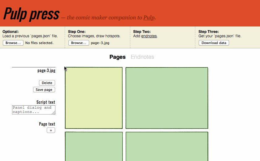
Note: Images can be any format but they must be named according to the page-<NUMBER> convention and start with page-1 as your cover image. For example, page-1.jpg, page-2.jpg etc. This has to do with the way Pulp Press generates the JSON file that will load your pages and zoom regions.
Next, start clicking and dragging to define your zoom regions. You can also set any alt text on a per-page basis or “Page text,” which will place arbitrary text on the page wrapped in <p> tags. Page text is most useful for the last page of the comic for including hyperlinks to a comments section or further reading.
As a convention, you can also include some properly marked up text to show the endnotes, which is a nice prompt for readers if they haven’t previously discovered them.
The following markup, class as internal and data-destination as endnotes will accomplish that:
<span class='internal-link' data-destination='endnotes'>Click here to view endnotes</span>.
Once you’re done defining zoom regions, set some endnotes, if you like, and then click “Download the data.” You should now have a pages.json file which has all the information needed to load your comic into Pulp.
To get it up and running, follow these four steps
- Download or clone the Pulp repo,
git clone http://github.com/ajam/pulp - Place your images in the
imgs/pages/folder. - Place your newly created
pages.jsonfile in thedata/folder. - Start a simple web server by typing
python -m SimpleHTTPServerinto your console while in the Pulp folder. Go tolocalhost:8000and you should see your comic!
Check out the Pulp README for more detailed customization and white-labeling options.
We also included one little easter egg. To give the drawer a more native feel on mobile, we allow you to stretch it to the left and it “rubberband” snap closed. As you expose what is “below” the comic, there’s a little guy with a microphone looking right back. Data collection is everywhere.

Credits
-
Michael Keller
Michael Keller is a reporter and developer on the Al Jazeera America Interactive Multimedia Team where he alternates between the phone and Sublime Text 2. He is also the co-founder of csv soundsystem, a New York City-based hacker collective and datathon dreamteam.