Features:
Visually Speaking: Patterns for Humane Data Visualization
The secret lives of data points, and how journalists can reveal them

Data can be impersonal, especially large datasets with thousands or even millions of records. The fact that most data of this magnitude is calculated by machines is, however, a sharp contrast to the ultimate goal of examining it in the first place—to find human trends and patterns behind the numbers.
Although violence, poverty, and other human problems are rife with data points to analyze, it can be tricky to visualize this information in a way that resonates with readers—who are likely detached from these tragic situations—and that humanizes the people behind the numbers. There are, however, several guiding principles we can use to visualize large datasets related to big issues in humane and visually appealing ways.
This is the first in a series of monthly columns written for OpenNews. “Visually Speaking” will explore the intersection of data journalism, design, and user experience.
Zoom Out Without Sacrificing Detail
By showing the scale and seriousness of a situation from afar, we’re able to pull readers out of the fatigue and “everydayness” that they may feel, reading about the same tragedy’s details over and over in the 24/7 news cycle.
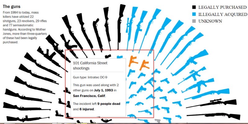
The Washington Post took this approach to visualize 30 years of mass shootings in America. Published days before a deadly Memorial Day weekend in New Orleans (which ended in 19 shootings) and the same day as the Los Angeles police’s annual gun buyback event (which recovered nearly 780 firearms), the infographic shows the collective toll of weapons in the hands of mass shooters.

(Charles Apple)
By communicating the human elements and outcomes of mass shootings as a whole, rather than offering another close-up look at specific instances and causes of gun violence, the Post offers readers a thought-provoking, aerial view of the weapons, perpetrators, and victims involved in mass shootings. At the same time, by revealing more information on mouseover, individual events are also addressed on a granular level.
(Charles Apple)
Data “Points” are People Too
Washington Post illustrator Richard Johnson executed this fundamental concept in an extraordinarily impressive graphic published March 2015. In visualizing the 220,000 lives lost in the then-four year Syrian conflict, Johnson used a stippled illustration of the Syrian flag composed of exactly 220,000 dots.

(Charles Apple)
In a double truck print layout, the graphic is impossible to ignore. It simultaneously conveys the enormity of the human costs of the Syrian conflict while paying homage to each of the victims.

(Charles Apple)

(Charles Apple)
Johnson’s illustration may not display data as charts and diagrams, but it is certainly a good piece of data journalism. It contrasts the number of deaths with what caused them. The flag frays into droplets of blood at the top and Syrians falling off the edge on the bottom. It makes a statement about the bloodshed’s effect on Syrian citizens: They’re living on the edge in an unstable nation, their lives in an indefinite freefall.
Turn Readers Into Users
User-centric design seeks to provide the best user experience possible, not just an eye-catching interface. However, these two concepts don’t have to be mutually exclusive. A common way for data journalists and news designers to marry UI and UX is by providing an interactive space for readers to explore the data for themselves. In doing so, passive readers can become an engaged audience.
One caveat: the effectiveness of allowing the reader to discover information—rather than spelling out the takeaways for them—relies as much on readers’ interest in the data as it does on the appeal of the UI and UX. In other words, aesthetic appeal can’t be a trade-off for good data journalism.
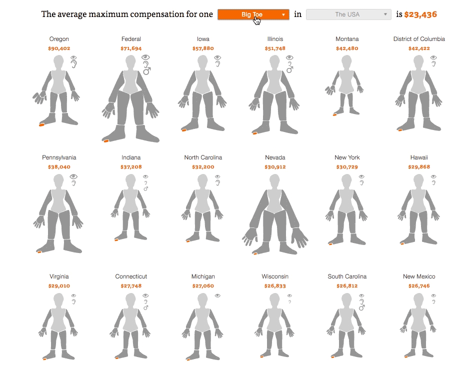
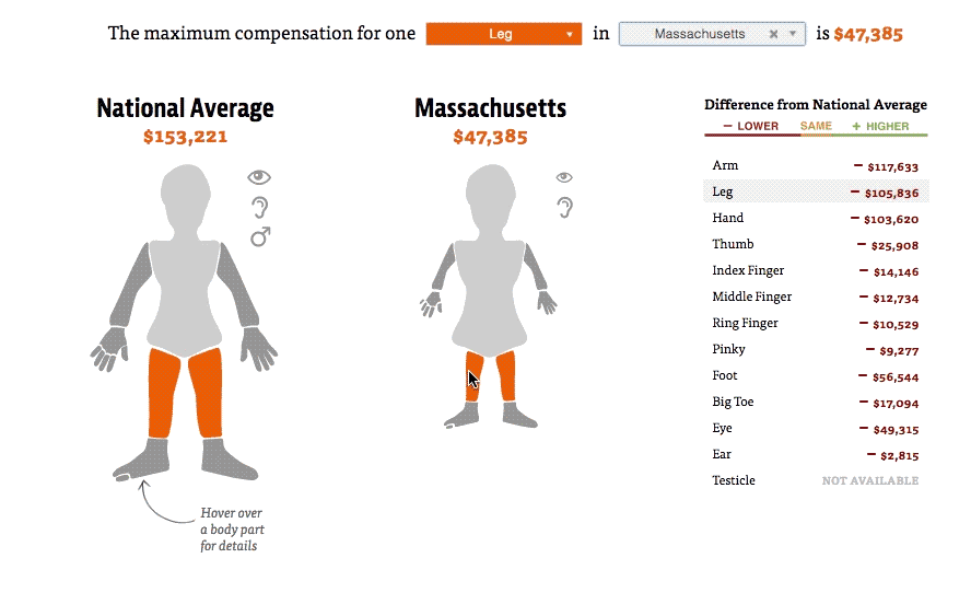
(ProPublica)
ProPublica’s viral interactive on the wide spectrum of states’ payouts for workers’ compensation is an excellent example of creating a presentation that encourages visitors to discover information that’s most important or relevant to them, rather than being spoonfed conclusions about the entire dataset.
Lena Groeger, a designer/developer who worked on the data project, chose small multiples for quick visual comparisons between states’ data. The user is also able to dive deeper into information on payouts by state (compared to the national average) or by body part (in relation to payouts on other body parts). This creates multiple avenues for users to interact with the data, both on a macro and micro level.
(ProPublica)
This “choose-your-own-adventure” approach to data is effective. In a post about the making of the project’s body-part charts and the “strange” sources of inspiration behind them, Groeger also wrote that the interactive data visualization was one of the website’s most popular pieces of 2015.
The Data, the Whole Data, and Nothing but the Data
An innovative example of letting the data speak for itself comes from the Upshot, a data-driven endeavor by the New York Times. The idea of publishing all of the insults lobbed on Twitter by President Donald Trump was a clever way to show, not tell, what the Republican presidential hopeful thinks—in his own words—since declaring his candidacy in June 2015.

(Yahoo)
While there is at least one other online archive that also keeps a running tally of the president’s tweets and some great pieces of data journalism that analyze the patterns and trends in his Twitter usage, the Times’ publication of all of the targets of Trump’s sharp tongue in a two-page spread in print and in an online directory shows the wide scope of his hostility toward real people. While Trump also has negative feelings about institutions and intangibles, it’s undeniable, no matter what your political leanings, that Trump’s focus is on human beings he dislikes. Politicians (especially his Democratic rival for the Oval Office), world leaders, news media professionals, and immigrants are characterized as everything from “failures,” “hypocrites,” and “liars” to “killers” and “criminals.”
The purposeful choice by the Times to let readers take in the sheer size of Trump’s negativity by categorizing more than 4,000 tweets, with no comments or analysis, highlights the people behind the data and allows readers to make up their own minds about what Trump has said.
Credits
-
 Dana Amihere
Dana Amihere is data editor at KPCC, an NPR member station in Southern California. She’s a designer, developer and data journalist who has previously worked for The Dallas Morning News, The Baltimore Sun, and Pew Research Center.


