Features:
How NPR Designed Their Live Elections News App
The Electris project, from concept to Election Night
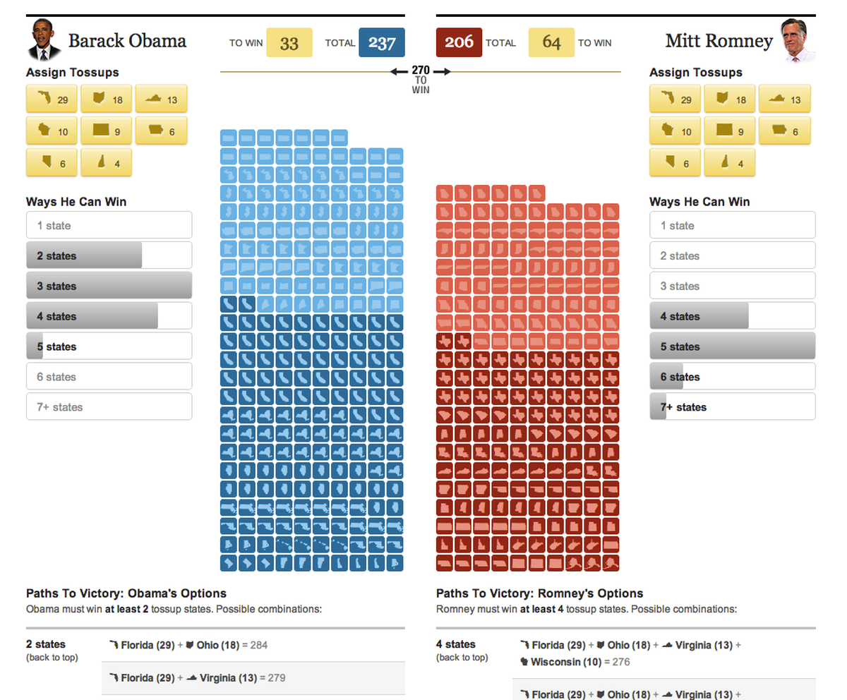
The final Swing State Scorecard app
After the party conventions ended, we brainstormed ideas for how to extend what our team had built for live coverage of the RNC to our election night coverage. We knew that we’d need to incorporate, at minimum, the following elements:
- Audio player for the live radio special
- A Twitter-style liveblog, internally called the “river of news”
- Topline results (Electoral College, plus balance of power in the U.S. House and U.S. Senate)
- Sponsor advertising
We also wanted to include Presidential election results by state, poll-closing information, results for all U.S. Senate races and key U.S. House races, and the “Back Channel,” a Tumblr blog of memes and other online conversation around election night, curated by the NPR social media team.
The arrangement of certain elements at the very top—the audio player, the ad and the topline results—seemed like a natural fit. More challenging, though, was deciding how to represent presidential results.
Display Options
The traditional election results display is a map, with states shaded red or blue according to who won. However, the geographic size of a state doesn’t correspond to its electoral power: For example, giant Alaska only has 3 electoral votes, while the much smaller Massachusetts has 11. And the geographically small but densely-populated Northeast is overshadowed by the vast (but less populated) West.
An alternate solution is a cartogram, where states are sized according to their electoral weight. The Los Angeles Times offered a particularly nice cartogram with live results on election night. A downside of this style of map, though, is that it can be hard to identify individual states and might not be suitable as the primary results display.
Bar charts could convey the current state of the race simply enough, but it would be harder to show the importance of individual states.
Finally, we landed on something more like a square pie (or “waffle”) chart, where we would have two “buckets” that would gradually fill with cubes (one cube for each electoral vote). That in turn inspired Brian Boyer to do something in the style of Tetris. Within a week, he and Chris Groskopf had come up with a working, drag-and-drop prototype, using ProPublica’s StateFace typeface for individual state icons.

The Tetris-inspired results concept
Additionally, Chris had implemented a feature that would calculate the combinations of states that each candidate would need to win the Electoral College. It was interesting information, and we knew we wanted to feature it, but weren’t sure quite how.
Iterations
We started with two key functional requirements:
- whatever we produced would have to work (with alterations) in both a pre-election and election night context; and
- it had to be responsive.
More difficult was narrowing down our central story. Our first iteration was a conventional “pick the states” electoral game—just with a non-map interface. In our model, users would drag states from an “undecided” column into “buckets” for each candidate. Users could start with empty candidate buckets, or they could pre-fill the buckets with predictions from NPR’s Ron Elving and then drag the tossup states into place.

The first iteration: a drag-and-drop results game
The drag-and-drop interaction model seemed to work well enough for desktop and tablet, but the small screen size and number of elements made it impractical for smartphones, as it wouldn’t be possible to have everything on the same screen at once.
It also didn’t seem very fun. So we started thinking about how we could simplify the experience, or make it more game-like.
First, we decided to limit the focus to NPR-designated tossup states. We guessed that most users would not want to go through the trouble of assigning all 50 states (plus Washington, D.C.) to candidates and instead would choose the pre-fill option anyway. (Also, for performance reasons, Chris’s “paths to victory” algorithm worked best with 12 or fewer tossup states.)
We brainstormed a few different approaches, including a system where users would see a series of prompts to pick a winner for a given state. It definitely had a more game-like feel, but perhaps boxed users in too much: What if someone wanted to make picks for only certain states? How could someone change their picks? And how would the “paths to victory” algorithm fit in, if at all?

Concept sketch: results as histogram
We also wanted to offer something different from all the other “pick the president” Electoral College games out there. “Paths to victory” seemed like our clear differentiator, something to build the app around.
This approach also fit with the story that was emerging as Election Day approached: Given the various state predictions, Barack Obama started out with, one presumed, more electoral votes than Mitt Romney. Obama could win the election by winning just a couple big-ticket tossup states. Romney would have to win more tossup states to make up the difference. We experimented with visualizing the possible combinations as a histogram, in addition to listing them out.
In an attempt to simplify the instrumentation, we put buttons for all the tossup states together, with separate Obama / Romney “buckets” below, pre-filled according to NPR predictions. If the user clicked a tossup state, its electoral votes were added to both columns, and the candidates’ “paths to victory” combinations would shift accordingly—the idea being to underscore a given state’s relative importance to each candidate.

Early sketch of a toggle method
Unfortunately, it failed the “six-year-old test”: Chris’s son couldn’t understand how both candidates could win the same state. And, in informal user testing, adults around the office found it confusing too.
A Winner

The Swing State Scorecard for mobile
Our final iteration centered on two sets of tossup state “chiclet” buttons—one with each candidate. Toggle a state for one candidate and it appears faded out for the other candidate. And the candidates’ “paths to victory” shift accordingly.
We launched the Swing State Scorecard two weeks before the election, then set to work reconfiguring it for election night.
(Our friends at the New York Times introduced a lovely “Paths to the White House” interactive about a week later, with a very different, almost Calder-like, visual design. They also adapted it for election night live results.)
Election Night

Sketch: moving toward Election Night
Because NPR news blogger Mark Memmott’s Twitter-style live updates needed to be featured prominently on the page, we made a “skinny” version of the Tetris-style graph that would appear in the left column, above incoming results. Brian figured out how to have called states animate into place (for Chrome, Firefox and Safari), thanks to the magic of CSS3 animations.
Once there were 12 or fewer states remaining to be called, we would introduce “game mode”—basically our Swing State Scorecard, but with actual results instead of predictions. Users could try to game out how the rest of the night would go and what each candidate’s options were given the states remaining. And when NPR called the election, “game mode” would go away, reverting back to the skinny results-only layout.
There was a risk that the election could be decided before game mode was activated. And, indeed, it was only active for about 20 minutes before NPR called the election. If you’re curious to see it, we’ve added a “replay” option: See a sped-up version of the state calls falling into the candidate buckets, and play with “game mode” (fixed to about 11:01 p.m. ET election night).

the Electris replay
Additionally, we worked with NPR’s Sponsorship Ops team to look at a different way of handling ads on the page, based on work being done for the new responsive blog templates elsewhere on the site. The result, which Danny DeBelius helped implement, was a “big box” ad for desktop users, and a special bottom-affixed, dismissible “adhesion” unit for tablet and mobile users. (Note to obsessive RWD window-resizers: The adhesion units only appear on touch-enabled devices.) It gave us a good bit more flexibility in designing for narrower tablet and mobile screen widths, as we didn’t have to design around a big box-sized roadblock (as we did for the Swing State Scorecard). We’re hoping to work this into our master app template for future projects.
Bonus! 8-Bit Mode
Election night represents weeks (or months) of work for something that gets about eight hours of actual exposure/use. To help increase the app’s visibility during that very small window (or, as he put it, “win the Internet”), Brian enlisted Jeremy Gilbert and Tyler Fisher of Northwestern University to build an 8-bit-style skin. They used a bookmarklet to apply some custom CSS to the page (including Jason Kottke’s Silkscreen bitmap font and 8-bit Obama/Romney photos) and a MIDI version of “Hail to the Chief.” When we introduced our post-election “replay” options, we added 8-Bit Mode as a toggle on the page.

The NPR Election Night page in 8-bit mode
People
- Jeremy Bowers
- Brian Boyer
- Danny DeBelius
- Tyler Fisher
- Jeremy Gilbert
- Christopher Groskopf
- Alyson Hurt
Organizations
Code
Credits
-
 Alyson Hurt
Alyson Hurt is the graphics editor at NPR, serving on the Visuals team (formerly News Apps + Multimedia). Previously at the Washington Post and the Arizona Republic. Graduate of ASU’s Cronkite School and Georgetown’s CCT program.


