Features:
How We Made Lobbying Missouri
NPR’s apps team talks about their collaboration with St. Louis Public Radio
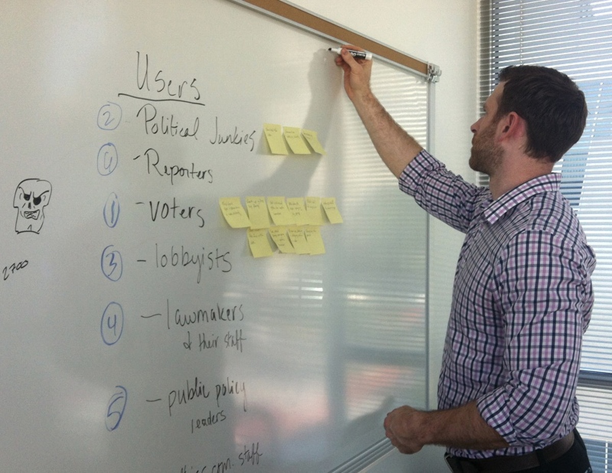
Danny DeBelius at work on the Lobbying Missouri app
Lobbying Missouri is a collaboration between St. Louis Public Radio and members of NPR’s news apps teams. We spoke with three team members about the project, their design process, and the code under the hood.
How It Began
How did this project begin, and specifically how did the collaboration between the two teams get started?
Stiles: It started with an email back in May from Kelsey Proud, an online producer at St. Louis Public Radio. The reporters and editors at the station remembered our partnership on an investigative story with WAMU, and Kelsey wondered whether we might help them with the their lobbying series.
The reporter in St. Louis, Chris McDaniel, had been gathering Missouri lobbying disclosure data all year and updating an interactive graphic made with Tableau Public. He also wrote a series of stories about interesting details found in the data—lobbyists giving lawmakers professional sports tickets, for example.
The station wanted a more sophisticated presentation that would allow users to explore individual gifts more effectively and also invite them into the more conventional editorial content. (And a site that worked on mobile devices.) But the small digital team there is constrained by its content management system, so we agreed to explore building a custom site.
How did you all work together to make the app?
Stiles: Interactive designer Danny DeBelius and I flew to St. Louis in September, and we did some exercises to help us focus on our users, and ultimately site features. Before we started sketching, we wanted to prioritize who we might use the tool, what they might want to learn, and the simplest method for fulfilling their needs.
We left St. Louis after 48 hours with a good plan and some rudimentary sketches to get us started. We then set about making the app with the collective team in three states: Chris Groskopf, a developer on our team who served as project manager, works remotely from Texas. We used Google Hangouts, HipChat, phone calls, and email to communicate as a team over the three-week development process.
A key thing we did was invite Chris McDaniel, our subject-matter expert, to our morning “scrum” meetings in which we tell the group about our progress the day before, what our plan is for the current day, and any impediments that might be blocking our progress. We also added him to our HipChat room for the project and as a user on GitHub. That allowed us to quickly ask questions and assign him work tickets when needed. We did weekly iteration reviews so there were no surprises. It was a model process, really, one that we’ll probably replicate for our next local-national collaboration.
Design Process
What was your design process like?
DeBelius: Design for our work almost always starts with paper or whiteboard sketching, and this project was no exception. Once the shape of our users and their needs had coalesced, I took to the whiteboard in St. Louis to begin thinking through how the site would be visually organized for our mobile users. Starting with the mobile use case is an important distinction of our process. In addition to ensuring the site will work on mobile devices, it also helps focus the interface on the highest priority features. By the end of our day of brainstorming and sketching, we had a good sense of what our homepage, organization pages, and legislator pages would look like.
The timeline for our projects is usually a matter of days or weeks from start to finish—a pace that rarely affords enough time for high fidelity mockups to make sense—so we generally move from sketching directly to code. Our current toolkit relies heavily on the Bootstrap front-end framework, which provides a solid fluid-width grid system and sensible typographic defaults, as well as a number of handy interface widgets. With Bootstrap’s help, tuning the default colors and typefaces to match the St. Louis Public Radio website was a snap. From there it was a matter of fleshing out the hierarchy established in our sketches and iterating until the design began to solidify:

The design in progress
The display of summary data on the organization and legislator detail pages is one example of a design element that evolved significantly over the course of the project. My first attempt with those pages carried over the homepage data design using cells for each of our data points, but the team felt that the nature of those figures might be more quickly understood using a data sentence presentation. This ultimately yielded the design we launched with:
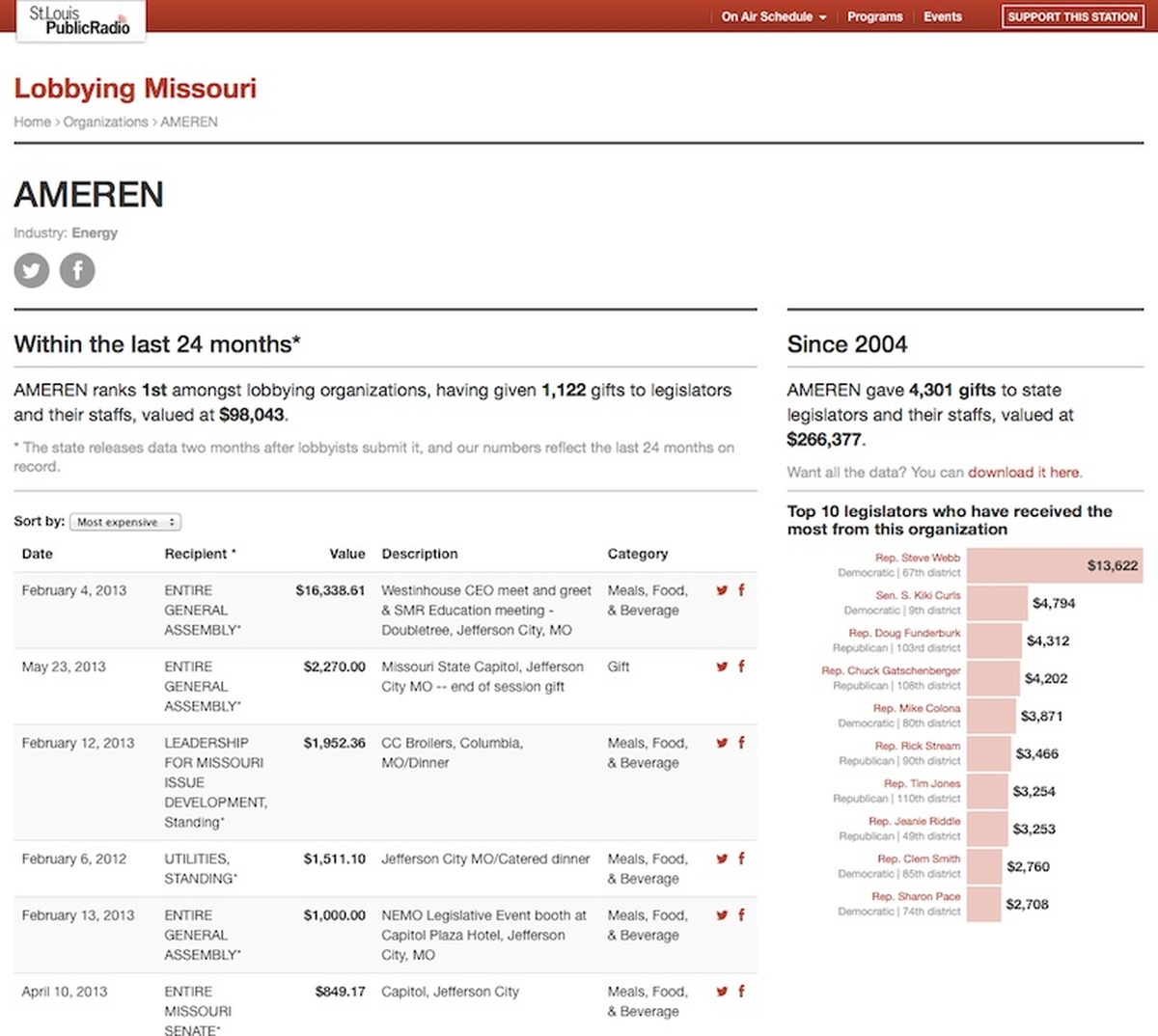
The final design at launch
The Tech Details
What’s the app made of?
Groskopf: This project was built on the NPR App Template, which we now use as the basis for all of our projects. It incorporates a variety of technologies to build the pages—among them Python, Flask, and Peewee—but ultimately the entire site gets rendered to flat HTML and deployed onto Amazon S3. Because the dataset is only updated monthly we can simply redeploy the entire site each time. This approach creates the absolute minimum technical debt for us as we move onto other projects.
Did you hit any particularly tricky or unusual design or tech challenges along the way?
Groskopf: Probably the thorniest technical challenge was to allow a user to search for their legislators by address. We know that many citizens don’t know their district, so this feature was very important. We used MapQuest Open’s geocoder to do the address lookups, constraining the results to just Missouri. Once we had a latitude and longitude, we needed to figure out which district polygons it was contained within. Unfortunately, the most obvious solution to this problem (geoqueries in PostGIS) requires us to run a server. We really wanted to avoid that.
The alternative solution we came up with was to use a MapBox interactivity layer as our data source. The technical details of how MapBox makes this work are out of scope here, but essentially MapBox stores the data about which district each pixel of the map is in. We bypass their typical tooltips and use their API to look up that data whenever the user drags the map. The code ends up being remarkably elegant.
However, unfortunately, this mapping solution ended up having a problem we didn’t foresee. As you zoom out, the UTF8Grid loses fidelity, which means that for users whose geocode places them on a district border, the legislators we show them may be wrong at wide zooms. As they zoom in they will correct themselves, but we should never show incorrect data. For the moment, we’ve adjusted for this by pushing the default zoom in significantly, but this is not optimal. If we were to do this project again (or do a version 2.0), this would be our highest priority to fix.
Another issue we had was the result of not testing real-world mobile performance early enough in the project. We had been rendering all ten years of our data onto each organization and legislator page. What we failed to notice until late in the project was that some of our pages were as large as eight megabytes. We addressed this by limiting those data tables to just the last two years. This isn’t the end of the world—most of the rest of the app only covers the last two years—but had we discovered it earlier we could have solved it with pagination or another, more preferable, method.
Fortunately, neither of these problems prevented us from launching on our deadline. In the end we delivered a project that our stakeholders were happy with and which seems have been well-received by the public. Bugs happen, but we still launch.
Credits
-
Danny DeBelius
An editor, designer and developer @nytimes. @nprviz alum. A sinner saved by grace (Eph. 2:8).
-
Christopher Groskopf
Christopher Groskopf is a data journalist on the NPR Visuals team. In November he’ll be joining Quartz. He divides his time between Tyler, TX and Washington, DC. Find him on Twitter: @onyxfish.
-
 Erin Kissane
Editor, Source, 2012-2018.
-
Matt Stiles
Reporter and data journalist in Seoul. News: @latimes. Nerd: https://t.co/3o2m3RuOQi. I might consume more 김치 (and data) than you. Ex: @wsj, @NPR, @TexasTribune


