Features:
How We Resurrected a Dragon
Bringing a 110-million-year old fossil to life for National Geographic, by asking the internet
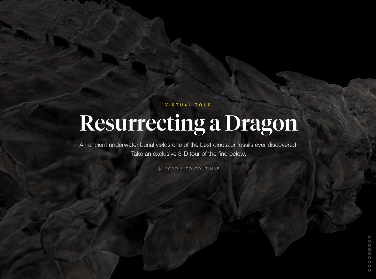
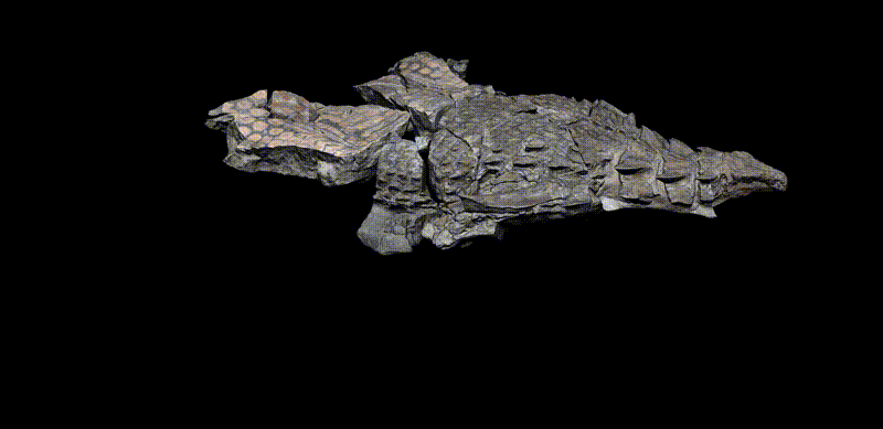
Resurrecting a Dragon is a 3D tour of the best-preserved dinosaur fossil of its kind. Despite the 110 million years since its undersea burial, much of the dinosaur’s form remains intact, with large areas of fossilized bone, skin, and stomach contents. For the print presentation of this dinosaur in the June 2017 National Geographic Magazine, a team went up to the Royal Tyrrell Museum of Palaeontology in Alberta, Canada to photograph all the details, and that was supplemented with an illustrated depiction of its death. For the digital version, the dinosaur’s incredible degree of preservation presented an interesting possibility: could we capture this dinosaur as a textured 3D object and turn it into a browser-based, mobile-friendly virtual tour?
And so began my second journey into WebGL via three.js. After my first go-round, I compiled a bunch of resources that helped me figure out how to make 3D globes of Mars with custom imagery. What I didn’t compile were the baby steps—the endless searches and Stack Overflow results that document the trial, error, and research inherent to the development process. So for this project, I saved many of the resources that yielded incremental progress in creating a 3D tour.
In articles like these, it’s easy to exude an air of all-knowingness in which solutions to problems naturally materialize out of omniscient wizard-minds. Instead, I want to explicitly acknowledge that since I started making things with code, my process has firmly relied on the internet as a key research tool. Without this vast, searchable repository of knowledge I would certainly have a different career, and I think it’s safe to bet that many others who code also constantly rely on the internet, not as a crutch, but as a second brain.
This article is an homage to the internet, and to those who ask and answer questions publicly. What follows is an attempt to document the baby steps, or, how I resurrected a dragon with help from the hivemind.
Camera Control
The idea with this project wasn’t just to provide a 3D toy. I wanted to walk visitors through what was important about this find, and to provide context to its features and significance. To do this, as the user scrolls down the page, I manipulate a camera and lighting in 3D space to walk through various anatomical features. Wrangling control over the camera in a convincing way was a key thing to figure out. It’s important to note that only a virtual camera is flying around the scene and framing the shots—the dino stays put (with one exception, see the “model rotation” section below).
As was done in this LA Times’ Mars VR interactive, and Tampa Bay Times’ chilling 3D tour of the Orlando shooting it’s not just about moving the camera from one point to another in space—it’s also about changing the camera orientation between points to look in the right direction.
The box not only travels along the track, but it rotates along its route.
So I created an editor mode for myself to record the positions and orientations of a camera in order to set up my nine separate views of the nodosaur. I positioned my scene manually with the Three.js orbit controls, while adjusting the field of view (FOV) and lighting with a dat.gui controller.
The project with editor mode activated
The FOV is akin to changing focal length in a real camera, and it can cause distortion of a subject if not used carefully. I recorded each scene’s settings into a JSON file (and re-recorded with a ton of trial and error, on the order of 300 tries over the life of the project). It was straightforward to figure out my camera’s position in 3D space (camera.position, camera.fov) according to the three.js documentation, but it wasn’t clear how to record where the camera was looking.
As with most things, after a bunch of searching, I learned that there’s a few roads to go down. This answer determines a look direction or “look vector” by inverting the camera’s natural inverted orientation to instead point at an imaginary object in space. This was a great answer, but I found it later. What I used in this project was inspired by this method (see other great examples here to better learn three.js and 3D graphics concepts). In this model, you add an object to the scene that stays in sync with the camera—that is, an object that never changes orientation relative to the camera. If I record this object’s position, then when I want to have the camera point at something in the future, I can plug that position into the camera’s camera.lookAt() function—looking at the right object sets the camera’s correct orientation.
Each of the scenes without animation between them. Adding animation serves to give the reader a sense of the spatial relationship between areas of interest.
With a record of camera positions and a proxy for orientation, I could then connect the dots with animation.
Tour Design
From my points in space, the idea was to create paths that a camera travels across, to smoothly animate between scenes.
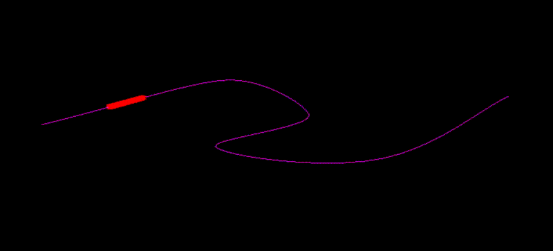
I don’t want to visibly connect the dots with paths as I fly by the dinosaur, but behind the scenes, I’m doing that, and hiding the lines. The LA Times’ Mars VR article was a great help here, as it takes a series of 3D positions and draws curves between them.
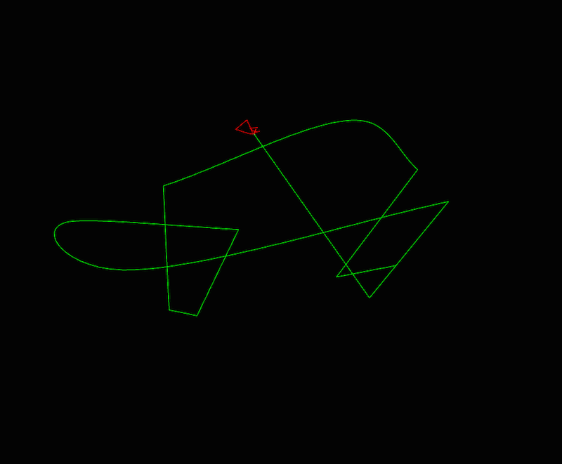
These are the paths that this project uses. The camera travels along the green path, stopping at each hard angle, while looking at corresponding locations on the red path. The nodosaur is too tiny to be seen from this view—it’s nestled within the red path.
The shortest path between two points is a line, but that’s not necessarily how I wanted my camera to move. Three.js has well documented functions for various types of 3D curves that I used according to how I wanted my camera to transition. The curve functions all come with a curve.getPoint() method, which gives a point in 3D space according to a distance along the curve. So, when scrolling a certain distance of a page—say I’m 1/3 of the way through, or approximately .33—I can take that .33, plug it into the curve.getPoint() method, and it will give me a 3D position along the curve according to that distance.
I’m drawing lines between camera locations, but I’m also drawing lines between where the the camera should be pointed. As the reader scrolls down the page, the camera’s position and orientation are transitioned along these lines accordingly.
Learning the terms “slerp” and “lerp” were also helpful in finding answers to 3D camera rotation problems. In D3.js you hear a lot about interpolation, which is how you transition one value to another. If you do so constantly over time, that’s called linear interpolation. In the 3D graphics world it’s shortened to “lerp.” There’s another term called “slerp,” which is spherical linear interpolation. It means transitioning from one point to another along a spherical curve.
While I didn’t do much slerping in this project, I did try some in my journey of trial and error. Understanding the terminology for the world of 3D graphics allowed me to do better searches to find answers that I needed. The key lesson was to try to be aware of domain jargon, which is actually really helpful when doing research.
Responsive 3D
At this point, I have a tour, I have scenes to transition between, and I’ve prepared some variations on a few different scenes for desktop and mobile. But that’s not enough to guarantee that everything I intend to be seen will be seen on various screen sizes, given that I’m making is a fixed-position, full-viewport presentation. For example, while I recorded scenes for “desktop”, they’re really a series of settings that look good at the exact arbitrary pixel size/ratio of my browser somewhere floating in my external monitor. If I do nothing, when someone else sees the dinosaur in their other-sized browser, it will be cropped, or float in a larger black void. Instead, the idea was to make each 3D scene responsive, gently nudging scene settings to ensure that an invisible 3D bounding sphere always fits within the user’s view. Unfortunately, you can’t just use media queries in WebGL.
The 3D scene fits to various screen sizes
Someone please tell some annoyed kid in math class that what ensues in this situation is a real-world use of trigonometry. Had I known that trigonometry can be important for doing fun 3D graphics stuff, I might have paid closer attention in high school ~20 years ago, and maybe would have had less of a struggle.
The general concept is that each scene, consisting of a camera at an X,Y, and Z position with a particular field-of-view (FOV) angle, is going to be modified slightly. Namely, the FOV will be nudged, zooming the camera in or out a little bit to fit a sphere that surrounds what I want to include in the scene. The amount of nudging will depend on how different the user’s viewport dimensions are from when I recorded the scene.
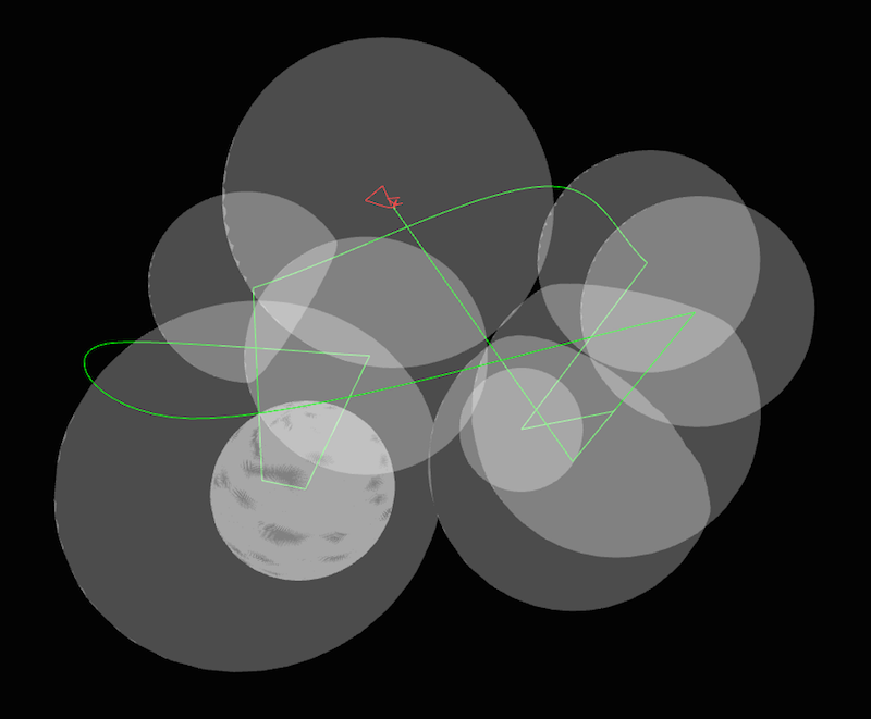
Same as the green/red paths in the previous image but with additional bounding spheres. Each sphere corresponds with a scene, and the camera adjusts view to fit the bounding spheres into a user’s viewport size.
You can think of a perspective camera as a pyramid, with a rectangular base corresponding to what gets displayed on your screen. In three.js, the FOV is the vertical angle of the pyramid. If I can wedge that angle around a sphere that surrounds my scene, the camera will output an image that is perfectly zoomed around the sphere.
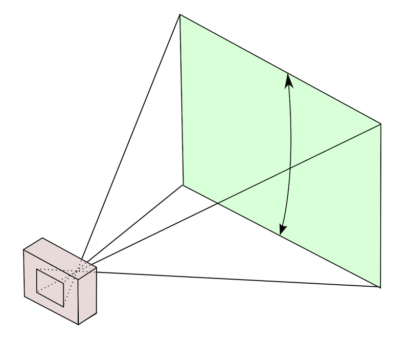
What a camera sees. The vertical angle between the top and bottom of what the camera sees is three.js’s FOV setting. (Source)
When we’re talking about angles like this, we really only need to consider a 2D slice—what circle am trying to fit?
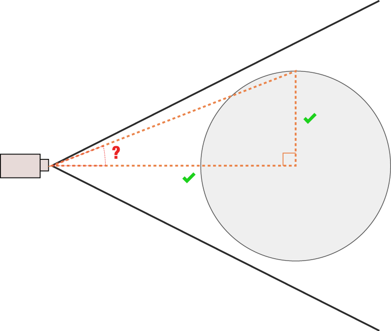
2D view of what a camera sees. We can calculate the angle that will fit that sphere according to its radius and distance from the camera, which we know.
My first approach was to use the plane that cuts through the very center of the circle, parallel to the camera’s view.
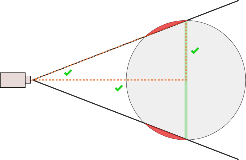
Sphere is cropped with this angle.
I used these answers to calculate the angle that would fit this plane, and the fit was pretty close, but my sphere was always cropped. As this answer states, “The sphere is being clipped for the same reason that if you stand close to a large sphere you can’t see its ‘north pole’.”
That made sense, eventually, and my answer was kind of the inverse to that one. I was using the wrong right-triangle, and so the wrong trigonometric functions to calculate my FOV. I ended up needing inverse trigonometric functions like arc sine (Math.asin()) and arc tangent (Math.atan()) to get my angle. It was a lot of trial and error, drawing pictures, asking colleagues bewildering math questions, and the typical banging-head-against-the-wall-until-finding-the-answer.
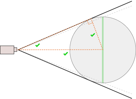
Sphere is not cropped. Success!
Once I had a shape fitting perfectly, I could take it one step further, making the camera fit the sphere horizontally where the scene demanded it. I did this by first calculating a vertical FOV as previously described, translating that to a horizontal FOV according to screen ratio, and applying that back to the vertical FOV (there’s actually no such thing as a horizontal FOV in the perspectiveCamera()). This answer pointed me in the right direction.
In the end, using a sphere wasn’t the most well thought-out choice—using a bounding rectangular cube instead would probably have made more sense, as screens are not circular, and a rectangle can fit an oblong dinosaur shape better. Note to self.
Regardless, I’ve posted the result of my struggles here on Stack Overflow, answering my own question, which I’ve learned is totally legit.
Lighting
Everything is illuminated (by up to three light sources at any given time with spotlights). Lighting is crucial to this project—it gives the dinosaur more of a realistic dimensionality that isn’t otherwise achieved by just blanketing the scene with light. Similar concepts apply to 3D graphics lighting as from a photo studio, and I got some good feedback by a photo editor colleague, Vaughn Wallace, who was involved in the conventional photography shoot of the fossil. Different lighting setups accentuate different features of the subject.
Lighting can make or break a model.
One of the lights in my project is placed in a fixed location in the 3D scene, but two of the lights are “mounted” on the camera itself, so where the camera goes, the lights go as well. This answer pointed me in the right direction; you can add lights as a child of the camera.
In three.js there are also “lightHelpers”, or visual geometries that help you visualize what your lights are doing. When lights are a child of a camera, the helpers go berserk. I went down a long, dark road to get my helpers to behave (and ensure that my light was also behaving). I can’t totally explain why the following fixes my helpers (something to do with the three.js matrix transformation calculation) but in the spirit of sharing, I’ve posted my solution as an answer here. Still waiting for that green checkmark, though…
I actually used directional lights for the first two thirds of this project. At a certain point I realized that using spotlights instead lead to a more realistic rendering, and more control over the light’s edge by using the spotlight.penumbra setting.
Low Polygon/High Detail (Normal Mapping)
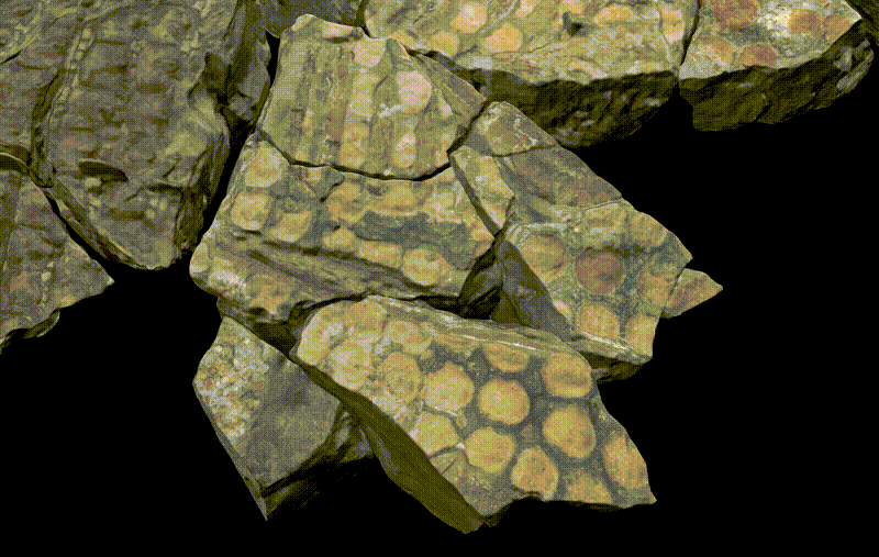
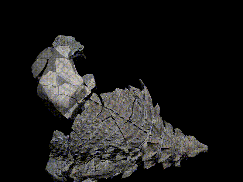
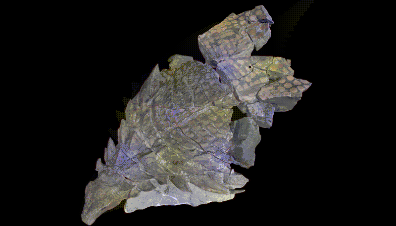
National Geographic fellow Corey Jaskolski went to the museum in Alberta to capture a dinosaur by digitizing the fossil in 3D. The fossil you see in the 3D model is the result of a painstaking preparation process, the result of 7,000 hours over 5 years by fossil preparator Mark Mitchell. Corey used photogrammetry techniques (special lighting, cameras, and image-processing software) to turn 2,145 photos of the fossil into a 3D mesh, and textures that can be draped over the mesh. These meshes (7 meshes corresponding with 7 individual fossil pieces) each weighed in at 6–13 million polygons, for a total of 50 million polygons. This is an astoundingly detailed and data-dense representation.
In its original state, at nearly 6 GB of data, these models were not compatible with the web, given that we wanted the experience to load in seconds. Attempting to render this amount of polygons would basically melt a phone, crashing the browser in the process. So we took great pains to simplify the dinosaur models without having to sacrifice too much visual fidelity.
The key technique we used to do this is called “normal mapping”. Normal mapping creates a dataset in an image that represents the orientation of vertices throughout the high-polygon models. The resulting images used in our project come in at less than 1MB.
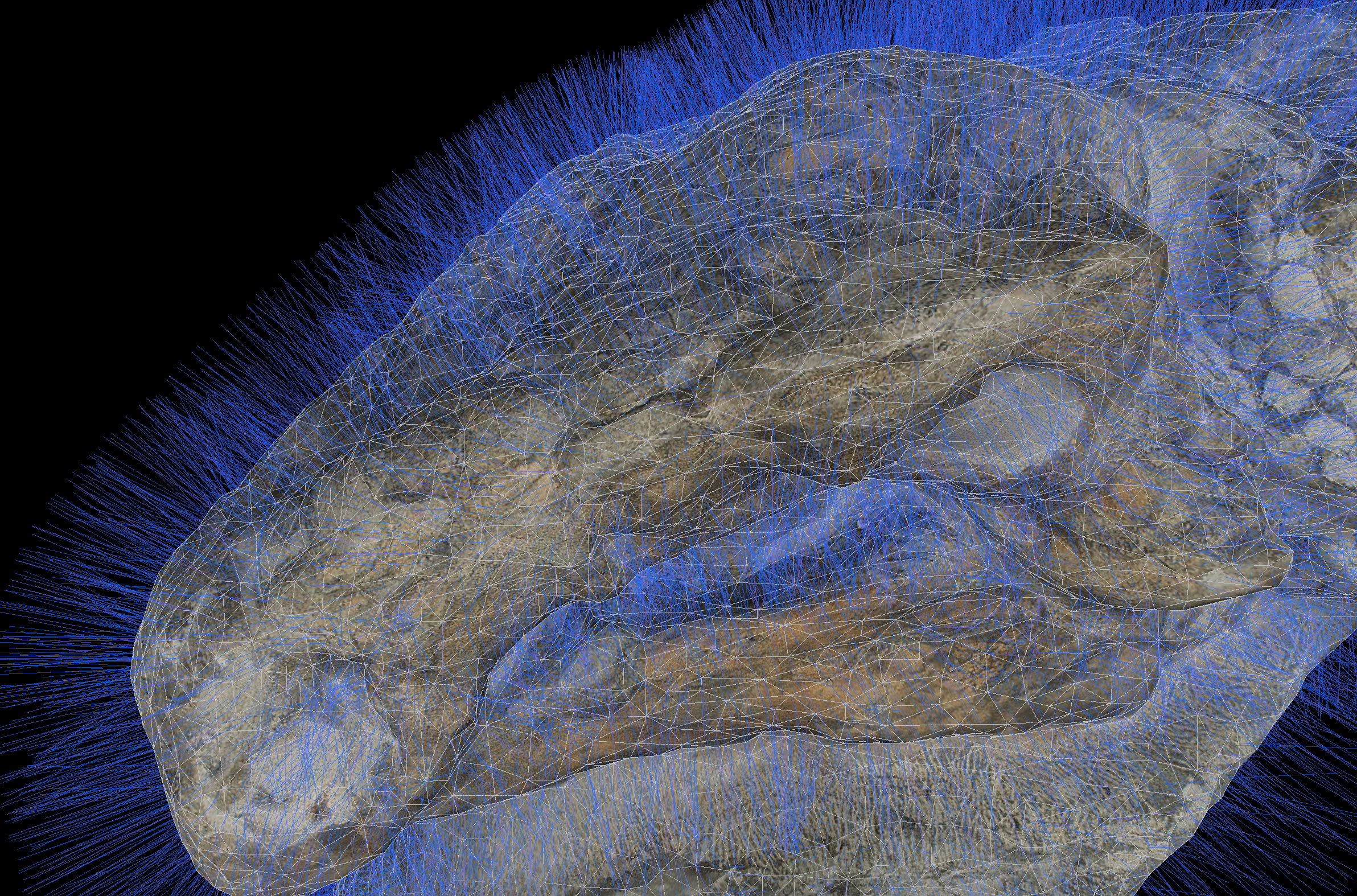
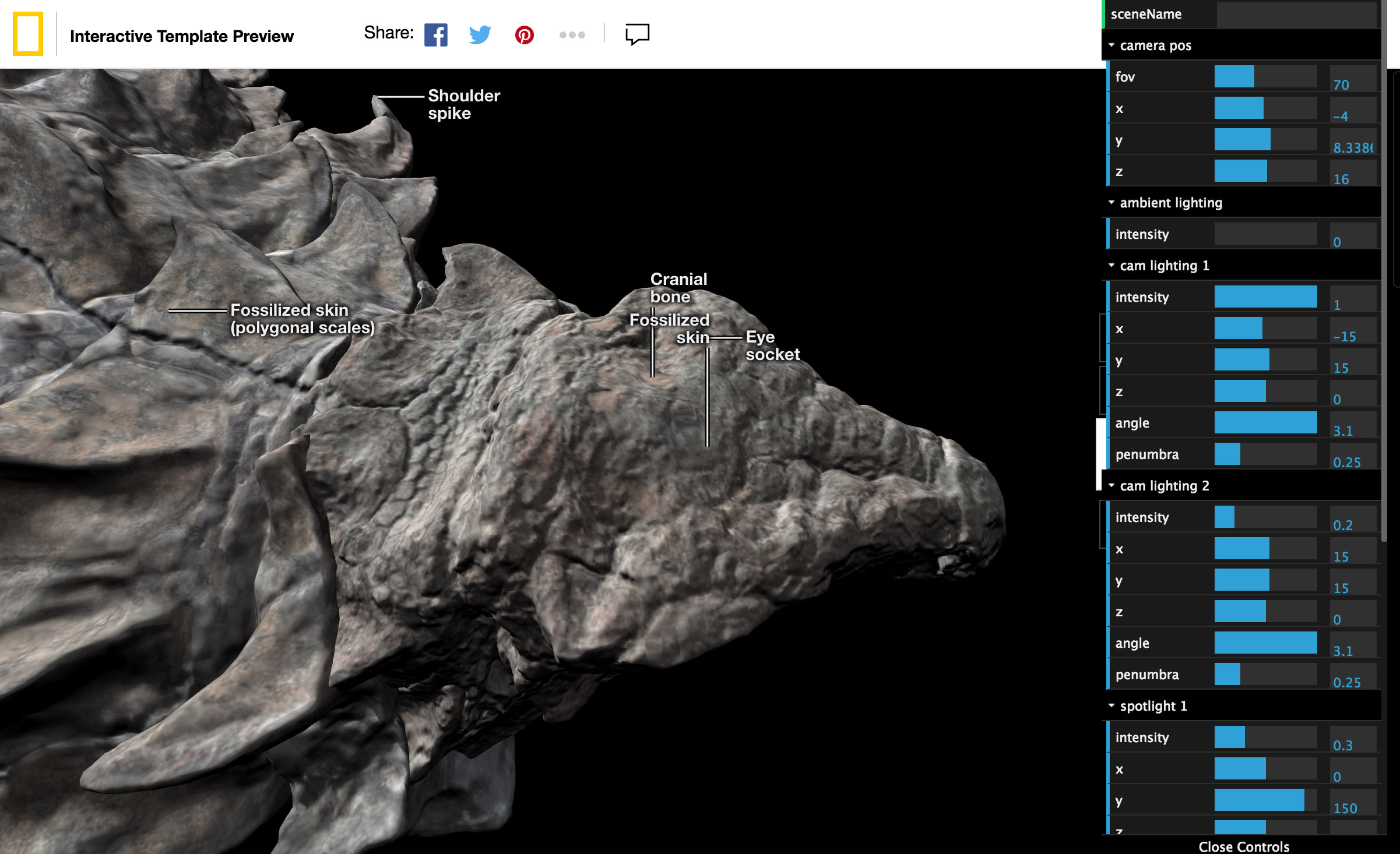
This is the nodosaur head with its triangular mesh exposed. At each triangle’s vertex, we visualize a line perpendicular to the surface, and the line’s angle is determined by how the surface is oriented. This angle, or vector, is called a “vertex normal”. The example “normals” shown here are of the simplified nodosaur head—we actually used much denser normals for our maps.
This detailed orientation of normals is encoded into an image, with X, Y, and Z mapping to the red, green, and blue (RGB) channels of the image. This special image is applied as one of the inputs to my dinosaur’s “material” (as a well documented normalMap input to the three.js materials). This image is then used when lighting the dinosaur, translating the image’s color information back into orientation values to feed into lighting algorithms to simulate detailed surface shadows.
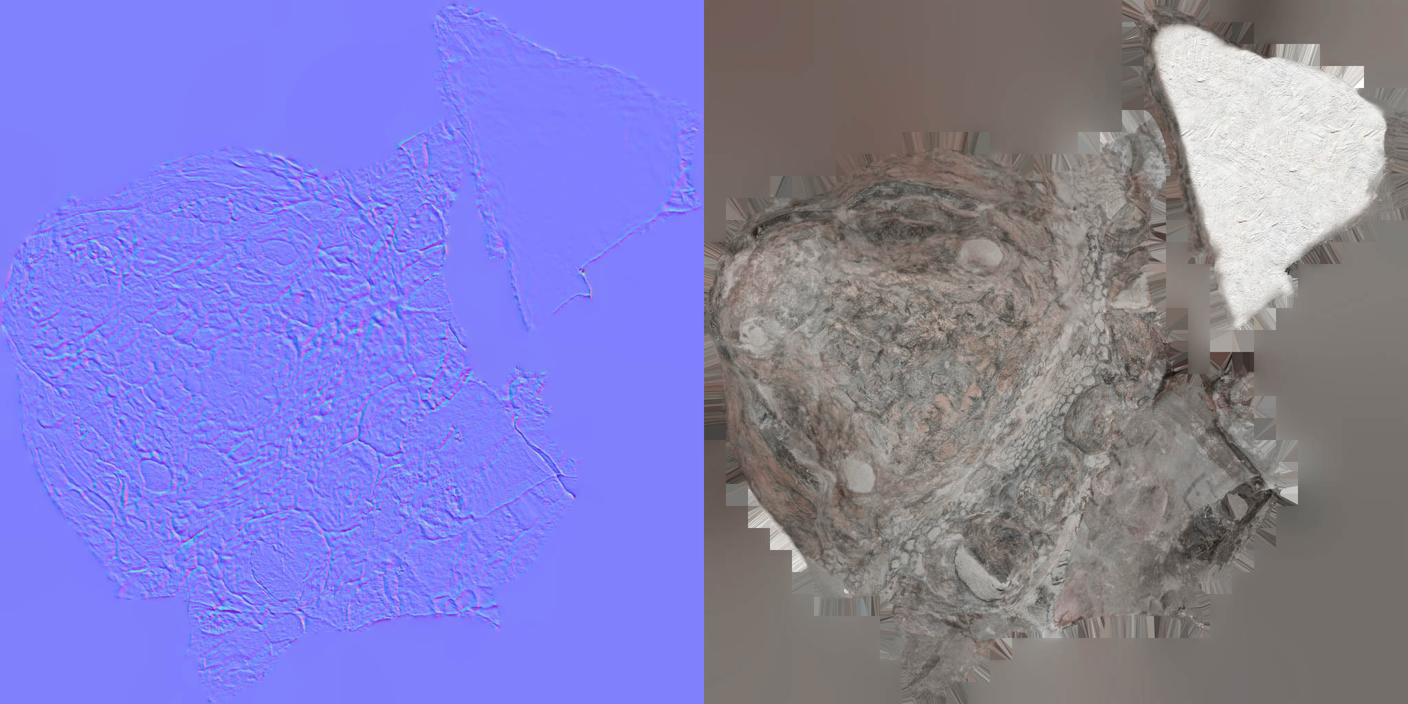
Left: This is a normal map. The colors of each pixel represent an orientation derived from the high-detail 3D model of the dinosaur head. This corresponds with locations on the “color map” of the dinosaur head (right). These specially generated images are “baked” (baking textures—key jargon for understanding how to generate images like these) in 3D graphics software. They get loaded in the browser and are wrapped around a simplified mesh. The normal map interacts with the lighting in the scene to simulate higher detail light and shadow than what the mesh geometry otherwise provides.
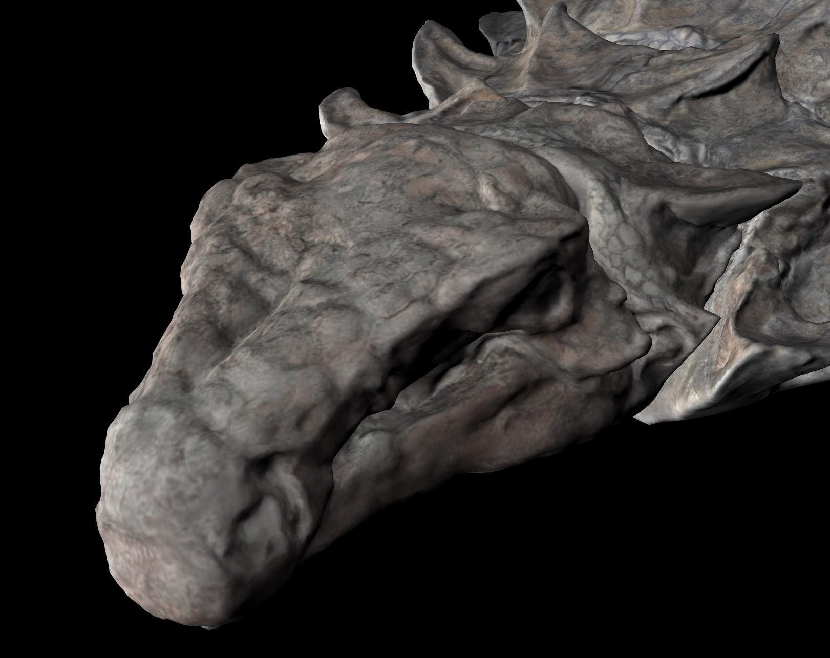

The dino head without (top) and with (bottom) the normal map applied
The normal map is an efficient way (a trick really, but commonly used in 3D gaming) to store huge amounts of surface detail. This is especially important because Corey and his team had taken the original models and carefully simplified each to about 75,000 polygons, a ~99% reduction. I then took these simplified models as .obj files (basically ascii files that represent vertex positions), and converted them to a three.js JSON format, using this offical three.js script. By using JSON, I could cut their file size in half by re-encoding them into a binary format. That brings all 7 models down to 15MB each, not including textures.
The achilles heel of this project was the combination of download size (loading time), visual quality, and animation performance. If any of these suffered, the user experience would as well. Getting the normal maps to work well were the crux of it all because they would bridge the gap between render quality and smaller file sizes, and make sure this thing worked smoothly on less powerful devices. Naturally, it took some trips to Stack Overflow to get things right.
The combination of meshes and normal maps did not work initially with what Corey provided. Three.js has a lot of built in loaders (see “model loading” below) to handle loading various file formats into 3D objects. If the loader doesn’t properly process the input data, or it’s in a slightly unexpected format, weird things can happen. When I first loaded my 3D dino head into the browser, I got a blocky triangular look.
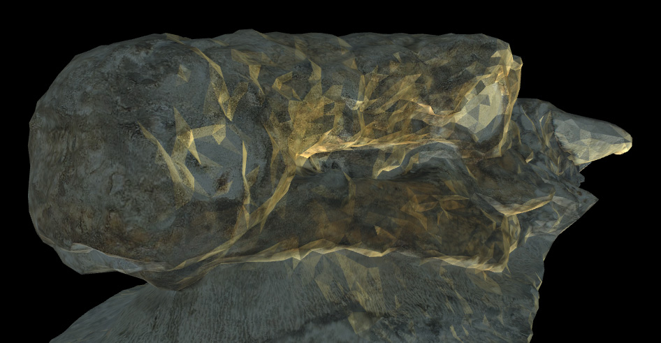
Notice the especially triangular look in this in-progress screen-grab. The vertices were not being “smoothed”.
I was very much out of my league with this problem, but was saved because someone ran into something similar. This lead showed me that I needed to modify the model loader to ensure that my vertices were being processed correctly. I can’t say I completely understand the solution, but without the fix, this project would have been dead in the water—a realistic depiction of the fossil was fundamental to the storytelling.
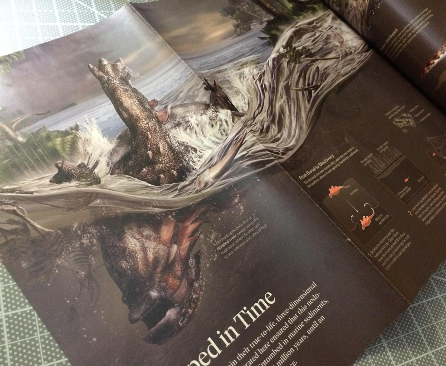
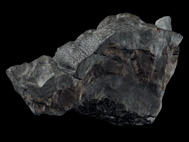
Did someone say dead in the water? Nodosaur illustration in the June 2017 National Geographic Magazine.
Model Transitioning
There’s a scene in this project where a piece of the dino transitions from true-color imagery to multispectral imagery. According to Corey, this could very well be the first ever 3D multispectral imagery of a dinosaur. He captured nodosaur and non-nodosaur fossils specimens using his modified UV/IR camera setup, but only select pieces of the nodosaur reflected light in these spectra, highlighting anatomical features in ways that will give future clues to scientists. We really wanted to highlight this to the reader as a significant finding.
Like the normal map, imagery of the nodosaur is specified as an input to a material, specifically as a UV or texture map. A material in this context is a 3D graphics concept that represents how imagery is warped to a geometry, and the way that it reacts to light in a scene. The material chosen here, specifically a meshPhongMaterial, accepts a normal map and a texture map, among other things. What I wanted to do here was supply two texture maps to the model, one of true-color imagery of the nodosaur, and the other as the special multispectral imagery, transitioning as the user reaches the scene.
Unfortunately, I couldn’t just add multiple textures to a single material without using a custom shader, and that had its own drawbacks when it came to rendering normal maps. Shader code is the way that low-level instructions can be sent to the GPU to render 3D graphics. I’m still pretty intimidated by shader code, and am just starting to make my way through Patricio Gonzalez Vivo and Jen Lowe’s The Book of Shaders, so I sought out other options—three.js explicitly abstracts away from shader code in order to make rendering 3D graphics easier. Derek Watkins over at the NYTimes has appeared to at least start to tame the shader beast in this post-mortem for his really nice antarctica feature graphics, and it speaks to the power and flexibility of 3D graphics programming, if you can wrap your head around it.
What I ended up doing instead was informed by this example, layering models atop each other. I created two instances of the piece of fossil of interest. For each duplicate piece, I then applied alternate materials, but positioned each piece in an identical position in 3D space. In the real world, this is a true violation of reality, with two objects inhabiting the exact location as another, but it’s totally legit with 3D graphics. The downside of this is that doing this leads to a phenomenon called “z-fighting”, where the models will display an unsightly interference pattern. Luckily I was able to find out how to force a render order, making the pinkish UV/IR piece to always render atop the true-color piece, in order to fade in things as envisioned. With this accounted for and both meshes in place, it was a matter of adjusting the opacity of the material according to the scroll to get the effect I was looking for.
Model Rotation
As can be seen in this video at 12:20 the 15,000 pound fossil fractured spectacularly while it was being loaded for transport from its excavation site. There were a few benefits to what was initially a disappointment. Aside from being easier to transport in pieces, the clean breaks in the fossil exposed cross-sections that further showed how incredibly intact its 3D structure remained after 110 million years, and exposed truly unique features like fossilized stomach contents. Another benefit of the fractures is that Corey was able to scan the fossil in 7 separate pieces for me reconstruct in virtual space. That means that we were able to do things with the models that are very hard to do in real life, like freely flip and manipulate these extremely heavy pieces.
This was especially important for one piece in particular, a piece that exposed internal anatomy along the length of its spine, revealing a distinctively pigmented hexagonal pattern. It was important to express to the reader that this section was not the surface of the nodosaur, but an internal split. Unfolding this split an animation would help indicate the initial structure of these pieces while exposing what’s inside.
Animating the piece in question presented some challenges. Due to how the model piece was prepared and exported from Corey’s 3D model preparation workflow, in concert with how the three.js model loader processed the piece as it was loaded, the model initially rotated around the center of the scene—that is, the center of the entire dinosaur. But what I wanted was to rotate the piece relative to its own axis, relative to its own center. This is akin to the Earth spinning on its own axis each day versus orbiting the sun.
This answer, which has a pretty telling animation of the problem, shows that I needed to do an extra processing step of my model pieces to allow them to rotate in place.
Model Loading and Effects
Loading large amounts of data and imagery into the browser is a matter of trade-offs. I took the strategy of preloading everything, which increased visual fidelity at the expense of initial load time. I could have loaded things as scenes came into view (lazy loading), but that adds a level of visual distraction, and it didn’t seem terribly practical, because one of our initial scenes was an entire fossil overview, meaning that we needed to load everything anyway. I researched level-of-detail implementations (LOD, helpful acronym jargon) and texture loading implementations, (cool example), kind of how a web map will load in more detail when you zoom in, but I wasn’t able to pull off something worthwhile given deadlines.
Three.js has some nice preloading capability that I took advantage of, (type “loader” into the documentation filter), but I ran into issues when I tried to deploy this project away from my local testing environment. I apparently needed to nullify some cross domain settings that were built into the three.js loaders.
Finally, I really wanted to pull off a depth-of-field effect, being able to drop things into soft focus before and beyond my area of interest, something that the excellent sketchfab viewer and various three.js examples pull off. I simply didnt have time for this effect, but found some clues in others using “effects composers,” which apply effects as a post-processing step before a scene is rendered in each frame. Next time.
The Living Nodosaur
The original plan for this project was to use a 3D model of what the nodosaur looked like when alive, but I ran into problems when it came to model transparency and highlighting areas on a model in 3D space.
Prototype of transitioning the model to a cel shaded look with a semi-transparent 3D model of what the nodosaur looked like when alive. Note the weird artifacts where the hind legs overlap with each other. Note: 3D model by Davide Bonadonna is a rough sketch, does not necessarily reflect scientific understanding.
One problem in particular was “self-intersection” of a model when using transparency. Others have run into this problem but I wasn’t able to find a great solution. Apparently transparency is a tricky thing to deal with in three.js and WebGL.
Additionally what I wanted to do was draw something of an outline in 3D space, kind of like a cel shading effect, to show where the fossil aligned on the live animal depiction. Others have pulled this off, but I wasnt able to achieve something satisfying based on my outline model, especially given my deadlines.
What we ended up doing was using a really nice 2D illustration of the nodosaur (courtesy of Davide Bonadonna) that we also used for the print version of this graphic, and aligning the 3D fossil model to the 2D life depiction.
It didn’t align quite as well as a 3D model would, but the fact that it was a full-color, textured illustration added a lot more context than would otherwise have been possible with the 3D life-model dino depiction.
Conclusion
The use of animated 3D in this project is not meant to be a gimmick, but as a way to offer more realism while persisting visual relationships between areas of interest. An easier approach for this project could have been a tour through annotated static photos of the fossil, or even pre-rendered 3D animations in video. But doing this in browser-native 3D meant the experience would show more facets of this incredible specimen while better filling the screen across platforms, in turn better expressing the subject matter. We wanted the the next best thing to being in a museum, short of putting on VR goggles (which is technically possible but would reach a much smaller readership in 2017). Doing this with WebGL however, as a developer, meant a much steeper learning curve.
Learning through a project, in my opinion, is the best and most satisfying way to learn. It’s always a struggle learning new tools and techniques, especially on a deadline, but I imagine vastly less of a struggle than it would have been before the “Web 2.0” came into existence. I can’t imagine not having a free-text search to see how other people have solved things.
Through research, code from strangers on the internet, and persistence, I was able to work through the various categories discussed above—but I could only do so because this project was a multi-month affair. Even then, I had to pull back on certain things I was struggling to make work. The success and failure of every project has come down to prioritization: attempt to do only the development necessary to fulfill storytelling goals, towards a usable, legible design for the most important platforms. That is to say, if a project is envisioned as interactive or animated, do these things enhance understanding of the topic without detracting from usability on all the devices a project is used? The implication here is that any amount of interactivity adds a lot of time because it means there’s more in an experience to get totally polished, and multiply that time by the number of devices and screen sizes to support. I feel satisfied with the outcome of this interactive, but I still need to remind myself that even though a lot is possible in a browser, telling a coherent story in the simplest way possible should get top priority.
Organizations
Credits
-
 Brian Jacobs
Brian Jacobs is a Senior Graphics Editor who designs and develops interactive maps and graphics for National Geographic Magazine. Brian uses open source visualization and data processing tools to create and envision custom editorial experiences across platforms. He was previously a Knight-Mozilla fellow at ProPublica, where he worked on “Losing Ground”, an interactive story about the slow-motion environmental catastrophe taking place in southeast Louisiana. Find him at @btjakes.

