Features:
Seven Projects from the OpenNews + Write the Docs Code Convening
New code and documentation for news organizations
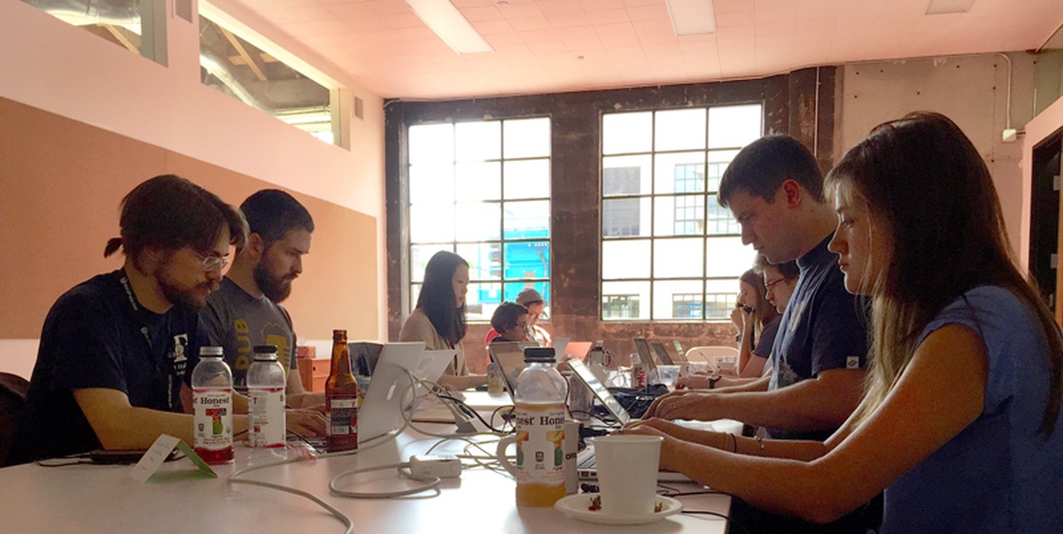
(Ryan Pitts for OpenNews)
On May 17, OpenNews held a code convening in association with the Write the Docs conference, bringing eleven journalist-coders together to do last-mile work and documentation on seven open source projects for newsrooms. Below, the participants introduce their projects and break down the work they did—and what comes next.
Analytics Journalists Can Use
Project: Google Analytics/Facebook Insights clients
From: Stijn Debrouwere
Most people who work a lot with analytics quickly get tired of clicking through GUIs. You just want the quickest possible way to export information from Google Analytics so you can analyze it somewhere else. And people are also realizing you can’t stick a huge analytics dashboard in front of editors’ and journalists’ faces—you have to give them something that’s meaningful and that they can act on. Think NPR’s article analytics and the Guardian’s Ophan dashboards, but also custom analytics email reports, slackbots that answer analytics questions, or trendspotters like Nieman Lab’s Fuego.
What I’m doing with my Google Analytics tools is making it easy to work with Google Analytics from the command line (so you can avoid those GUIs) and from Python (so you can do all sorts of interesting automation and dashboard-building).
We’d already been using this wrapper for quite a while at Fusion so I knew it was stable and (close to) feature-complete, but without much in the way of documentation, it was hard to get people excited about it. The code convening in Portland motivated me to finally improve those docs, and to start prepping for a 1.0 release.
At the convening, the command-line interface got some much-needed polish, too. To grab yesterday’s top ten articles and show them in an ASCII table, do something like this: googleanalytics query pageviews --start yesterday --limit 10 --dimensions pagepath --sort -pageviews, and of course you can output to CSV and JSON as well.
There’s still work to do on the documentation, but the biggest hurdle now is helping people understand the mental model behind most analytics software—metrics, dimensions, filters, segments. It gets to be a bit much if you’re new to analytics, no matter how user-friendly the software is. Helping people find their way in analytics wonderland is the next thing I want to focus on.
For those who are interested, I’m doing similar work for Facebook Insights and social media share counts, making them as easy to work with as possible, so you can focus on the analysis and not waste time getting the data.
Custom Elements for Easy Data Handing
Project: Web Component CSV Charts
From: Audrey Carlsen, Thomas Wilburn—The Seattle Times
Building newsroom tools with a very small team can be a challenge: projects polished enough to be usable by non-technical editors or reporters take a long time to complete, during which time those coders aren’t working on other interactives and digital storytelling. At the Seattle Times, with only two news developers, we’ve decided to set our sights a little lower. By building tools that are aimed at HTML/CSS-capable producers and editors, but do not require any JavaScript skills, we can crank out new functionality very quickly, while still addressing real newsroom needs. Custom elements hit this sweet spot almost exactly.
We’ve been using custom elements for a while now (see also: our
leaflet-map element, our responsive-frame for embedding external
resources, and our article on covering elections with a custom SVG
element). At the recent OpenNews Code Convening in Portland, OR,
we worked on two new elements for our web producers: a <sort-table>
element for sortable data, and a <simple-graph> that generates
non-interactive charts.
<sort-table>
Audrey wrote our sortable table element a little while back. It’s a
straightforward tool: put CSV data inside the tag, and it’ll be turned
into a table. Attributes on the element can be used to disable the header,
to enable sorting only on certain columns, or to customize columns with
CSS classes (for alignment, formatting, etc.). During the code
convening, Audrey added a new feature to the tag that’ll be useful when
working with rapidly changing or live data: the ability to import from
Google Sheets using Tabletop. Just add a sheet attribute to the tag,
and it’ll pull in data from the spreadsheet instead of from its
contents. Of course, when the story is done, you can paste in the data
as CSV to “freeze” it.
<simple-graph>
This particular element was a new creation by Thomas, but heavily influenced by the sortable table. Like its predecessor, it reads its contents as CSV, then visualizes them as either a line or bar chart. The left-most column in the table becomes the x-axis, and each additional column will be treated as a data series. Attributes on the tag let you choose the chart type, customize the colors, and turn off the chart key (which is automatically hidden for single-series graphs). We also re-used Audrey’s Tabletop adapter, so that the graph can also be fed from Sheets, if necessary.
Using These Tags
Like all our components, these tags are meant to be used in our
Browserify workflow: install them as NPM modules, and then require()
them into your client-side code to enable them. However, the project
also generates a usable JavaScript file if you run the bundle Grunt
task. Finally, you can try out the tags and download the built files
from our demo pages for both the sort-table and simple-graph elements.
It’s apropos to link to these demo pages, considering that the code convening took place during the Write the Docs conference, which is all about technical documentation. We try to put together good docs for our projects at the Seattle Times, but there’s also nothing quite like good sample code. Our web component scaffolding, like our news apps template, automatically generates a test page for custom elements with live-reload enabled. This plays an important role in our workflow: essentially, we write the markup that we want to see, then write the code to make it work. By the end of a project, we automatically have working examples that we can include in our docs, and samples that users can look at and tweak to see how each feature works.
After getting burned with open-source, front-end projects where the “tests” have been abandoned (and are effectively useless as documentation), we appreciate this as users and developers, and would encourage other teams to consider it as an approach.
A Simple, Google Drive-Powered Donation Framework
Project: Donation Builder
From: Kathryn Beaty—The Texas Tribune
Donation Builder is a framework that organizations can use to create a customized app for their donations process. The project was informed by our work at the Texas Tribune rethinking our donation process, which led us to build a new donations app with Middleman. The primary audience for Donation Builder is nonprofits with small tech teams who are looking for a better and quick-to-set-up way to inform potential new members and supporters about their mission and work, as well as easily lead them to donate. Plus, because Donation Builder is powered by Google Drive, it can be kept up-to-date by less technical colleagues, as well.
The Code Convening writing day provided me with the time to start documenting the project, get the documentation up on readthedocs.org, and add the ability to deploy through Heroku. There was a great energy in the air working in the same environment as other teams documenting and building their open source projects. You can check out Donation Builder on GitHub and read its documentation.
Next up for Donation Builder, I’d like to set up a job that can be triggered to redeploy the project when the spreadsheet that the project uses is updated. In addition, I’m planning to continue adding more options for organizations to further customize the page to best meet their needs. I also learned a lot at the Write the Docs conference about writing helpful documentation, and I’ll be updating the project in the next few weeks with that new knowledge in mind.
An Automated Pipeline for Google Drive
Project: Driveshaft
From: Michael Strickland, Scott Blumenthal—The New York Times
At the heart of many interactives lies some source of data. In a newsroom, that data is often more than integers and booleans: it’s the prose that connects the numbers together, the (often written) story that surfaces out of the charts and graphs, meaning we tend to work with words as structured data. And as easy as it is for developers to use a CSV or JSON file in their applications, it’s rarely the best place for reporters, copyeditors, and yes, even developers, to write in.
At the New York Times, we’ve been using Google Docs and Google Sheets to solve this problem. They are tools that are familiar to everyone involved, and their collaborative nature is a perfect fit for the chaos of breaking news. Writers work in a document or spreadsheet, then we convert it to structured data as JSON which we load in an interactive. But this process of loading data from Google into an app can be frustratingly manual. And where automation is possible, it can be precariously fragile:
How many google spreadsheet-based news apps silently withered this past week after Google switched off ClientLogin?
— Al Shaw (@A_L) June 2, 2015Driveshaft solves this by acting as an automated pipeline for Google Drive. It takes Drive files and converts them to JSON, then publishes them to Amazon S3 where your application can reliably access them. Our developers and editors have been going through these steps in various ways for years, but with Driveshaft, it’s available to all through a web interface (and a bookmarklet).
Driveshaft keeps versioned updates of your JSON around, making it easy to roll back updates. And it can do everything without ever making your data public: Driveshaft reads your files from Google using OAuth2, and can publish to firewalled S3 buckets, making the pipeline useful for staging applications or internal settings. And the best part: you can deploy your own version to Heroku in one easy step.
We hope you’ll check our documentation to see if Driveshaft can help your team make its data more portable, and of course let us know what we can do to make it better!
A Geographical Data-Joiner to Take the Drudgery out of Context
Project: Geomancer
From: Cathy Deng—DataMade
Geomancer is a tool for mashing up datasets based on shared geography, by the data team at the Associated Press and DataMade.
For reporters who work with data, it’s laborious to look up population or demographic data about the counties or zip codes represented in a given data set. The goal is to remove the drudgery from a common task, so reporters can focus on finding the story.
On the Geomancer interface, you can upload spreadsheets and join relevant data in just a few clicks. There’s also an API, so Geomancer can be integrated into newsroom applications.
Currently, Geomancer has data from Census Reporter, the Bureau of Economic Analysis, and the Bureau of Labor Statistics. Geomancer was designed to be extensible, so there’s documentation on how journalists can add the data sources and datasets they find most useful. There’s also documentation on how to use the Geomancer API.
A Realtime Editor for Curating Data
Project: Flatsheet
From: Seth Vincent, Gabriela Rodríguez
The Portland code convening was an opportunity to work through a few longstanding challenges in the Flatsheet codebase: integration with the data management tool Dat, implementing a new editor, and improving documentation. The core code that the new version of Dat is based on is now also the internal database for Flatsheet, making integration of the two projects straightforward. There’s also now a new grid-style editor for Flatsheet based on virtual-dom that can handle many thousands of rows of data in a performant way.
And with the help of Gabriela Rodríguez, we’ve done the initial work of moving documentation to Read the Docs at flatsheet.readthedocs.org so all our docs can be in one place.
WordPress for News Organizations
Project: Largo
From: Ben Keith, Ryan Nagle—INN
Ben Keith and I attended the code convening at the Write the Docs ’15 conference in Portland, taking advantage of an opportunity to immerse ourselves in the community of bright minds dedicated to writing awesome technical documentation.
Our goals for the convening were:
- Fill out details of Largo’s documentation around setting up and using a child theme for customizations and adding your own features.
- Detail how we do development for Largo and child themes built using Largo. This is primarily about making it easier for us to work with and support INN members who want to make changes to their themes.
- Come up with some strategy for compiling core functions/API reference for Largo.
Of these three goals, we made great progress on the first two. We’re still working on a strategy for extracting documentation from Largo’s PHP source code and converting to restructured text. If anyone has thoughts on this, let us know!
You can view our additions from the code convening at largo.readthedocs.org/en/write-the-docs/developers.
These changes will make their way to the official Largo docs with the next release of Largo, version 0.5.1. We welcome feedback, whether it’s in the form of a GitHub issue, a tweet, an email, or a postcard.
Join Us
OpenNews holds open calls for code convening participants—generally around a specific theme—before each convening. Keep an eye on @OpenNews for announcements of our next event!
Organizations
Credits
-
Kathryn Beaty
Current developer @thefineway. Former developer @TexasTribune. Love art, poetry, and music.
-
Scott Blumenthal
Deputy Editor, Interactive News @NYTimes. Co-creator and first generation pioneer of OZET (https://t.co/vPJAJ1jA6y). Boxing fan.
-
Audrey Carlsen
You drown when you stop kicking. Words, charts, maps at @NYTimes // formerly @SeattleTimes.
-
Stijn Debrouwere
Journalist @tijd
-
Cathy Deng
building things at Patreon ♡ previously BuzzFeed Open Lab, DataMade ♡ RTs≈endorsements tbh
-
Ben Keith
Works on WordPress sites/plugins/themes at @INNnerds. Runs @looming_midterm. Favs all the things. he/him.
-
 Erin Kissane
Editor, Source, 2012-2018.
-
Ryan Nagle
I’m listening. Member of @AdHocTeam. Previously @BreakingNews, @INN, @tribapps.
-
Gabriela Rodriguez
data, journalism, tech & social justice | GPG 59CABD19 | @info_activism @stumpsyn | Formerly @coralproject, @opennews, @lanacion | https://t.co/ByX5j1TzZ5
-
Michael Strickland
-
Seth Vincent
-
 Thomas Wilburn
Thomas Wilburn is the Senior Data Editor for Chalkbeat, a nonprofit newsroom focused on education. Previously, he was a senior developer for the NPR News Apps team, and a founding member of the Seattle Times Interactives team.


