Features:
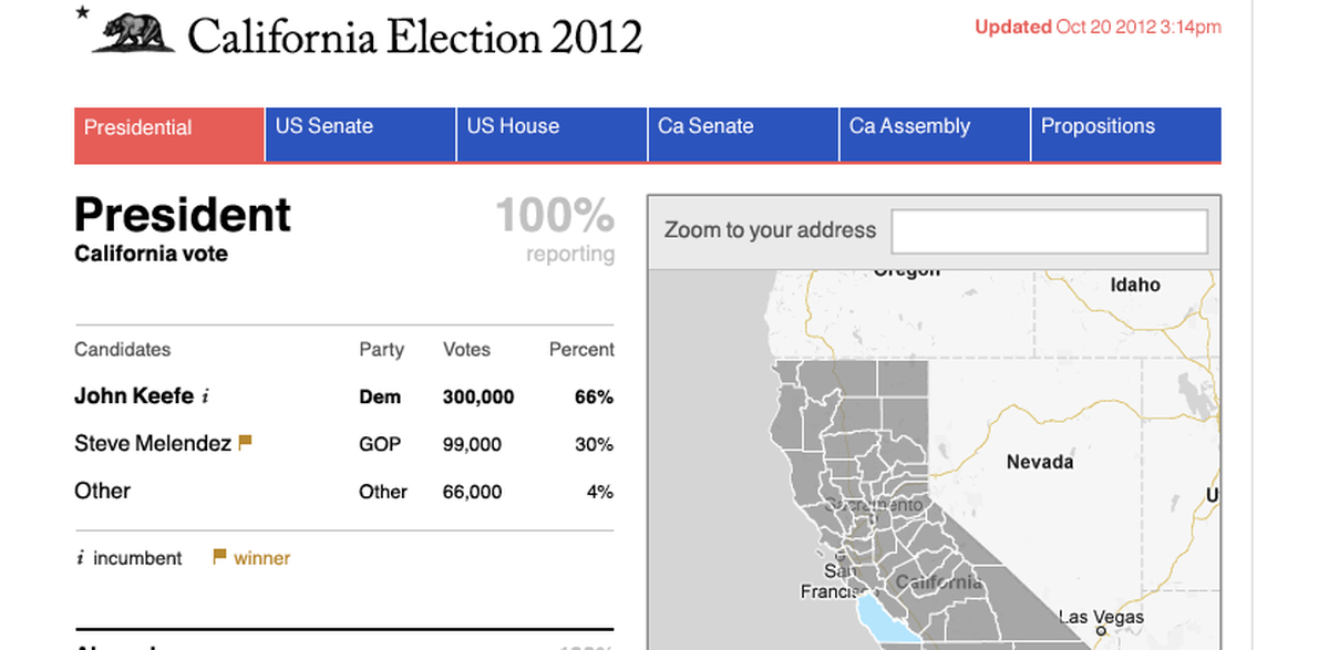
WYNC & KPCC’s California Elections Map
How we made CA’s live election data into an embeddable, freshly updated map
A sketch of the embeddable map-in-progress
We like election data that’s free and easy to use.
California is providing live data on election night; we’re making it easier to use.
The result, we hope, will be an embeddable map anyone can use on election night, driven by online data that’s easy to code against.
All free. All open source. All in the public interest.
The Beginning
This trip started on a bus in Austin, Texas. It was January, ten days after the Iowa Caucuses, and KPCC’s Kim Bui and I were talking elections on the way to Spark Camp. She told me how California provides live results and clear, complete documentation for using it. They had used it before, and wanted to try something again for November.
Between then and now, Dan Sinker at OpenNews asked about projects I might pitch for a Code Sprint grant. This was it: Make the California data easy to use, and make some good maps with the result.
What We’re Doing
We have three goals:
- Take the Secretary of State’s XML feed and convert it into JSON, the data format of JavaScript, so it’s easier to use by web applications.
- Put the JSON data in a public place that won’t crash on election night, and update it with fresh returns.
- Make an embeddable results map that runs off that data.
What We’ve Done (So Far)
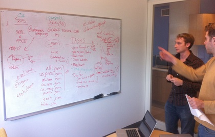
Making the plan
A week ago, developers and designers at WNYC had an internal hackday. We cleared our decks of other obligations and met in the morning to sketch out the plan.
The Data Structure: Based on my experience with election nights, and Schuyler Duveen’s experience with JavaScript, we sketched out what the JSON file should look like when it’s done—making changes and tweaks along the way, sometimes in coordination with Bui via Gchat. It’s here.
The Data DVR: That day was also the first day of California’s test feed, so Adam DePrince wrote a program that would capture the XML file every few minutes. He then wrote a “playback” system that would allow us to run tests even on non-test days.
The Parser: DePrince, Duveen and Glenn Mohre grabbed the XML feed and worked on outputting it into the JSON structure we had outlined. The parser and DVR code are in our under-construction Github repository.
The Map: Louise Ma and I worked on sketching out how the embeddable map should look and work, making changes and adjustments as we worked. Steve Melendez set up the skeleton of the map app using Backbone.js, and has since coded between other projects to craft the JavaScript to fit Ma’s design.
The Uploader: Just yesterday, Melendez built a cron job—basically a program on a timer—to run the parser and upload the JSON file every five minutes.
The Project Page: KPCC’s Sean Dillingham is working on a Github project page and documentation to make it a heckuvalot easier to replicate and use our work than it is at the moment.
Testing One, Two, Three
Wednesday was a scheduled test of the Secretary of State data feed, so we gave it a go and are now squashing a few bugs that popped up. We hope to have a ready-for-prime-time version of it going in time for the final Wednesday text next week.
If you’re interested in learning more, fill out this form to acknowledge the dangers of 1) publishing test data and 2) relying on code we’ve whipped up in a few days.
Huge Thanks
We couldn’t have done what we’ve done so far without the awesome digital teams at KPCC and New York Public Radio, and the support of managers at both stations. And thanks to the OpenNews Code Sprint grant, we actually set out to make designs and write code.
People
Organizations
Credits
-
John Keefe
John Keefe is the Senior Editor on the Data News Team at WNYC, which helps infuse the station’s journalism with data reporting, maps and sensor projects. Previously Keefe was WNYC’s news director for nine years. He’s on the board of the Online News Association and is an advisor to CensusReporter.org. Keefe tweets at @jkeefe and blogs at johnkeefe.net and datanews.wnyc.org.


