Features:
Return of the Code Convenings: Elections and Updates
Four new projects and news from many others
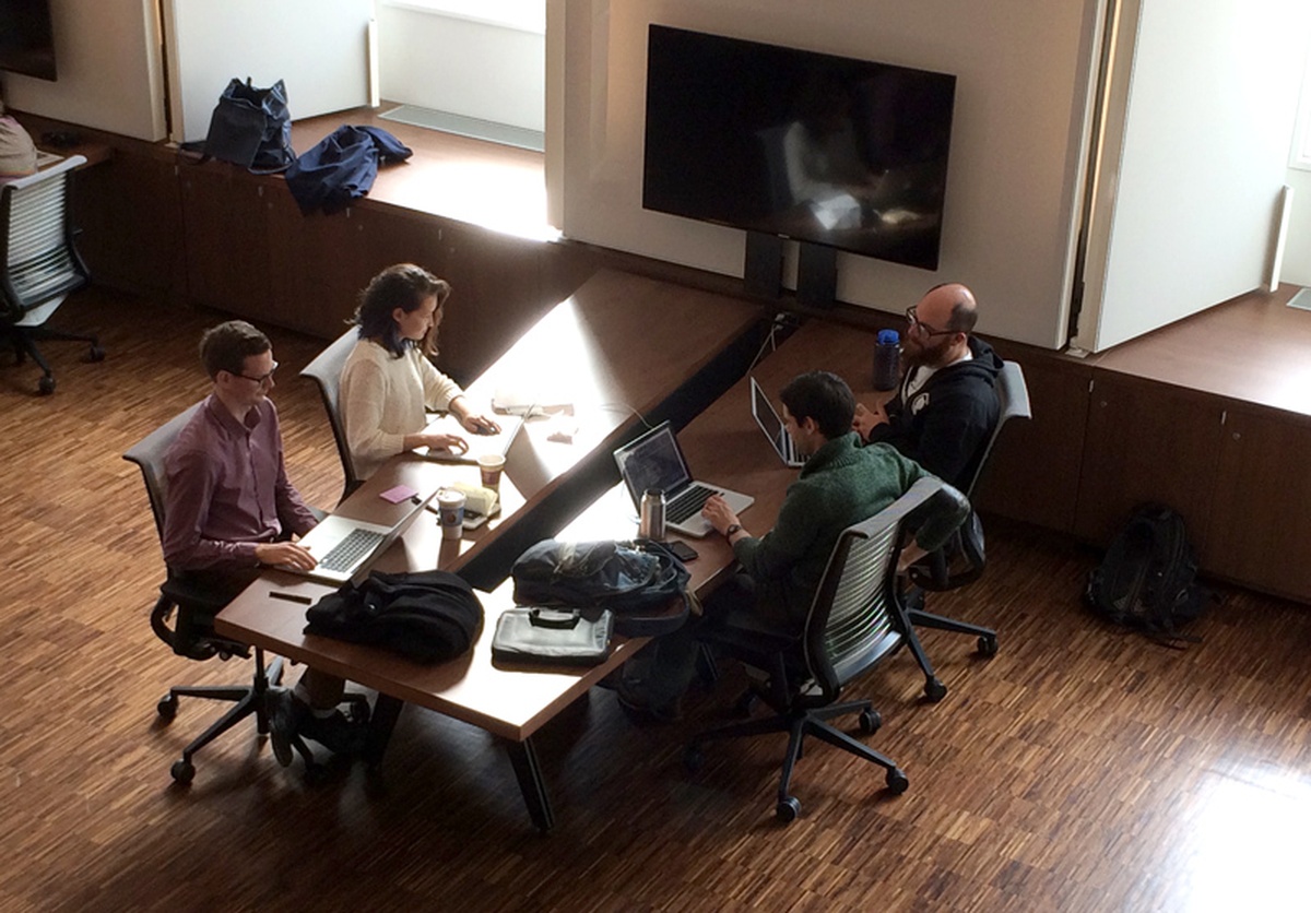
Rare photo of news coders working in natural light.
Earlier this month, we held our third-ever OpenNews Code Convening, and our first one west of Portland, Oregon. Code Convenings are short events that bring together pairs of developers from news organizations to finish, document, and release open source projects they’ve been chipping away at. The idea is simple: block off time for newsroom designers and coders to tie up loose ends and launch great projects, free of the demands of daily newsroom work, and in the encouraging company of their peers from other organizations. And as our first three Convenings demonstrate, our fundamental approach—solicit doable projects, defend developers’ time, feed and caffeinate them, and stay out of the way—works remarkably well.
The NYC Convening
Today and tomorrow, we’ll be publishing write-ups on the four projects that took flight at our recent Code Convening, which was hosted with warmth and generosity by the folks at the Brown Institute for Media Innovation, which is housed in a beautiful wing of the Columbia Journalism School here in New York. The NYC Convening focused on elections-related projects, and was attended by eight developers from MinnPost, OpenElections, the Washington Post, and WNYC. Despite the shared theme, four very different projects emerged from the Convening:
- Clarify, from OpenElection’s Derek Willis and Geoff Hing
- MinnPost’s Election Night API, from Alan Palazzolo and Tom Nehil
- Wherewolf, from Jenny Ye and Noah Veltman of WNYC
- Whippersnapper, from Katie Park and Kevin Schaul at the Washington Post
Our thanks go out to all the participants, to code-reviewing and morale-boosting volunteer Brian Brennan, and especially to Emily Bell, Mark Hansen, Michael Krisch, and Elizabeth Boylan of the Brown Institute for welcoming us into their space.
Code in the Wild
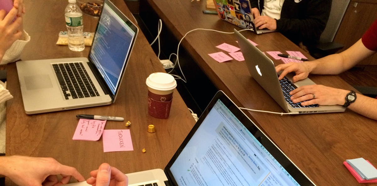
From the inspiring coding montage.
We also took the NYC Convening as a chance to look in on the projects that were produced or launched at the previous two convenings, held in Portland, OR and San Francisco.
Landline/Stateline
Sisi Wei writes:
Landline/Stateline will now allow users to pass in customized options to change (1) the basic look and feel of the map and (2) overall map size parameters. For more advanced users, we’ve also made it easier to add and move around custom map shapes. For example, our default demo already places Alaska and Hawaii in the Gulf of Mexico. We’ve also added documentation on how to create a custom county-by-county map. As an example, we created a New York City borough map as the demo (in New York City, each borough is its own county).
ProPublica actively uses Landline/Stateline to generate our own maps, and as such we’ll update and improve the tool every time we find a new, useful feature.
Original launch post on Source.
Pym.js
Alyson Hurt sent us an update:
Pym.js, our solution for responsive iframes, became a central part of dailygraphics, our toolkit for small-scale projects (e.g., charts, tables and small interactives) that accompany stories on our site. This summer, Tyler Fisher and Christopher Groskopf refactored Pym.js to eliminate a dependency on jQuery and to support generic message passing between the parent and child frames.
It’s been exciting to see it in the wild, in use at organizations like 538, PBS NewsHour, Texas Tribune, Time and the Investigative News Network.
Original launch post on Source.
California Civic Data Coalition
Ben Welsh reports back with a monster update:
A new version of our software for downloading campaign finance and lobbying data now supports the popular PostgreSQL database backend, thanks to significant contributions from a new volunteer.
Version 0.1.0 of django-calaccess-raw-data is now freely available on the Python Package Index and GitHub. Upgrades include Django 1.7 support and fancier logging outputs, as well as numerous bug fixes and small improvements to documentation.
If you already have it installed, an upgrade is as easy as:
$ pip install django-calaccess-raw-data --upgradeThe chief improvement is the ability to load data into the PostgreSQL database. Previous versions only worked with MySQL.
The new feature was provided by Bill Chambers, a graduate student at the UC Berkeley School of Information.
“I hope that users of the system, including myself, will be able to unveil key insights about the lobbying and fundraising activities done by our state representatives and associated political groups,” Chambers said. “Fundamentally, this kind of information deeply deserves to be open and accessible.”
django-calaccess-raw-data is a free and open-source Django app to download, extract and load campaign finance and lobbying activity data from the California Secretary of State’s CAL-ACCESS database.
It was originally released in August by the California Civic Data Coalition, a loosely coupled team from the Los Angeles Times Data Desk, The Center for Investigative Reporting and Stanford’s Computational Journalism Lab.
Upstream applications refine and review the source data. They still lack PostgreSQL support. If you’re interested contributing, we’d be thrilled if someone wants to follow Bill’s lead and pitch in.
Original launch post on Source.
Tamper/Pourover
Erik Hinton sent a brief but awesome check-in:
PourOver and Tamper have been widely embraced. Currently, PourOver has more than 2,200 stars on GitHub and has been forked more than 100 times, many branches actively updating. Since launch, PourOver has seen several core updates including batch-loading functionality and an optimized event schema. PourOver has been able to integrate continuous-range search, thanks to a pull request combining PourOver with Crossfilter. Tamper has been continually maintained. The community has created the first third-party tamper implementation, a JS encoder.
Original launch post on Source.
FourScore
Our own Ryan Pitts notes what’s changed:
FourScore creates an interactive chart that lets audience members respond to a question, marking their position on a grid. It’s useful for visualizing the interplay of a couple sentiments at a time. For instance, whether an event made you feel happy vs. sad, as well as whether you considered it important or unimportant. (This Osama bin Laden graphic at the New York Times was one of the original inspirations for FourScore.)
The chart will pull from any custom data source that can generate a JSON feed, or can be configured to use a simple Google spreadsheet as a back end (which also gives you a data entry form for free). An inline template styles the display for individual responses, with an optional minimap showing its relative position on the grid.
FourScore has popped up alongside other stories since its release. KPCC Southern California Public Radio used it to capture thoughts on parking problems in L.A., and the Financial Review explored people’s opinions on government spending cuts.
Coming Soon
We’ll be hosting many more Code Convenings in 2015—follow @opennews on Twitter to catch the announcement of the call-for-proposals for the next one.
People
- Geoff Hing
- Erik Hinton
- Alyson Hurt
- Tom Nehil
- Alan Palazzolo
- Katie Park
- Ryan Pitts
- Kevin Schaul
- Noah Veltman
- Ben Welsh
- Derek Willis
- Jenny Ye
Organizations
Credits
-
 Erin Kissane
Editor, Source, 2012-2018.


