Features:
How We Made “Your Warming World”
A Q&A on the New Scientist App
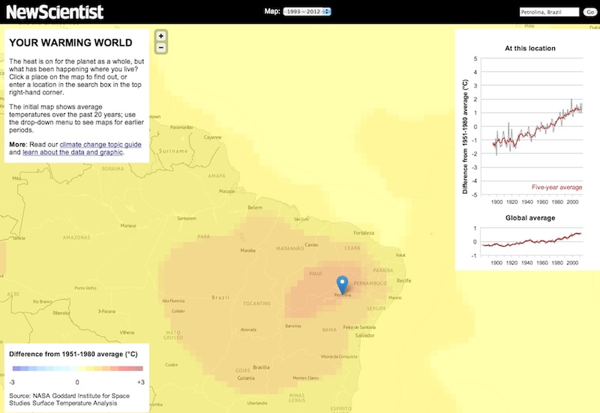
Zoomed-in view of the map (New Scientist)
We spoke with New Scientist’s Peter Aldhous and NPR’s Chris Amico to dig into the data, mapping, and interface details of their collaboration on Your Warming World.
Origins
How did this project begin?
Peter Aldhous: For a few years now, I’ve been something of an evangelist within New Scientist for data journalism and data visualization. Having experimented with various smaller projects, both for newscientist.com and on my own website, I was itching to attempt a more ambitious app, with the goal of demonstrating to my colleagues the value of having this type of project in our editorial arsenal.
What it needed was the right dataset/story, the right collaborator, and a supportive editor willing to invest some modest funds to make it happen. I’d admired Chris Amico’s work at NPR for some time, especially his piece on the Texas drought, and when I learned he had gone freelance, everything quickly fell into place. I already had the idea of making a visualization to localize the global story of climate change. It’s a story that isn’t going to go away, which means our app will be updated and will hopefully have a long shelf-life. Once Chris said he was interested, Sumit Paul-Choudhury, New Scientist’s editor, quickly gave the green light.
Design & Process
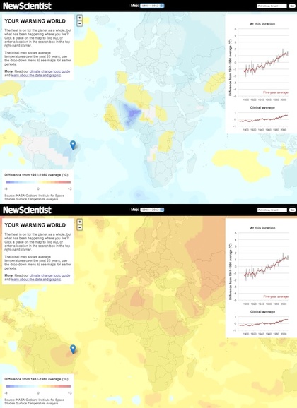
Mapped data from 1893-1912 (top) and 1993-2012 (bottom) (New Scientist)
What did you set out to accomplish with this project? And how were your design decisions shaped by that goal?
PA: There is no bigger, more complex and more challenging story in science than climate change. Many people do not even accept the scientific evidence that our planet is warming. I’d been struck, however, by a research paper suggesting that those who come to the issue with a skeptical frame of mind are more likely to be convinced by a simple line chart showing the rising trend in global average temperature than by a text explanation. My journalistic instincts told me that stories have much more resonance if you can make them personally relevant to as many members of your audience as possible. For New Scientist, that audience is international. So that led to the idea of clicking on a map or using a geocoding search box to reveal a line chart of the temperature record at any location on the globe, tied to the question: “What has been happening where you live?”
The design of the app stemmed directly from that, and changed very little from my initial mock up. I knew we wanted a global slippy map, a chart of global average temperature over time, another chart showing the historical temperature record at the selected location, and a brief panel of text to introduce the app. Apart from that, the goal was to have a clean look, broadly consistent with newscientist.com’s design, and to write some simple CSS to ensure that the app displayed properly on a variety of screens, from iPad to a 27-inch iMac, and on all major browsers/operating systems.
The switchable map layers are secondary, and are intended to do two things: help users identify interesting places to click on, aside from their own location, and to show in a general sense how the planet has shifted from cool blues more than a century ago to the warm oranges and reds of the default view, which shows average temperatures over the past 20 years. As it happens, it’s clear from the analytics that most users never switched from the default view, but that’s fine because that serves our purpose of showing what parts of the planet have warmed the most since the baseline period of 1951-1980 to which everything is compared.
What was your process like? How did you two work together, and how long did it take, start to finish?
Chris Amico: We didn’t have much overlap between us: Peter got and cleaned the data, and he did the initial design. I wrote the JavaScript and Python for the map and chart.
While we kept the actual work separate, one thing that really helps the reporter-developer relationship is when you can speak each other’s language. A couple times, Peter had an idea and, as a way of convincing me it would work, rigged up a prototype. So much win there.
PA: All in all, it involved a few weeks of my time, with quite a bit of that spent talking to climate scientists about what data to use and the tools available to process it. We budgeted for about a week of Chris’s time (not including his sleepless night, mentioned below). As Chris says, there was a clear division of labor.
The Data
The app is accompanied by a pretty detailed explanation of the methods used to gather and analyze this data set. Can you situate that within the larger conversation about getting reliable climate data?
PA: The fairly extensive “nerd box” on the “About” page in part reflects New Scientist’s audience, and in part stems from a determination to be clear and transparent about the NASA analysis, given the political controversy that surrounds climate science.
Many of our readers are pretty technically sophisticated, and some will appreciate the opportunity to look under the hood. I hope that even those who don’t want this level of detail will be reassured to know that we’ve done our homework, and understand the data we’re playing with.
The various analyses of the global historical temperature record have been subject to intense scrutiny and criticism. We chose the NASA dataset for a number of reasons, not least because it has better coverage of the Arctic, where the warming trend is especially marked, than the two main alternatives.
The debate over whether the planet is warming ought to be over, in my opinion, after the Berkeley Earth Surface Temperature Study combined all the available data and came to the same conclusion as previous analyses, including the NASA analysis we used. But I anticipate that hardened skeptics will continue to cast doubt on the reliability of climate data. If our app plays a small role in convincing ordinary people that the world really is warming – and that climate change is a local issue, not just an abstract global one – then I will be very satisfied.
Was this an easy data set to work with? Did you have to do anything complicated to get it into a useful state?
PA: I was anticipating some major headaches wrangling the data, but it actually proved to be easy, thanks to excellent cooperation from the NASA team, and two very useful tools. The data was supplied in a format called NetCDF, often used to store arrays of scientific data defined by latitude, longitude and time. I used a plug-in for Microsoft Excel to pull the data into spreadsheets, which then needed very little editing to produce the CSV files crunched by Chris’s scripts.
I generated the map layers using a NetCDF viewer called Panoply, developed by Robert Schmunk of NASA. I exported images from Panoply as TIFFs, cropped them to remove everything but the global map, then georeferenced and reprojected them to a Web Mercator projection using GDAL, before loading them into TileMill and saving them to MapBox.
CA: From a technical perspective, the data set was fairly simple to work with (once I wrapped my head around it. It’s three-dimensional – latitude, longitude, and time – which looks weird when you mash it down to a two-dimensional spreadsheet. After that, it’s easy to work with in Python.
Assembly
What did you use to make the app?
CA: In addition to the tools mentioned by Peter, the app depends on Leaflet, Backbone, a little jQuery, Highcharts, and a fairly simple Python script.
When Peter approached me with this idea, I immediately thought the best way to store all this data was to embed it in a UTFGrid and serve it with Wax. Peter was already working on the map overlays, so it seemed reasonable to just add another layer with grid data embedded.
I wrote a Python script using Shapely and Fiona that constructed a two-by-two grid and encoded each grid square’s temperature anomaly data as a JSON array stored as a property. GeoJSON schemas (and shapefiles) don’t have an Array field type (at least using Fiona), so I was storing JSON as a string on a GeoJSON object. (In retrospect, this should have been a warning sign.)
I rendered the mostly-invisible grid layer in TileMill, uploaded it to MapBox and used the Tooltip API in Wax to pull data out of the UTFGrid. If you look at some of the older commits, you’ll see where this ran into trouble. The grid reloads for every zoom level, which is inefficient and slows things down. There were problems getting touch interactions to work, and with IE. It was loading a ton of data into memory, to the point where browsers were crashing. Just a giant pile of over-engineering on my part.
All of this was happening the first week of January, with new NASA data due to come out in a week. In a fit of madness, I stayed up one night and rebuilt the grid. I decided to just put everything on the file system, much like you would map tiles, except without the zoom dimension. Files are named logically (annual/0/0.json) and each holds a JSON array of temperature data. They’re really small, so an ajax request takes no time, even if you make a bunch of them (and they’re cached in the client).
This works because the data is just a two-by-two degree latitude/longitude grid. When you click on the map, the map knows that location and can round to the nearest grid edge. UTFGrid is great for data that follows the contours of the underlying geography, but in this case it was too much.
This took Shapely and Fiona out of it (no more Python dependencies or GDAL, just the standard library) and meant all of the data could be kept in version control (though git was unhappy with that first giant commit) and zipped and uploaded. Basically, this made everything better, for the price of one sleepless night.
Leaflet does all the map interactions. It’s my favorite mapping library by far. Backbone manages the layer menu and keeps everything in alignment. The map layers are all hosted on MapBox, and we used the MapBox geocoder. The chart is Highcharts, which was pretty easy to get working.
The app is entirely static, all HTML, CSS and JavaScript, which was important to me because this was a freelance project, so I needed to be able to hand it off and walk away without worrying that I’m going to get angry calls from Peter in two months because a traffic spike knocked it down.
Conclusions
Did anything surprising or especially challenging arise during the design and development process?
CA: Other than what’s above…
I put the app in front of a few friends, and I spent a lot of time playing with it myself. It surprised me how much fun a simple interaction can be. Move the pin, and the chart moves. It piques your curiosity. That was an early sign that we had something right.
Is there anything you’d do differently on a similar project in the future?
CA: I used to have a mantra over my desk: “Resist the urge to be clever.”
With projects like this, really any project, there’s always this temptation to try something I’ve never done before. That was UTFGrid on this project. I should have ditched it earlier, which would have given me more time to add other features.
PA: Looking at reactions to the app on Twitter and elsewhere, it’s clear that there was a little confusion in some quarters about what the map layers were showing. Some people thought, for instance, that the default view showed changes over the last 20 years, rather than comparing average temperatures for that period to the 1951-1980 baseline. That baseline is central to the NASA analysis, so I’m not sure there was any alternative. But the confusion has hammered home to me that you need to think carefully about explaining to people what they’re looking at – or better, make it so obvious that there’s no room for misinterpretation. That’s a challenge to bear in mind for future projects.
Anything else we should know?
PA: If you’re planning anything similar, hire Chris. He’ll do a great job!
Credits
-
Peter Aldhous
Science. Data. Journalism. Maps. Reporter @BuzzFeedNews, lecturer @UCSC_SciCom @ucbsoj, instructor @AMI_Berkeley
-
Chris Amico
Journalist/developer @ USA Today Network. Builder of @HomicideWatch. Sinophile for fun. Past: @frontlinepbs @WBUR, @NPR, @NewsHour.
-
 Erin Kissane
Editor, Source, 2012-2018.


